- Fuego Yámana
- /
- Ultra Ascensores
Ultra Ascensores
Ascensores Ultra approached Fuego Yámana with the idea of refreshing their image. In this case, the team carried out a deep brand refresh, seeking to redesign the logo without losing sight of the symbol that had already been established among clients.
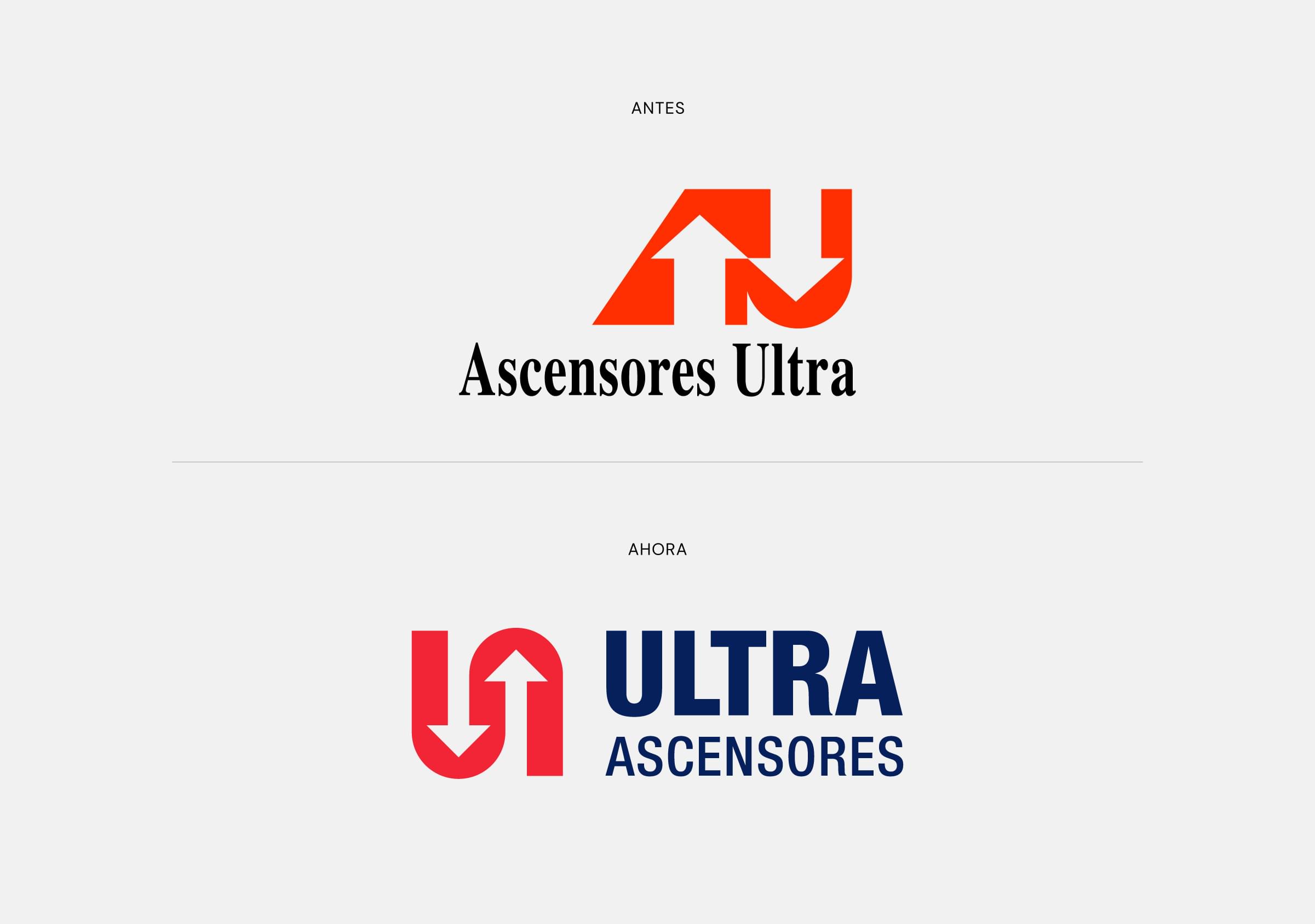
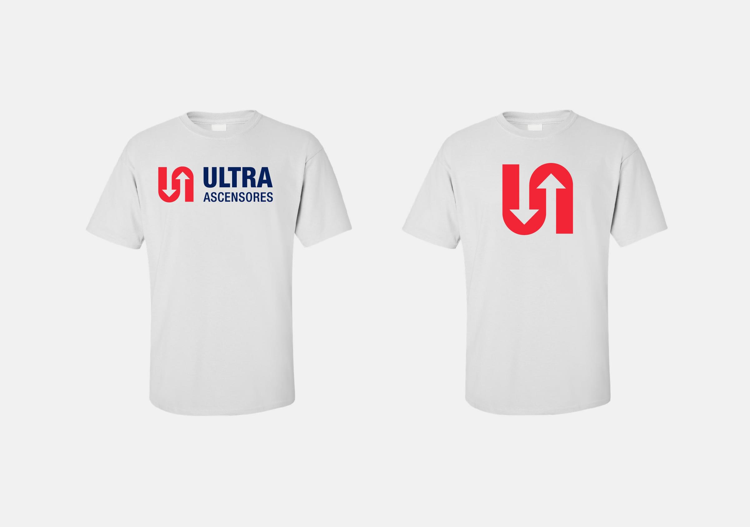
In the design work carried out, we kept the classic scheme of the brand, symbol + logo, making some adjustments that sought to improve its order and operation. First of all, we recommended changing the name from Ascensores Ultra to Ultra Elevators, to give more focus to the word ‘Ultra’ and achieve greater visibility and better reading.
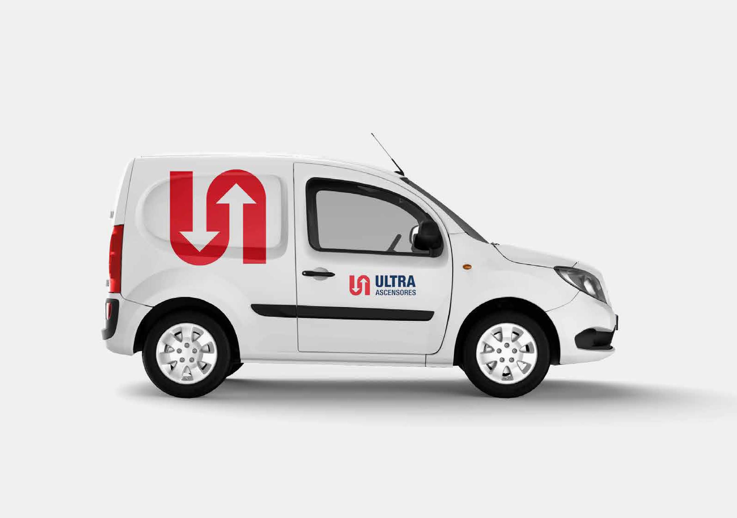
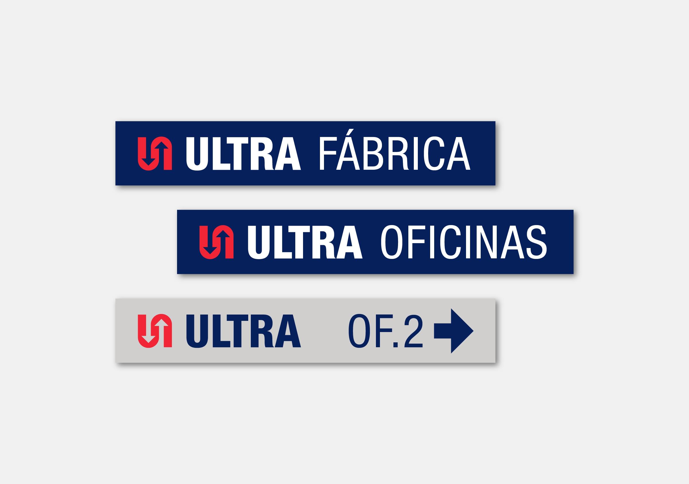
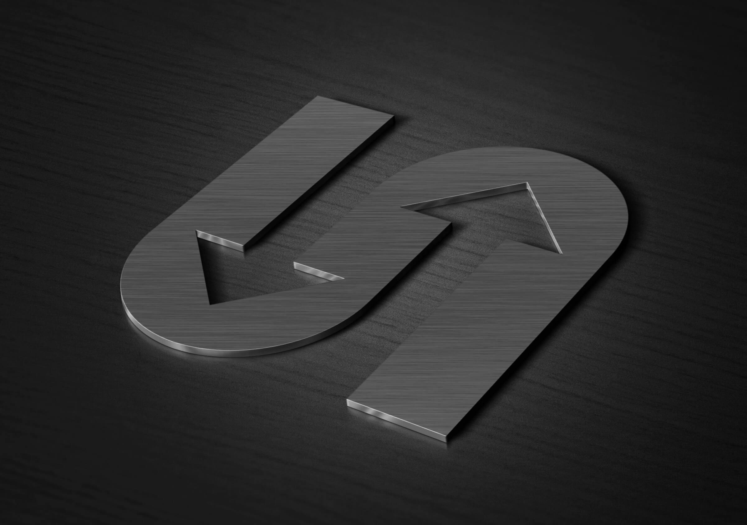
On the other hand, when redesigning the new symbol, we kept the original idea of the letters UA marked with arrows, but balanced the shapes, achieving a more symmetrical logo, with a defined typographic program and color palette.
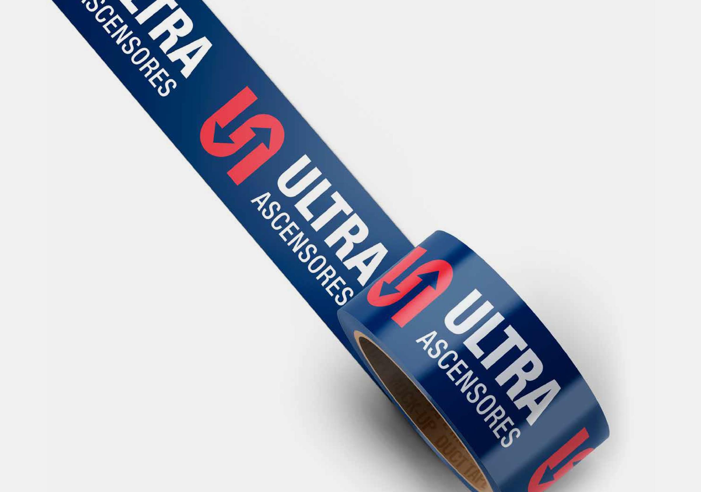
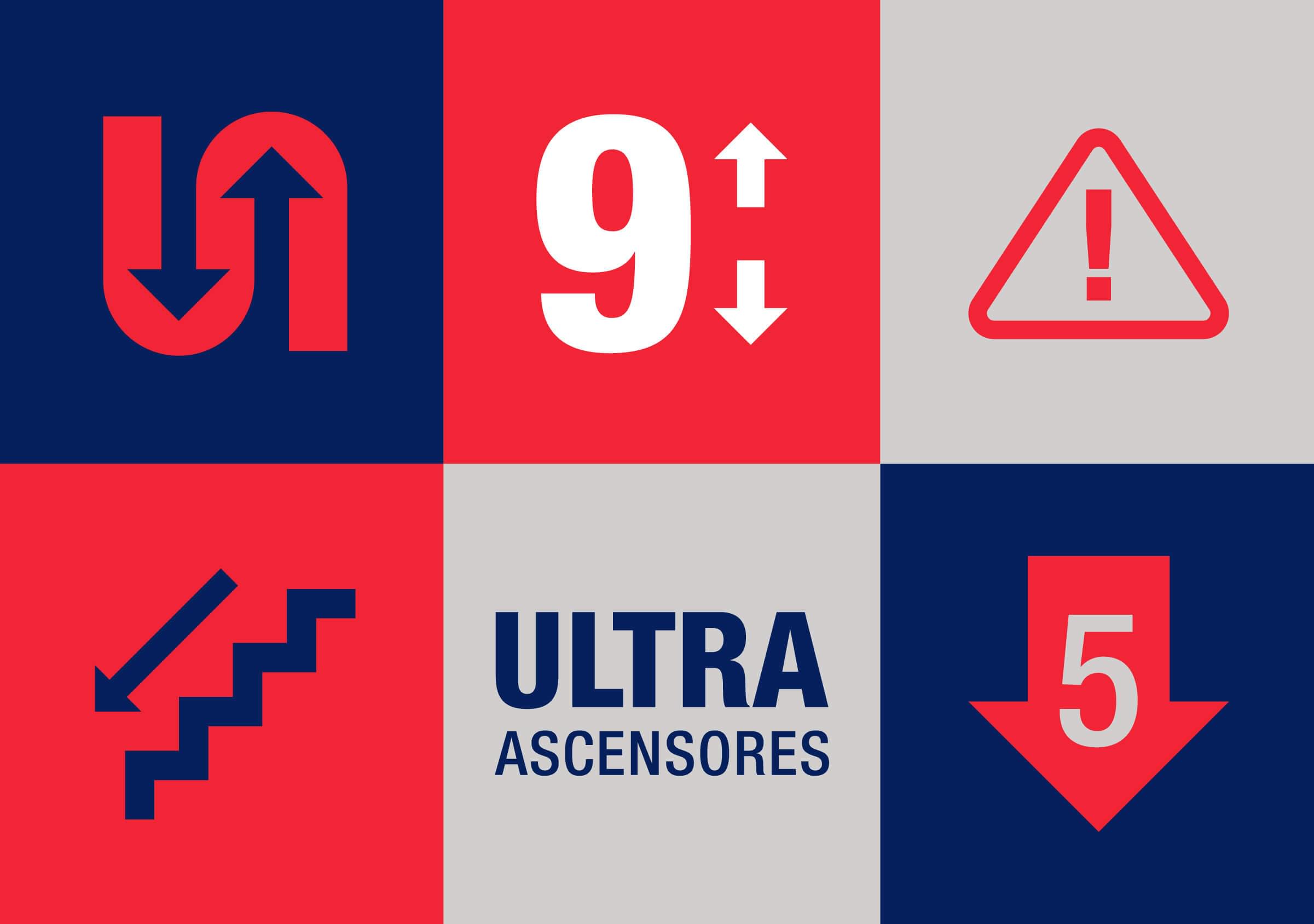
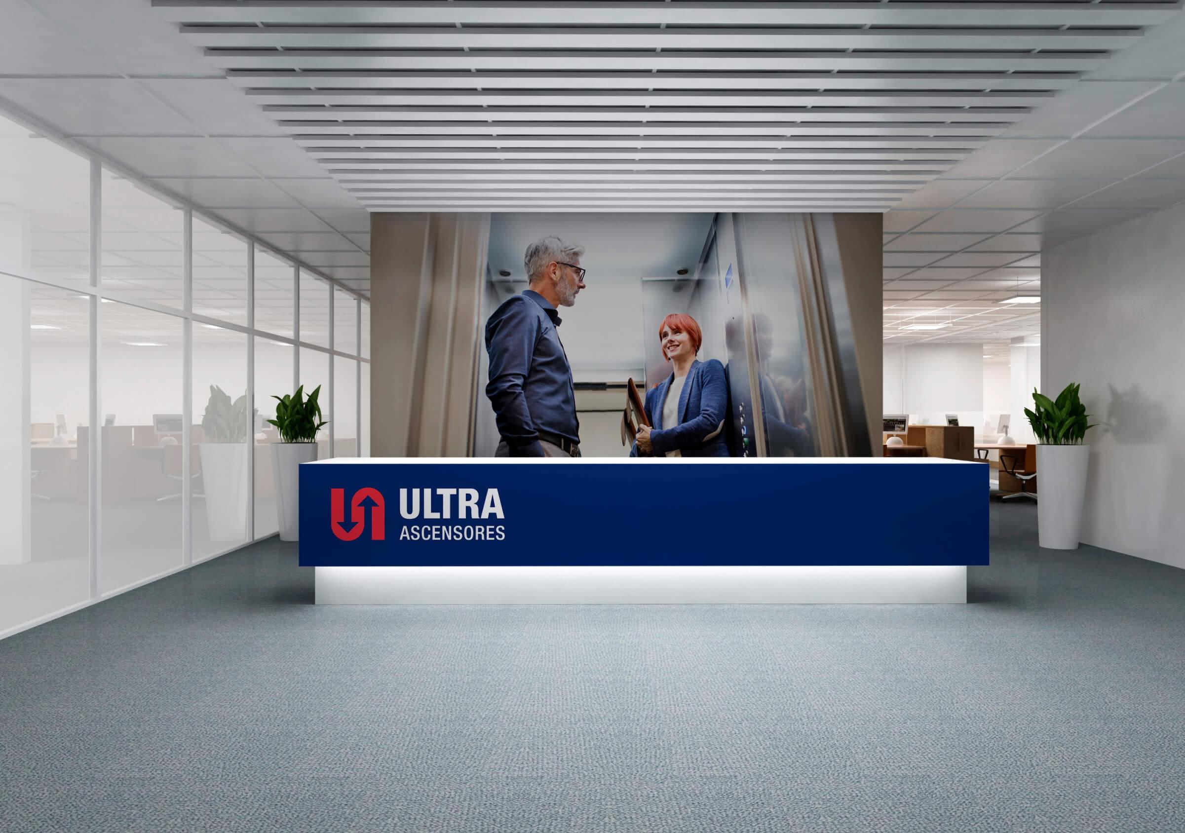
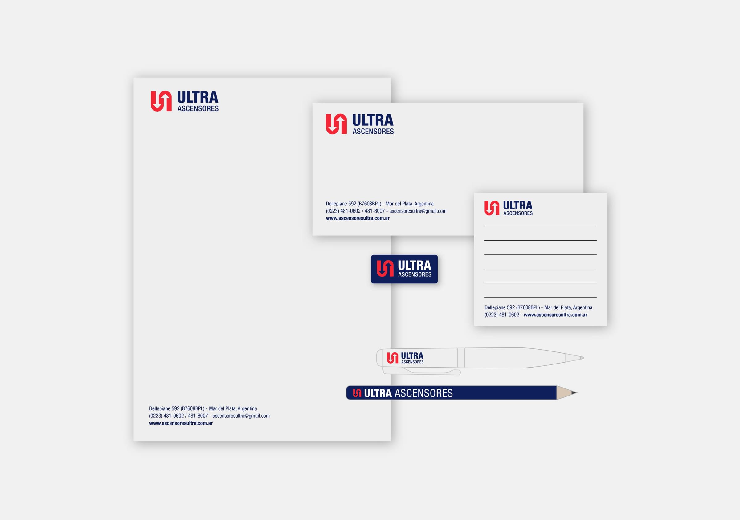
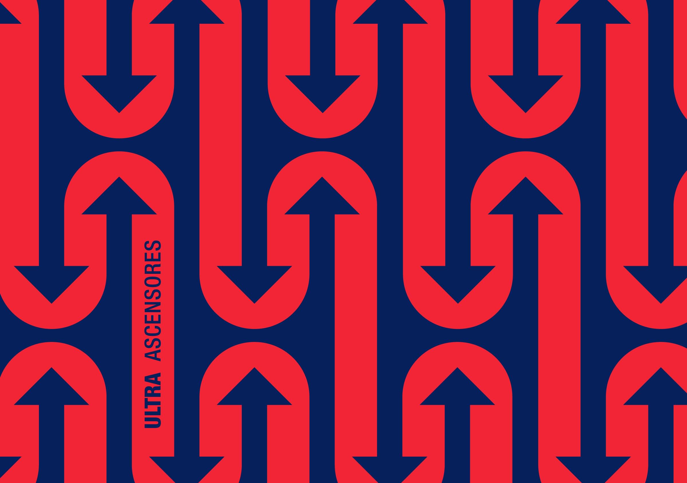
The proposed visual language gives rise to new company communications, with a much more contemporary look. Using the symbol as the starting point, patterns are incorporated into the brand identity programme, adding visual condiment to the wide range of applications.
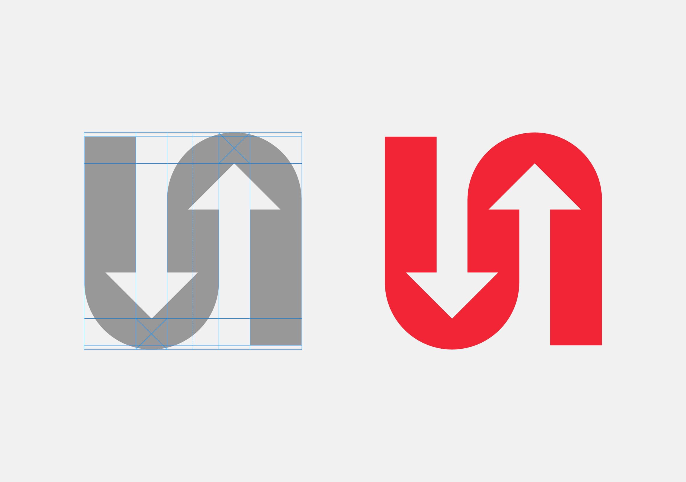
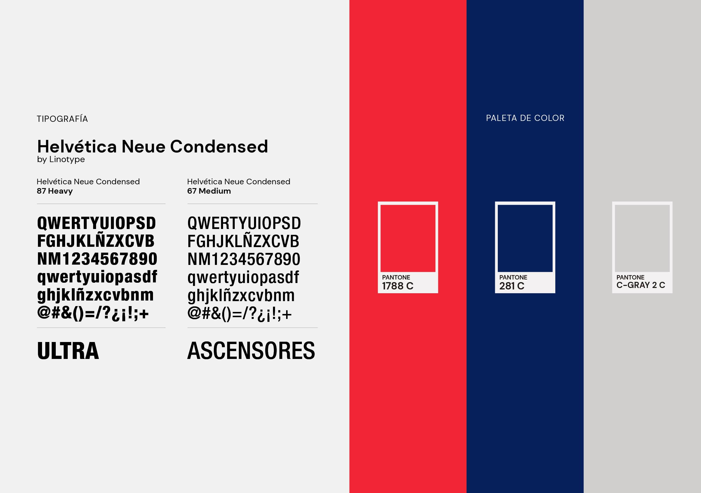
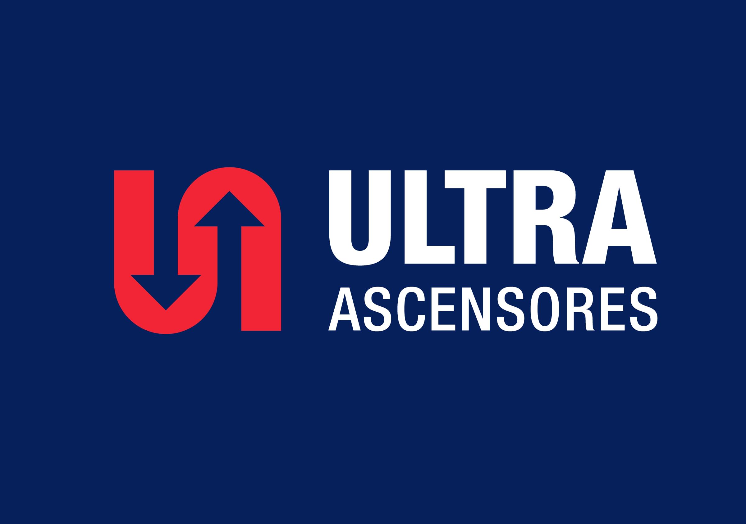
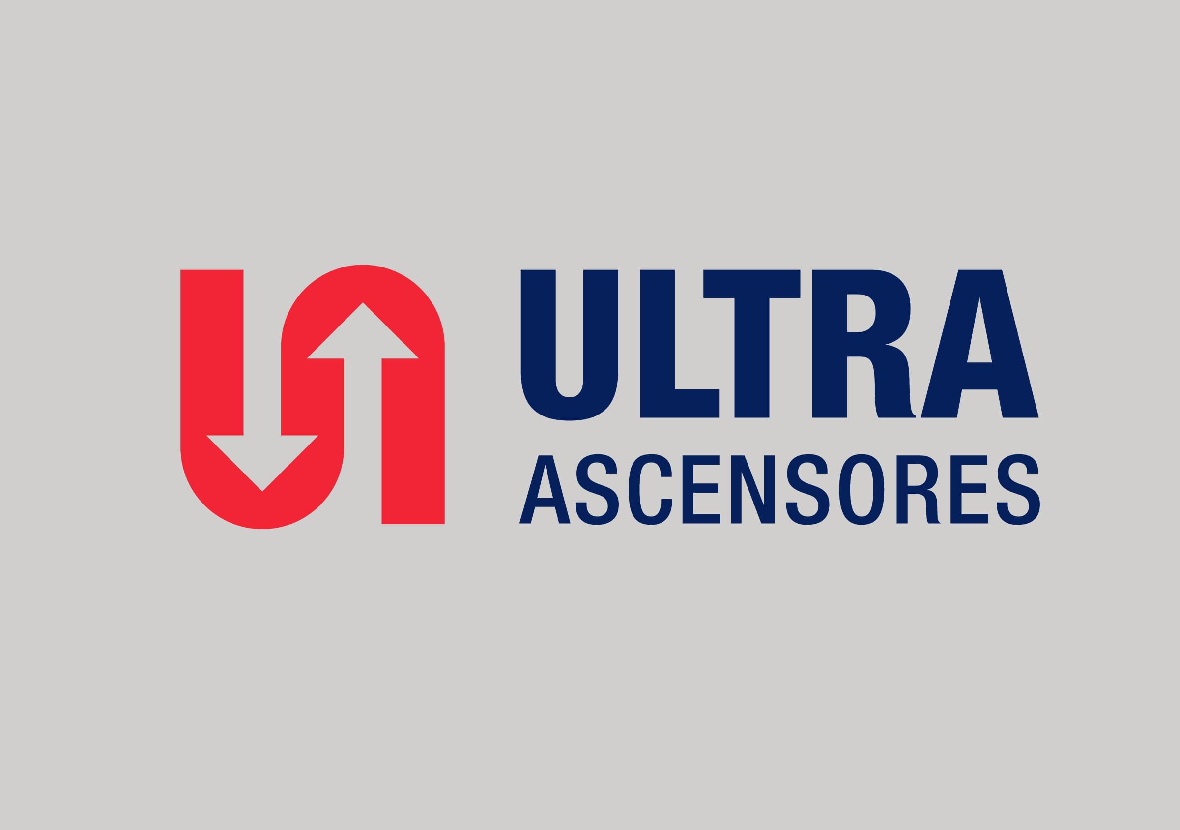

The project result is a stronger brand from the visibility and functioning points of view, that brings Ultra Ascensores closer to the concepts of innovation and technology, with which the company wanted to relate.
