- Fuego Yámana
- /
- Indiecita
Indiecita – A food brand is born
A company with eleven retail stores asked us for help in creating the brand for their food products private label. From the naming to the visual identity, this is how Indiecita was born.
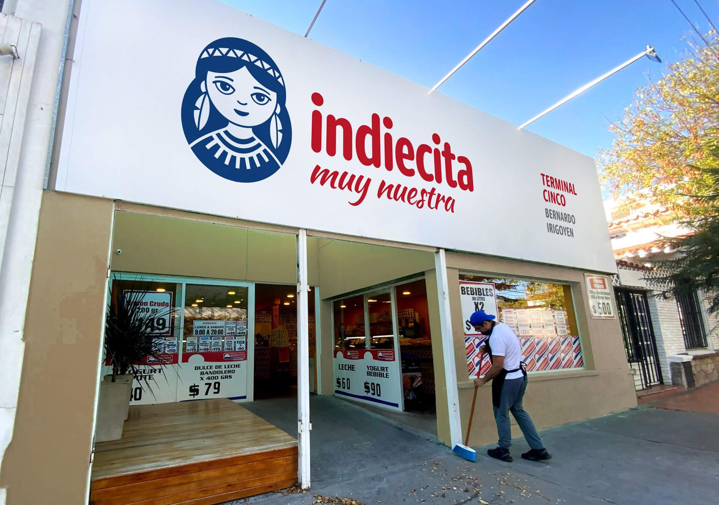
The naming strategy for the product line focused on the search for an empathetic, close and familiar alternative.
Looking for a term that was simple and recognizable, that could represent a wide range of products (from dairy to baked goods, coffee, among others), while at the same time that could later become their retail brand. Another important consideration was to ensure that the selected term was available for trademark registration in the different categories.
Indiecita was inspired by the owners’ daughter name: India.
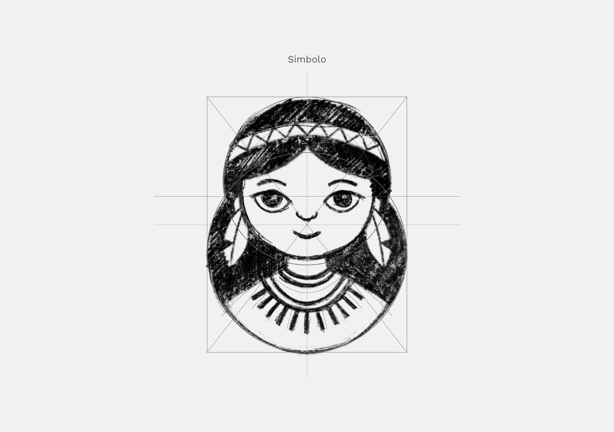
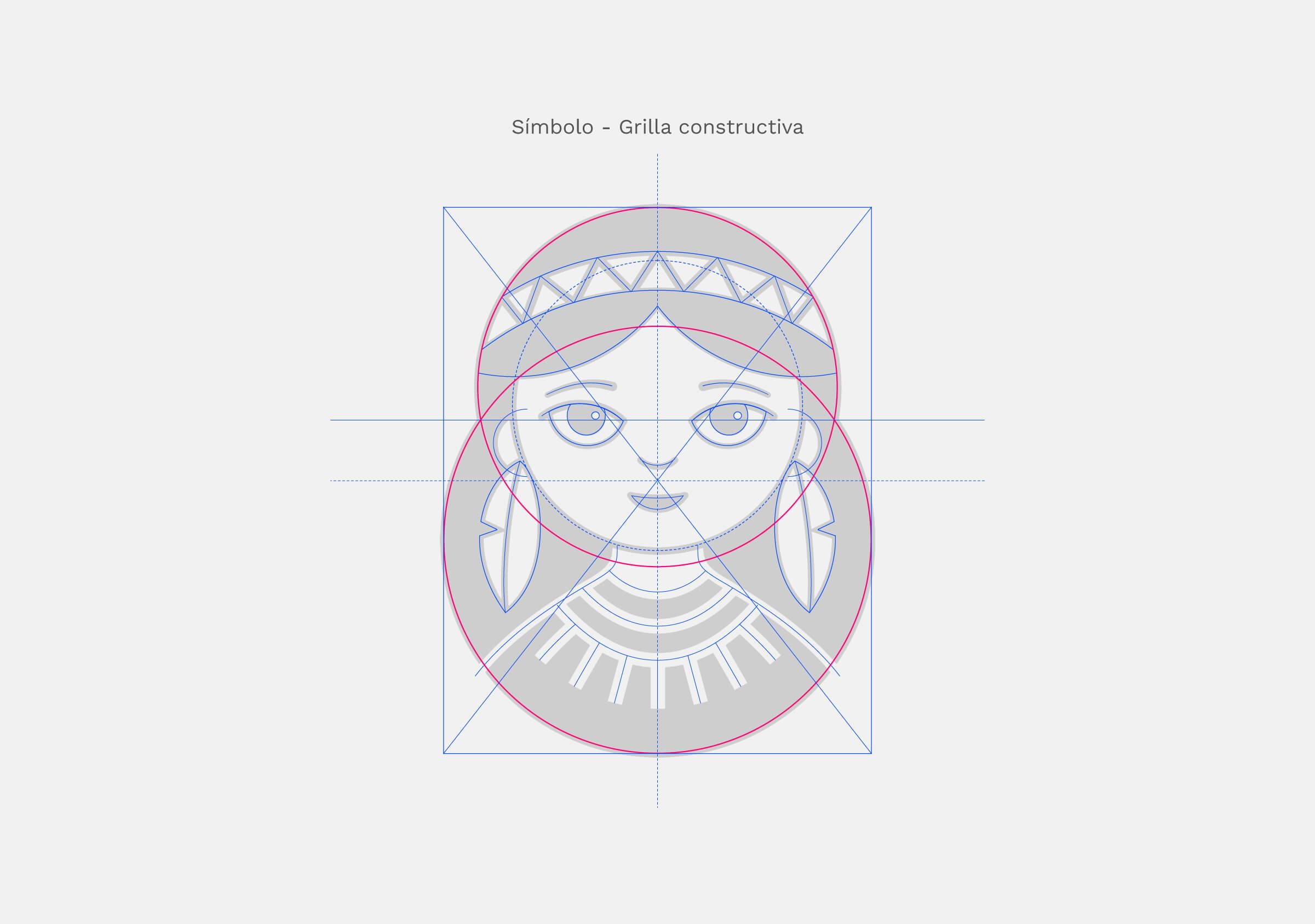

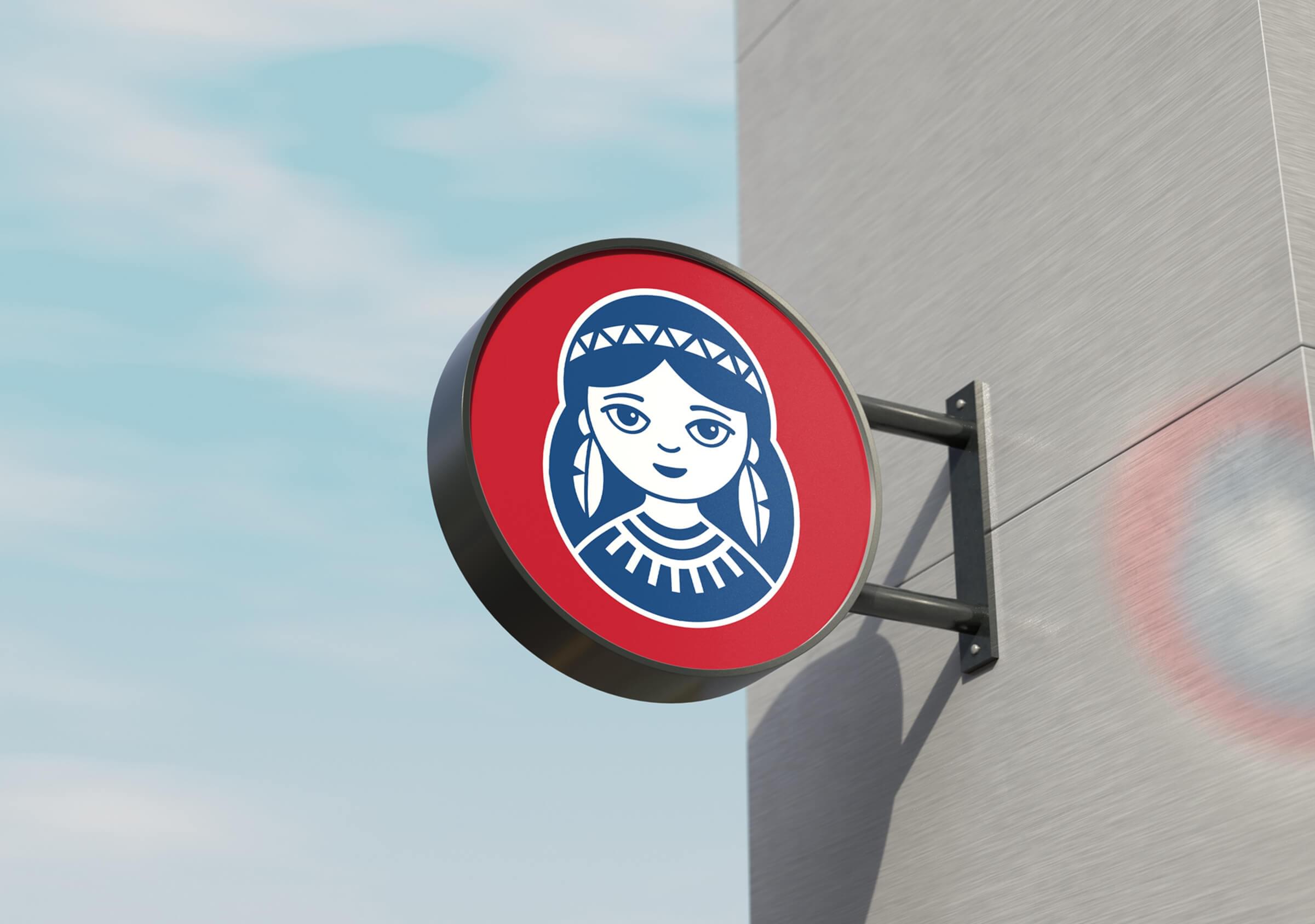
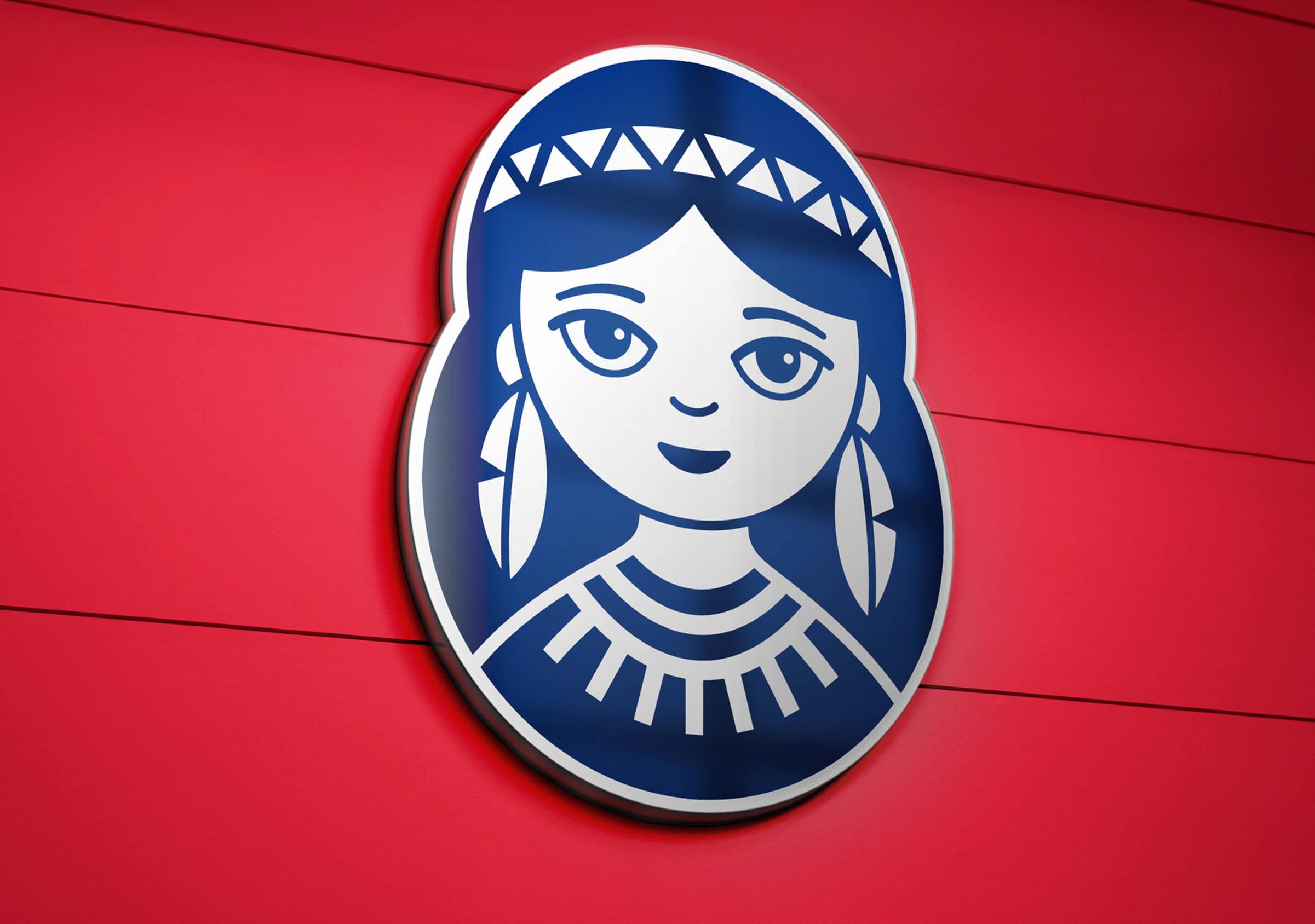
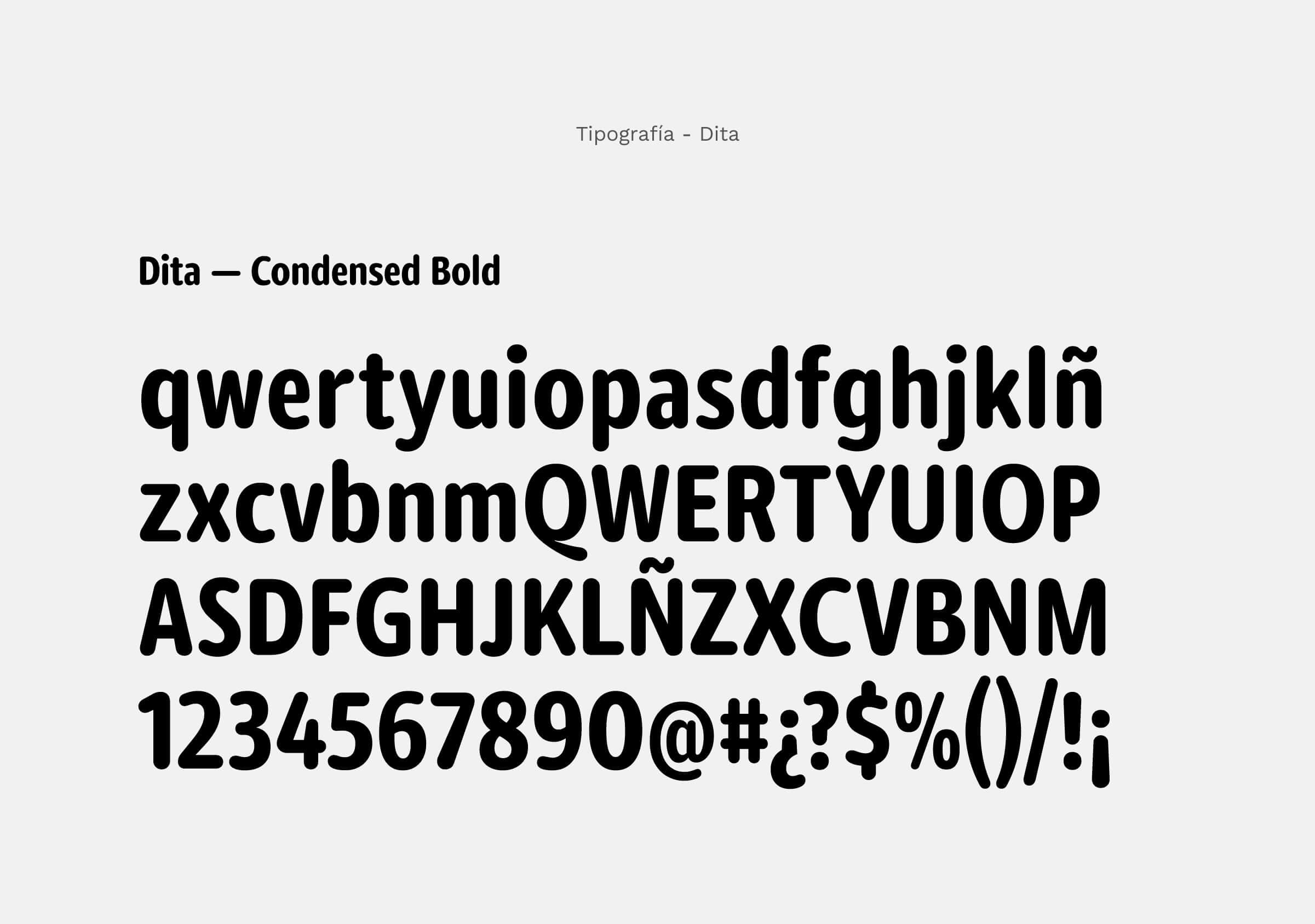
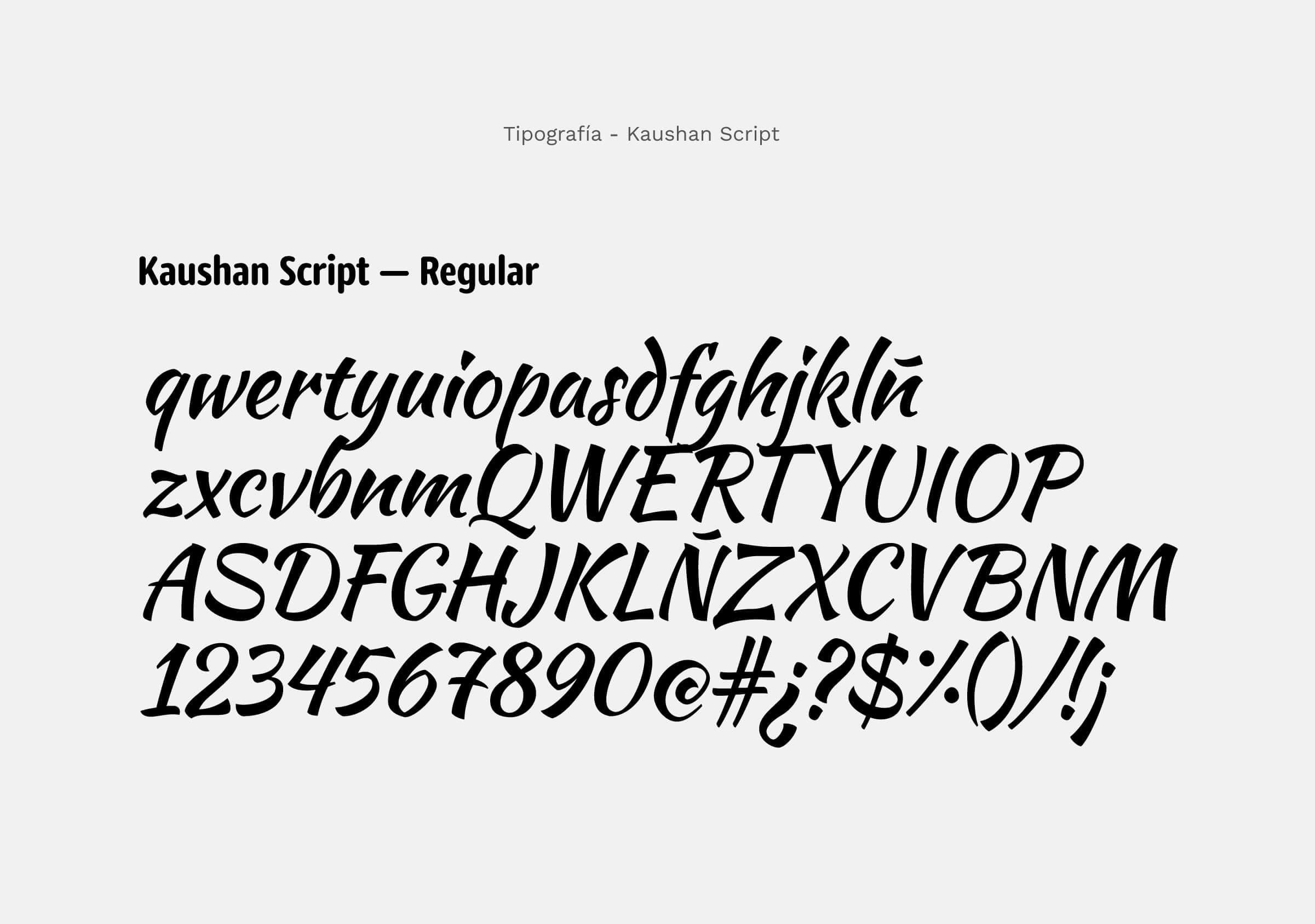
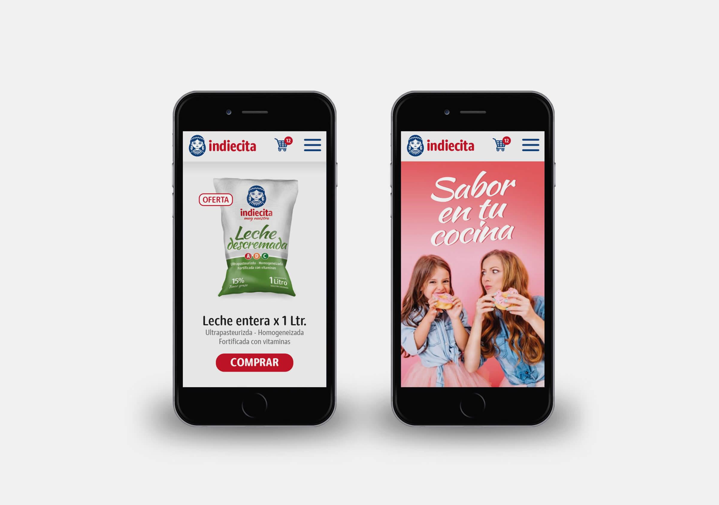
The graphic brand strategy defined a logo and symbol typology, which was also very consistent with the defined name, due to the possibility of associating the brand with a figurative symbol. Thus, a graphic image of a girl that was nice and friendly was sought, and complemented with a simple and rounded typography to make it approachable.
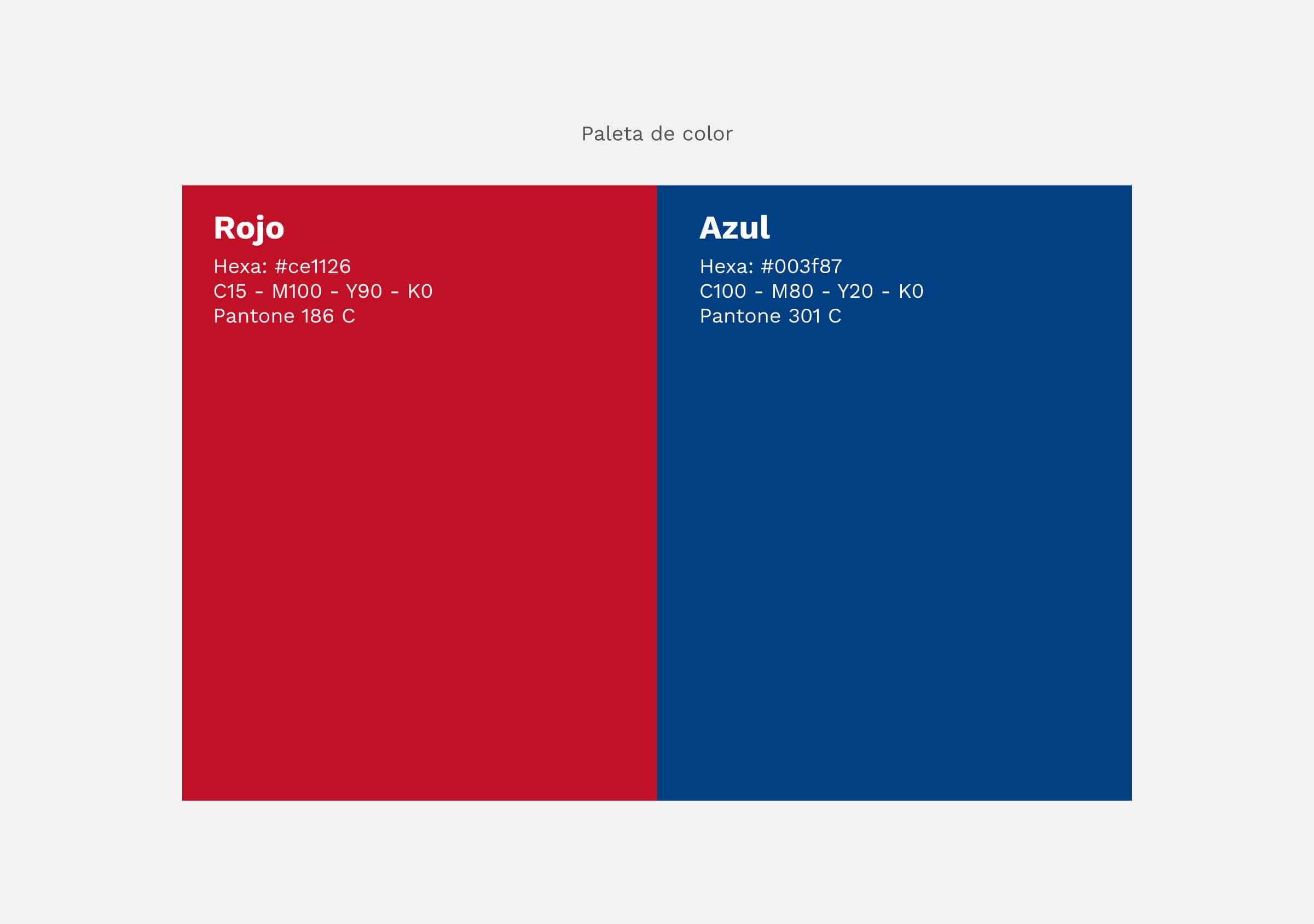
The color scheme selected was white, red and blue, in order not to collide with the “color codes”
that the products use for their communication: Whole and skimmed, dairy, baked goods,
coffee, chocolate and others.
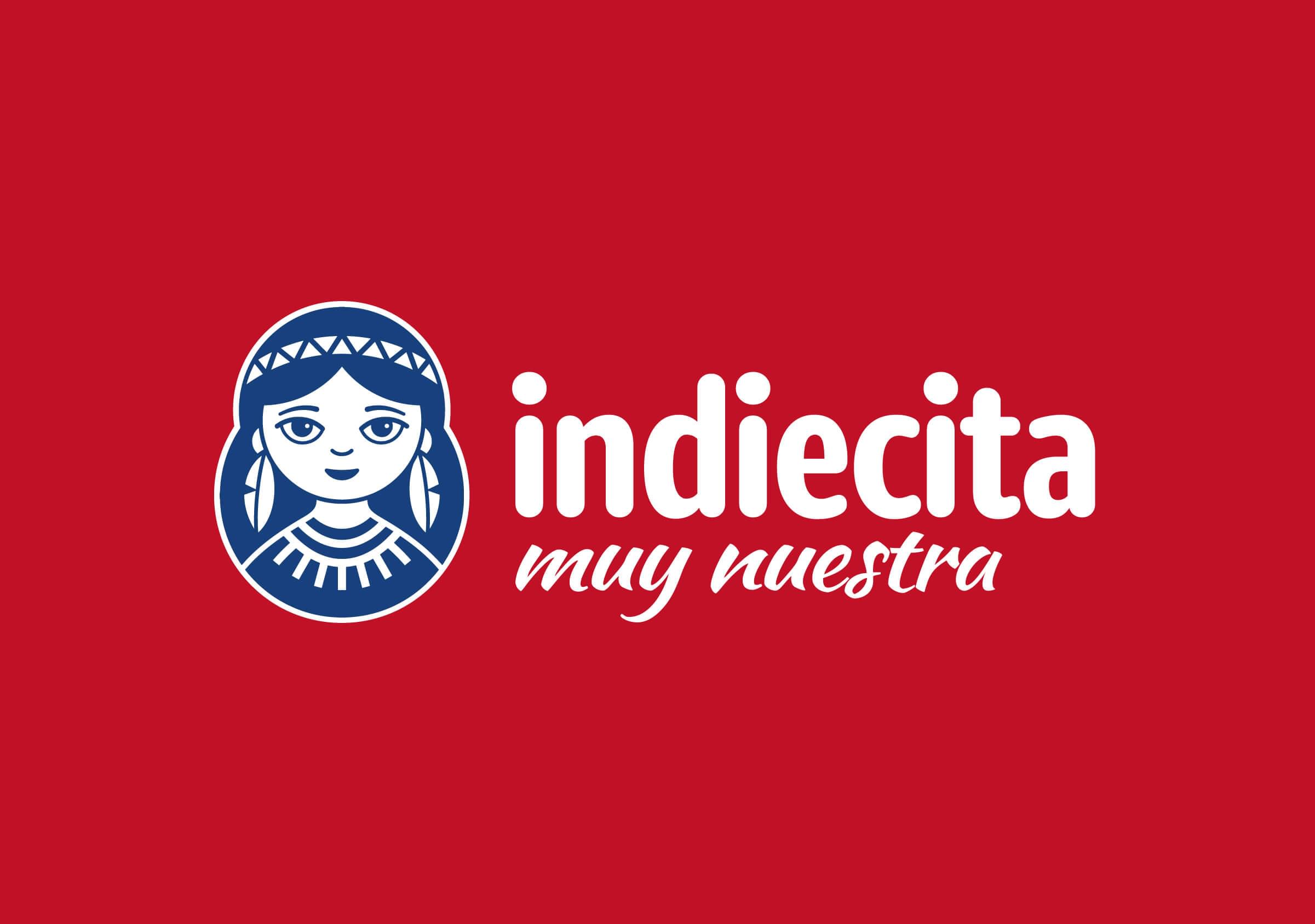
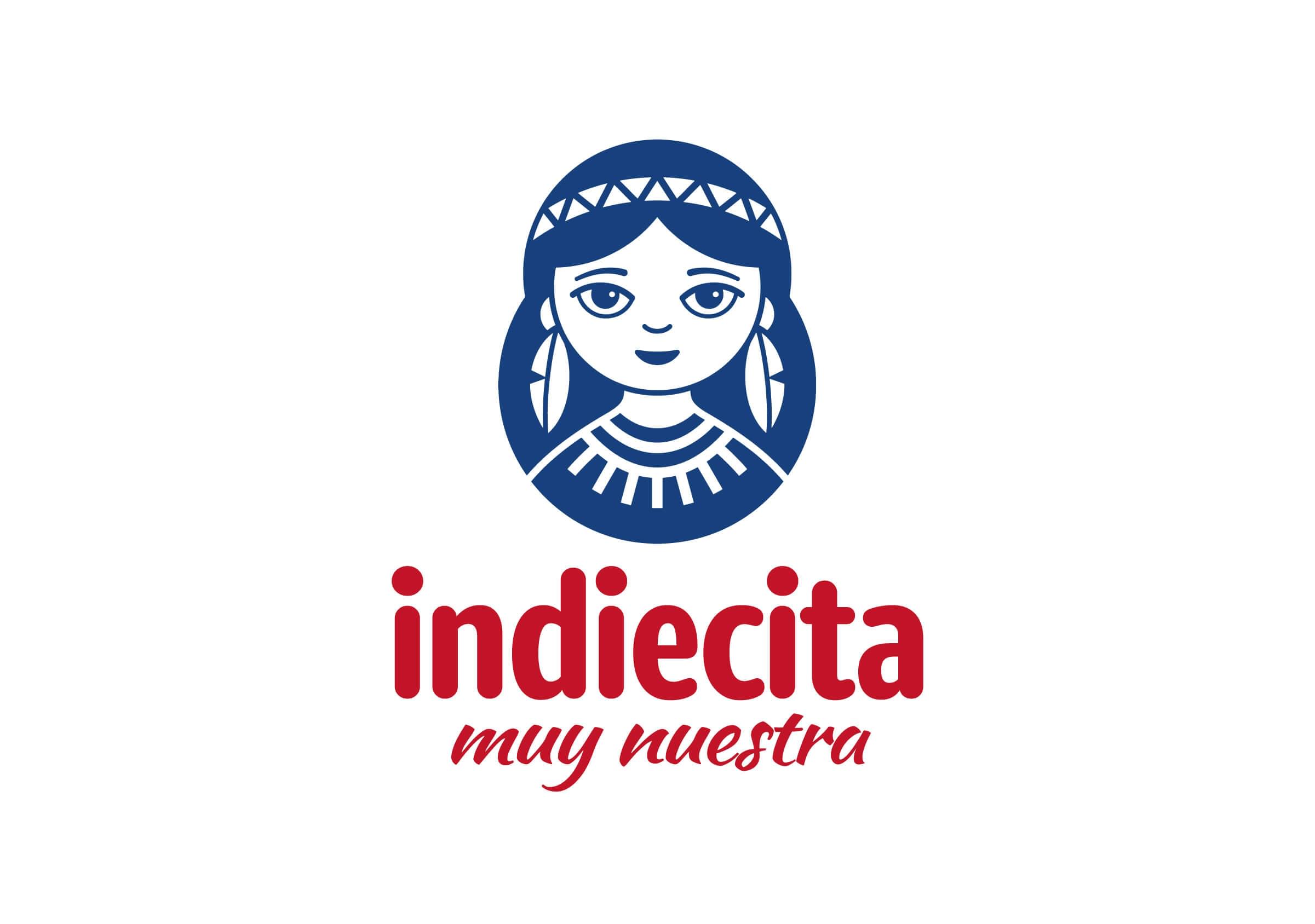
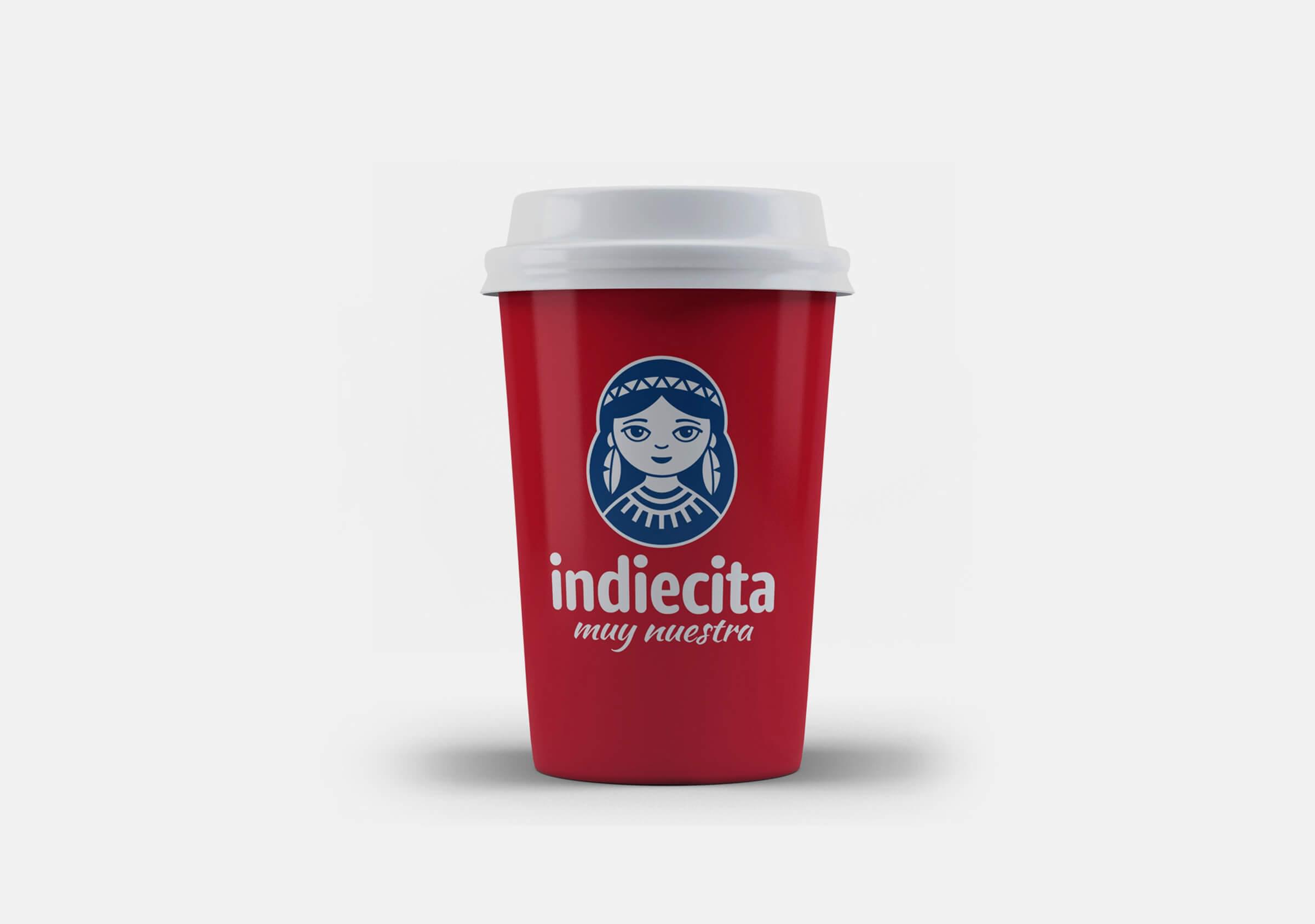
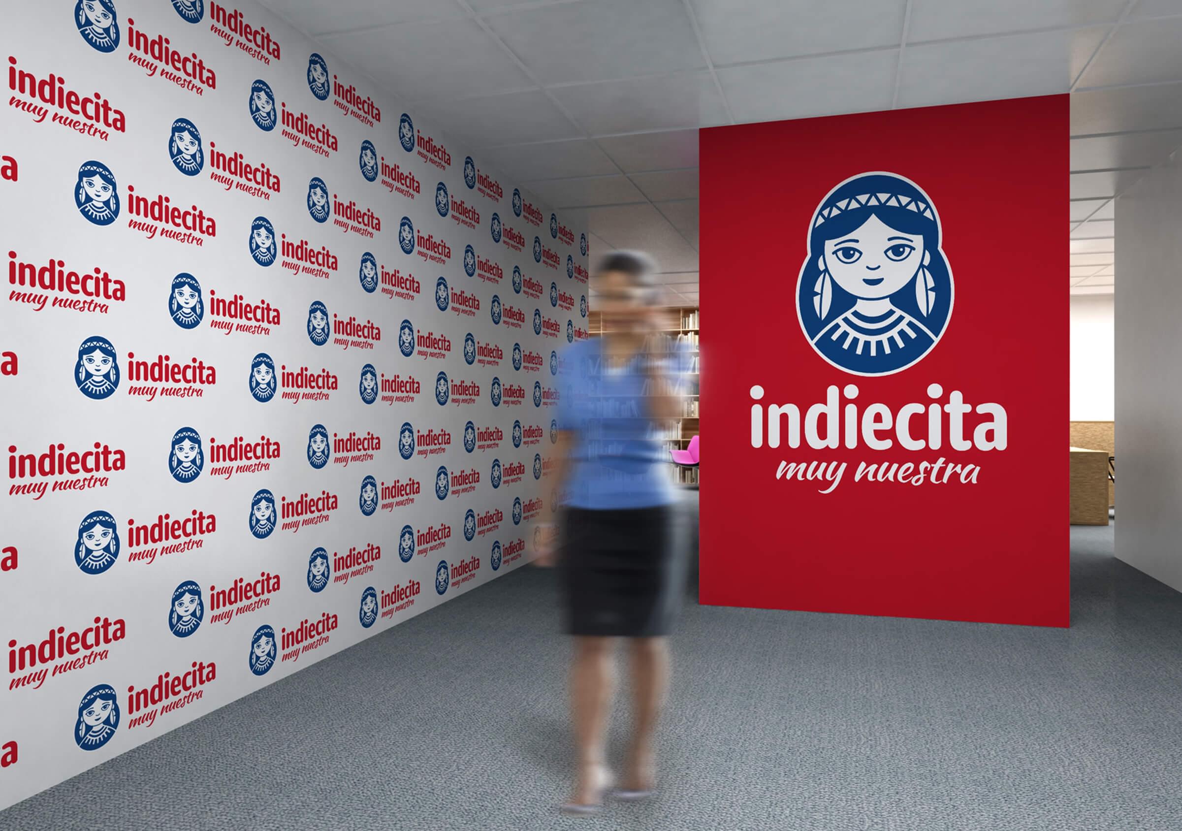
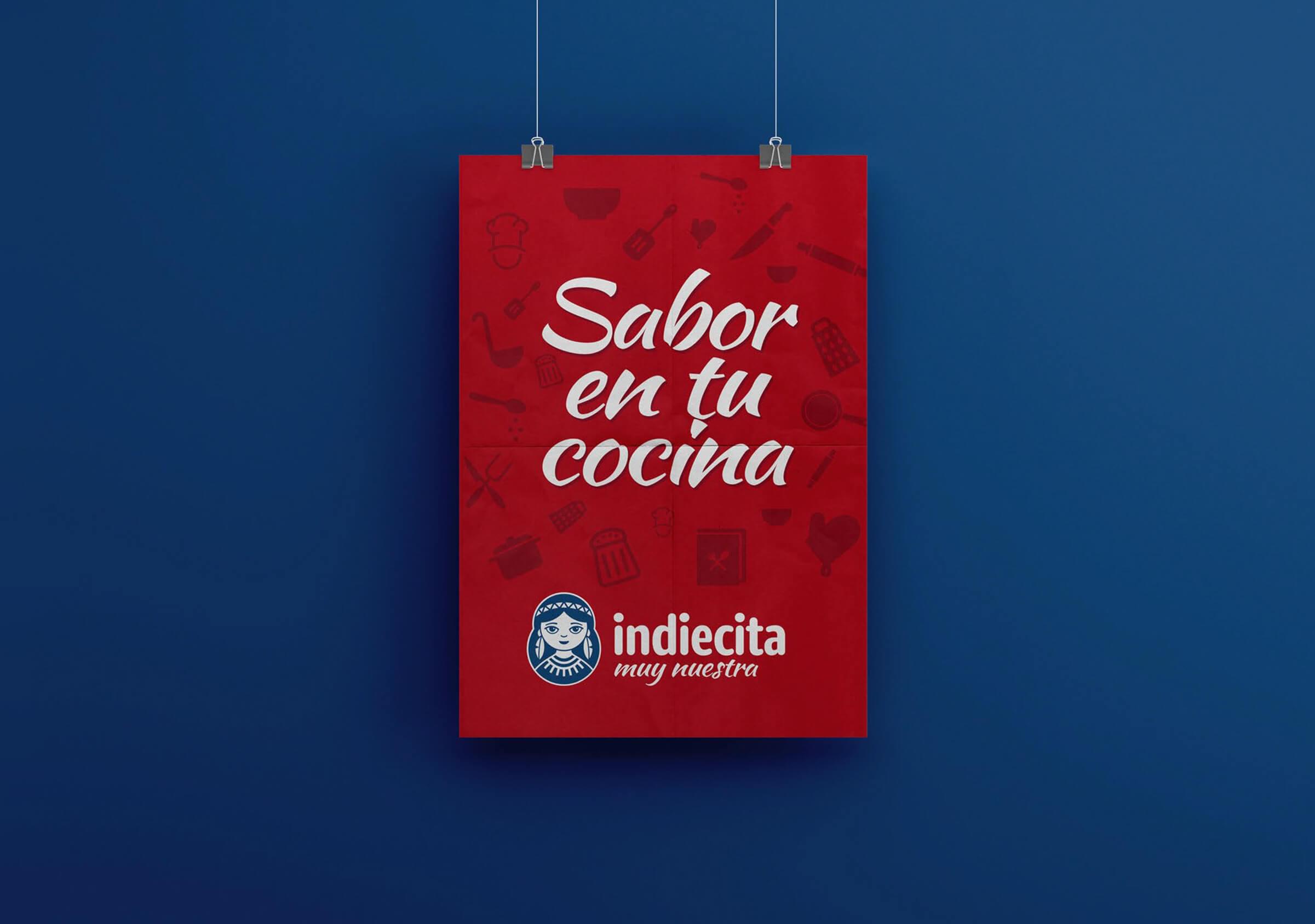
The result is a brand with a simple, recognizable and memorable fantasy name, with an empathetic graphic brand and a pregnant visual identity, with great potential to generate identity through the combination of colors, shapes and selected fonts.
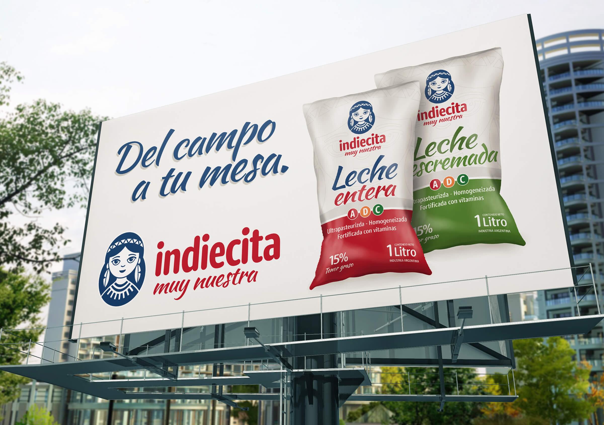
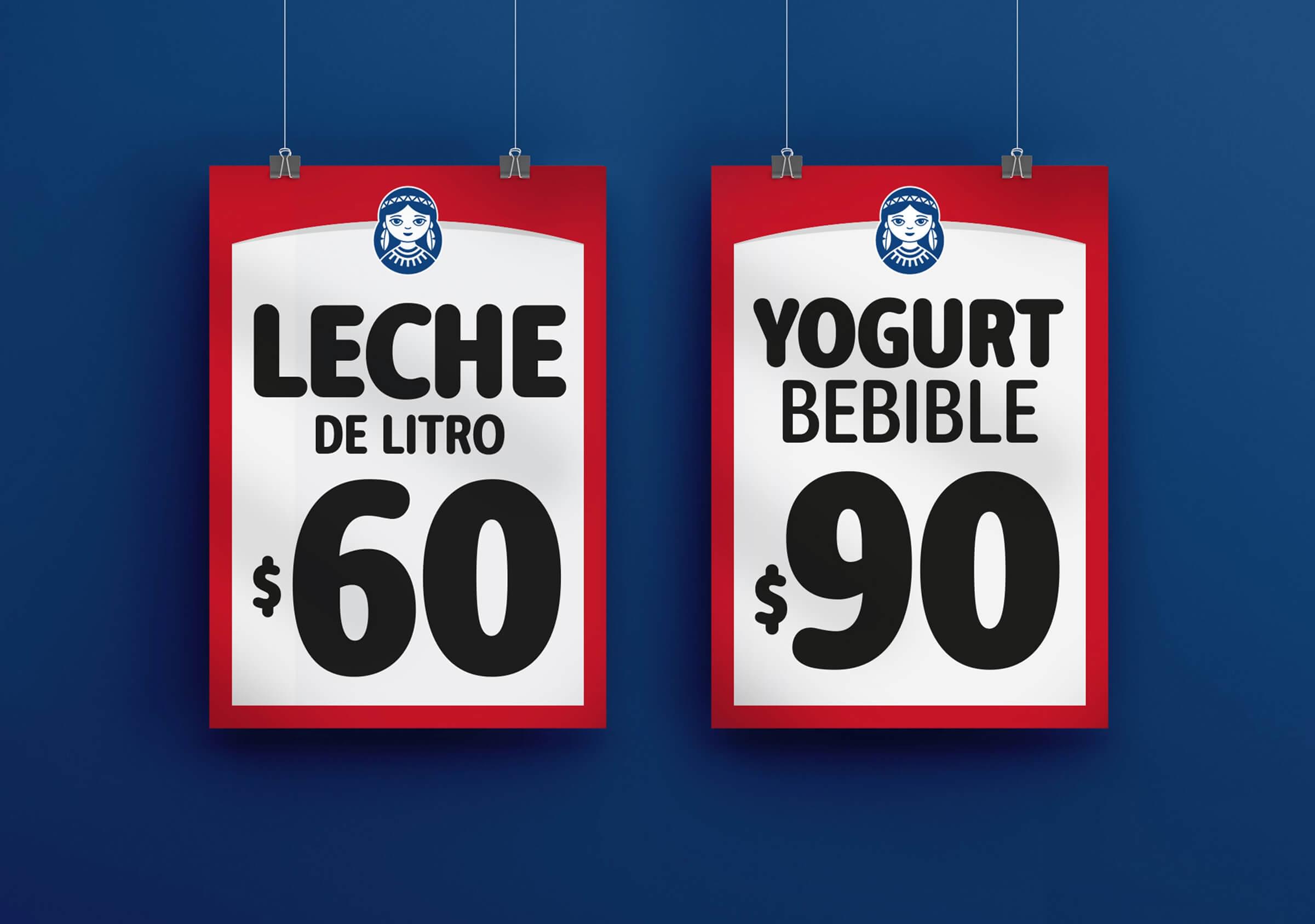
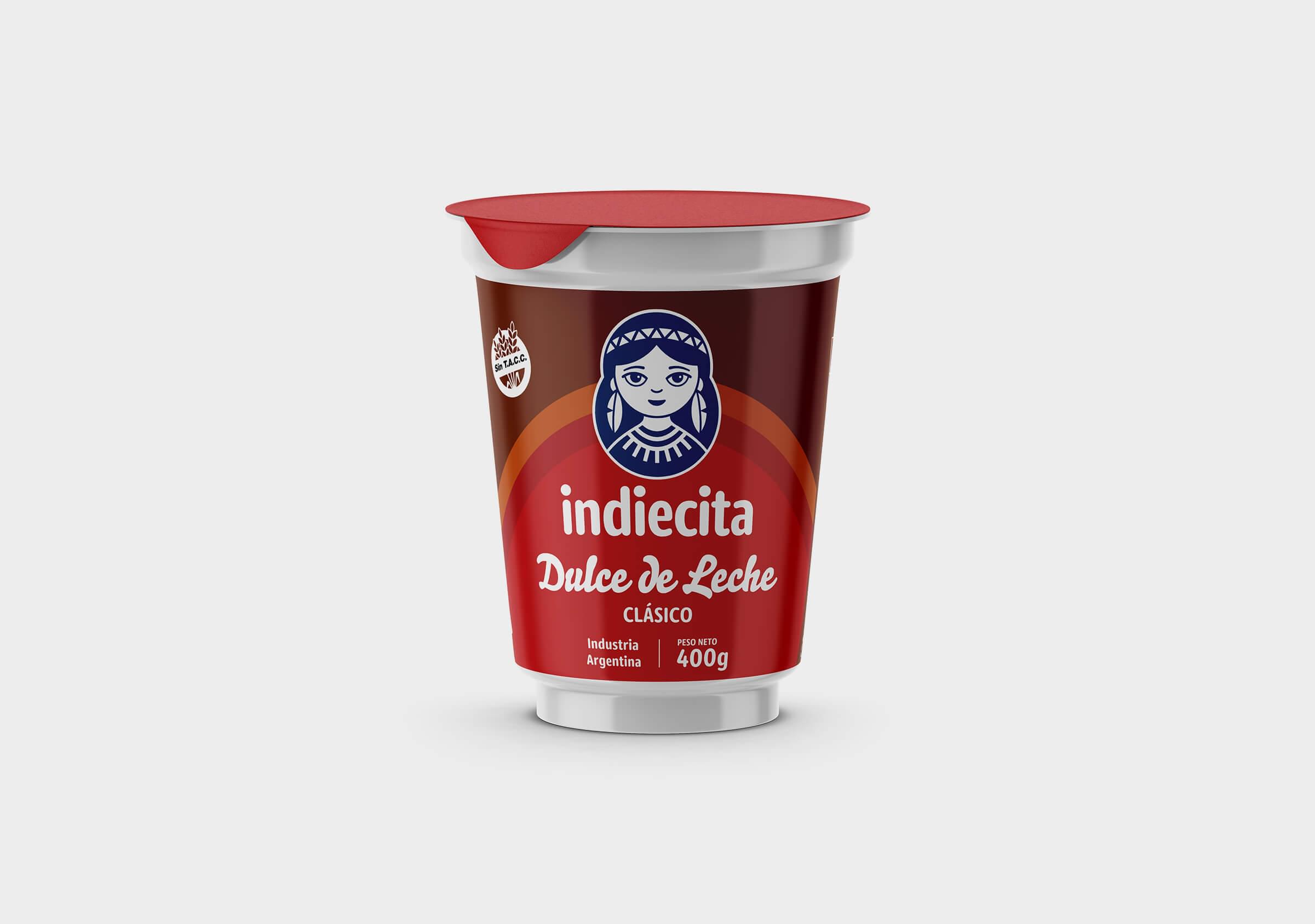
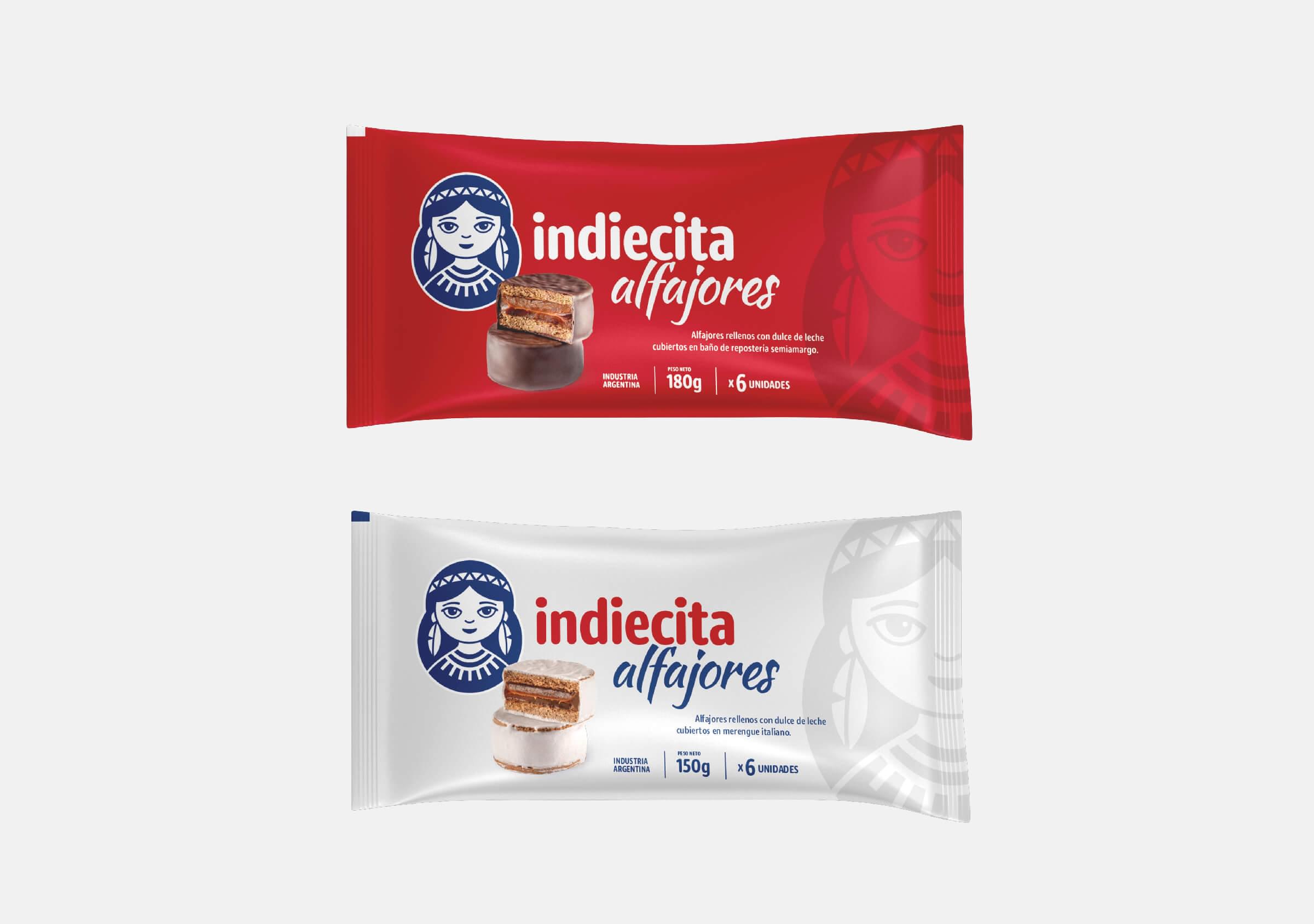
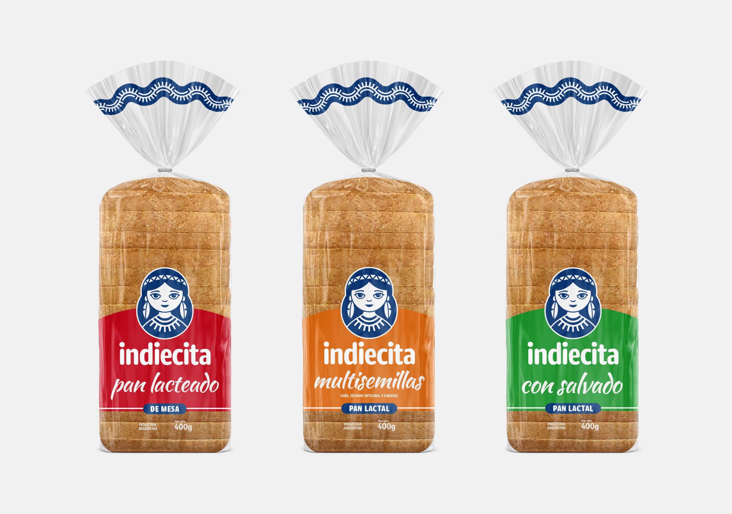
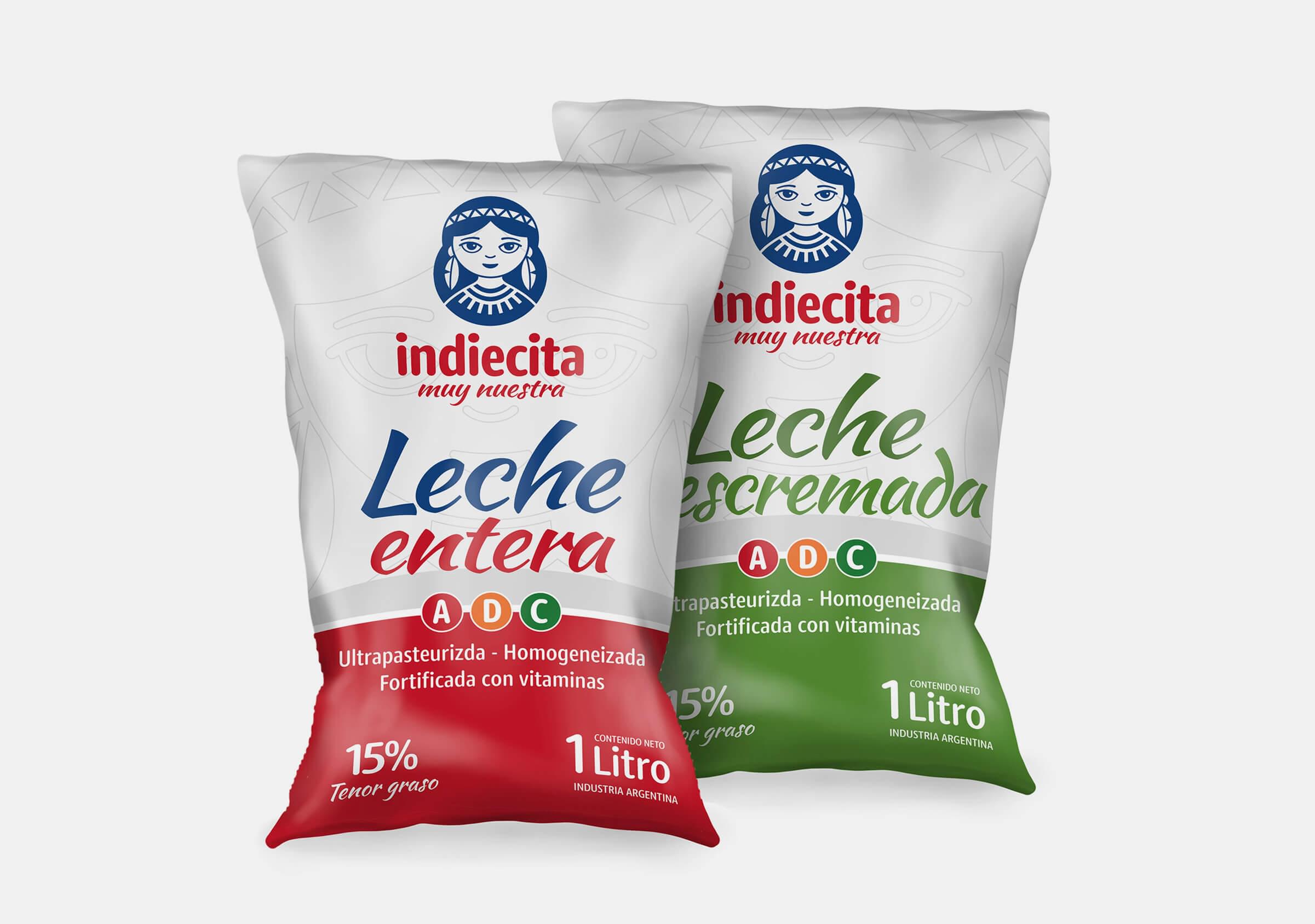
As a second stage of the project, we designed the packaging for Indiecita’s products. Including the new bread line-up, alfajores and dulce de leche.
