- Fuego Yámana
- /
- Bonano
Bonano
Bonano is a company with a long history in the metallurgical industry. They approached the agency to solve their visual identity problem that, over the years, had been getting worse.
bonano.com.ar



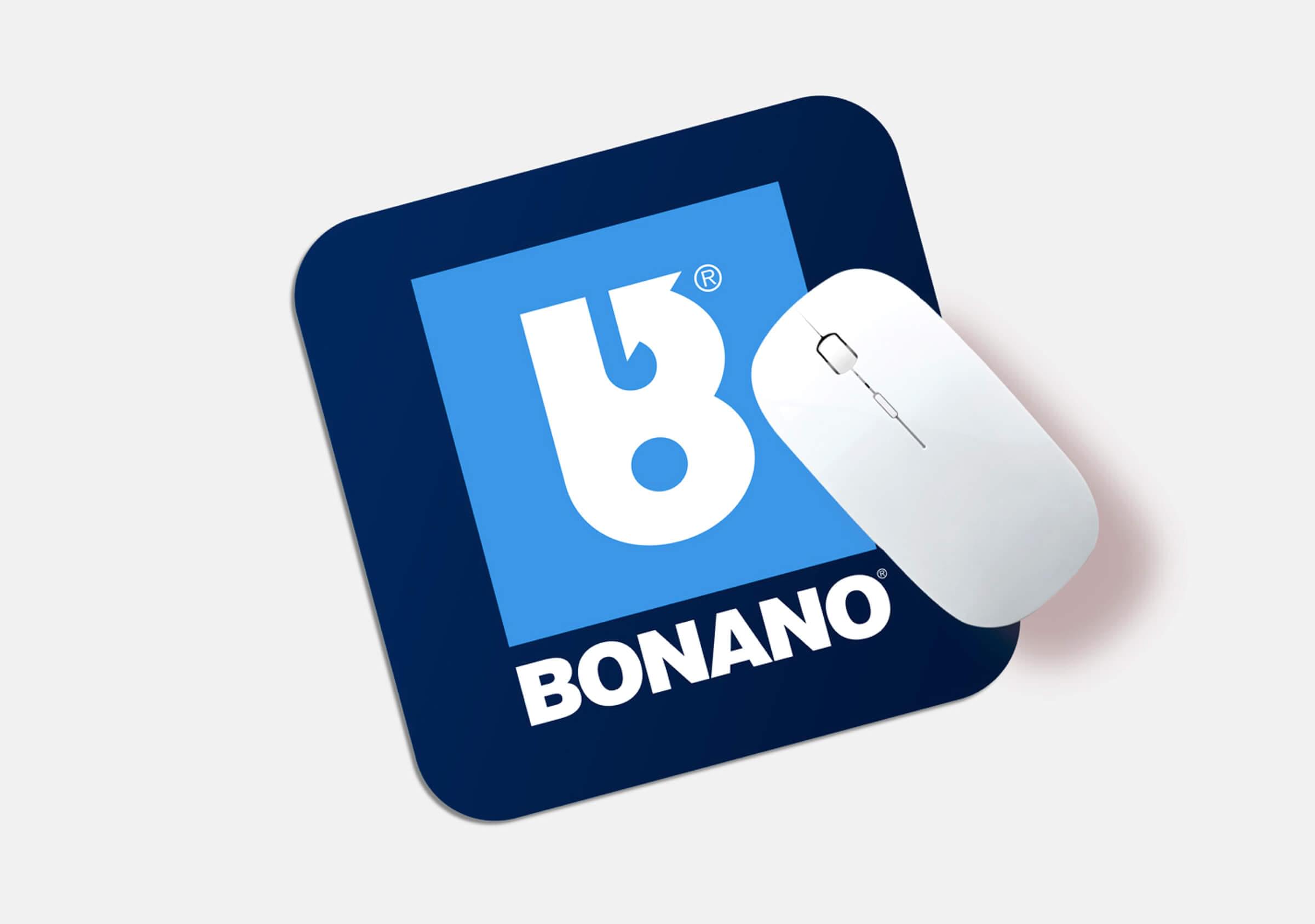
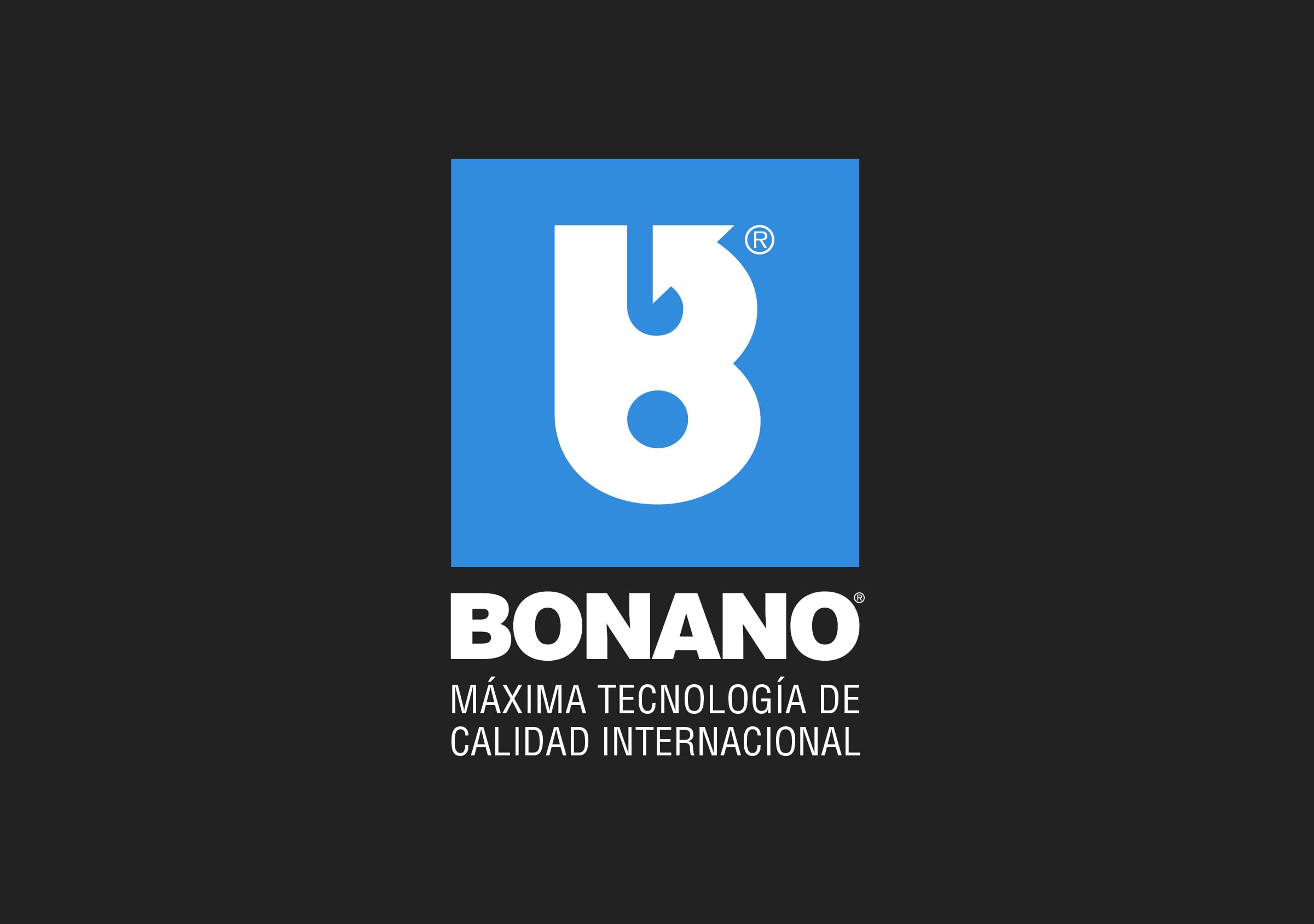
The main challenge we faced was to improve their existing brand, starting from a symbol already positioned, recognized and with a great presence in various applications across the company (from couplings to bolts).


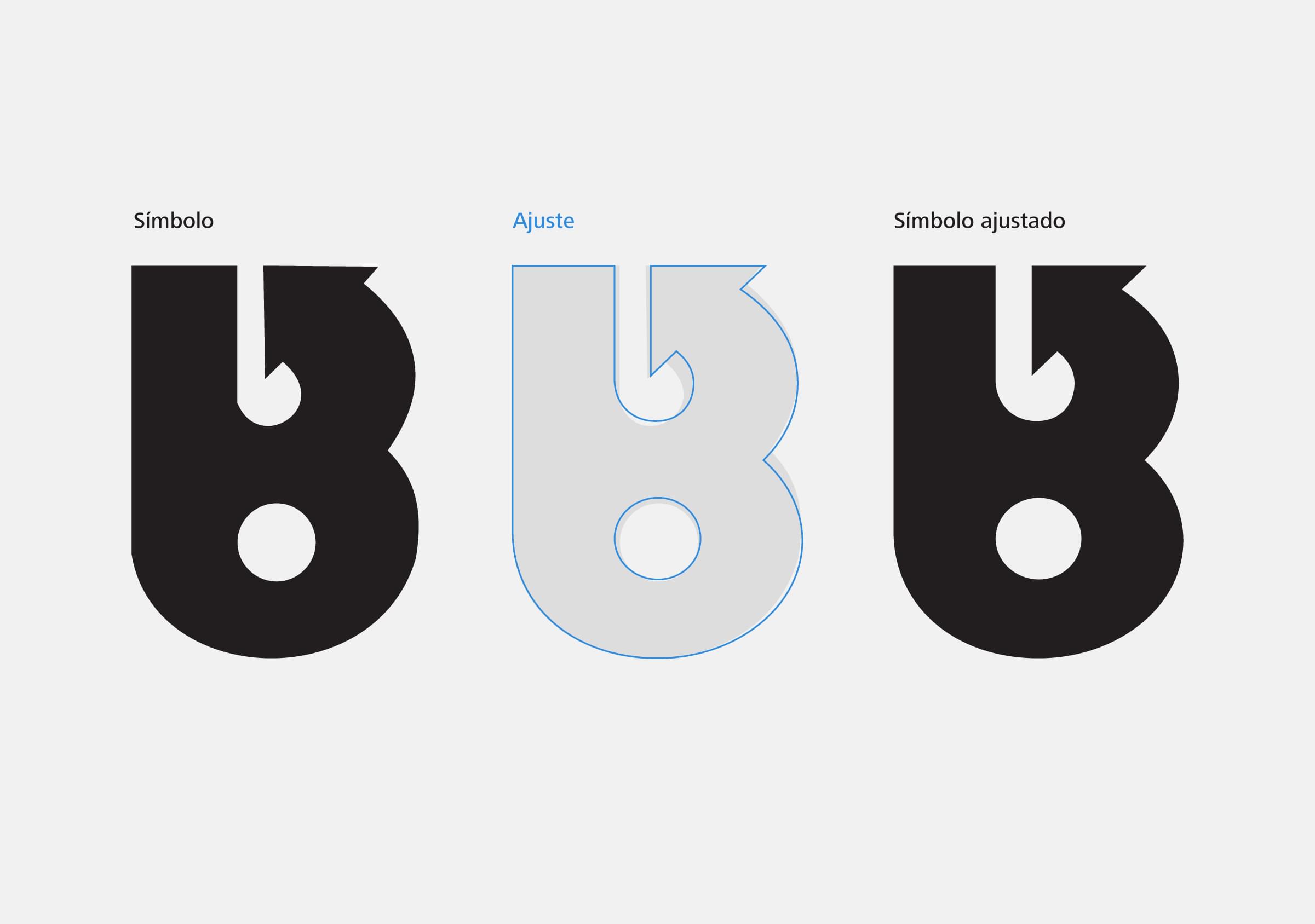
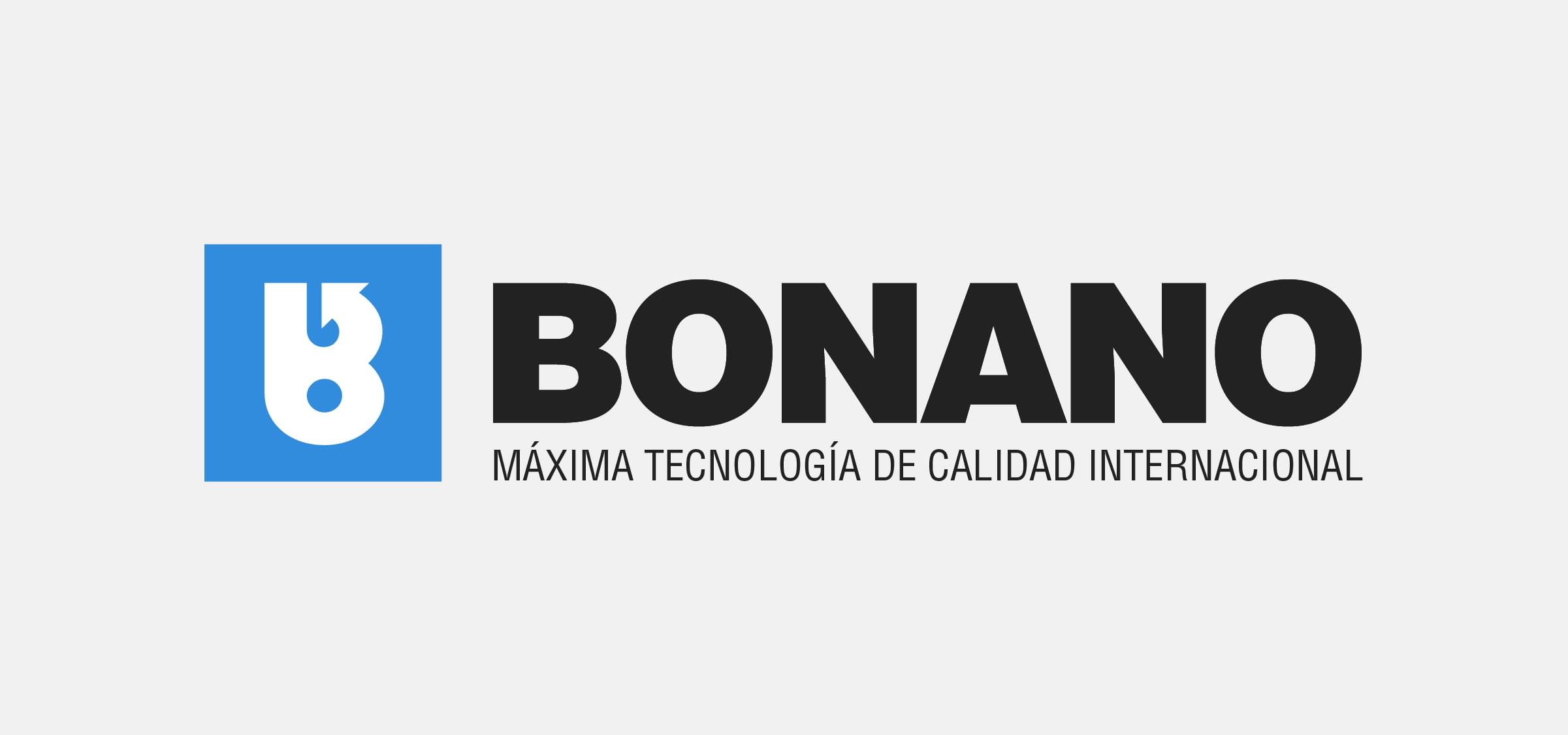
Our graphic design task focused, first, on making an optical adjustment to the symbol, to achieve a subtle improvement in its readability and application at small scale.
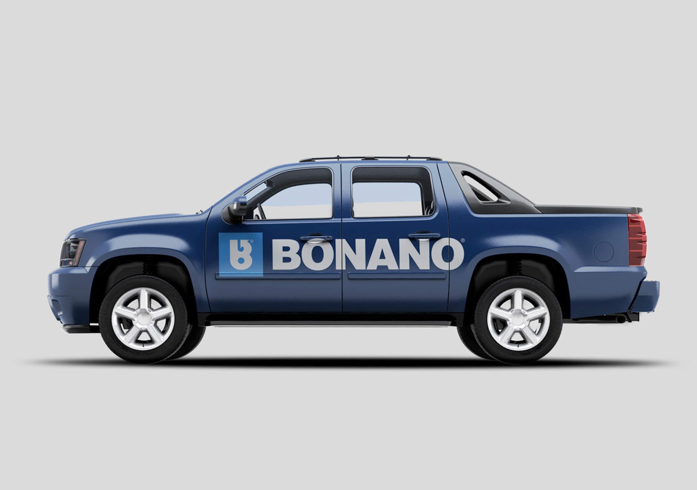
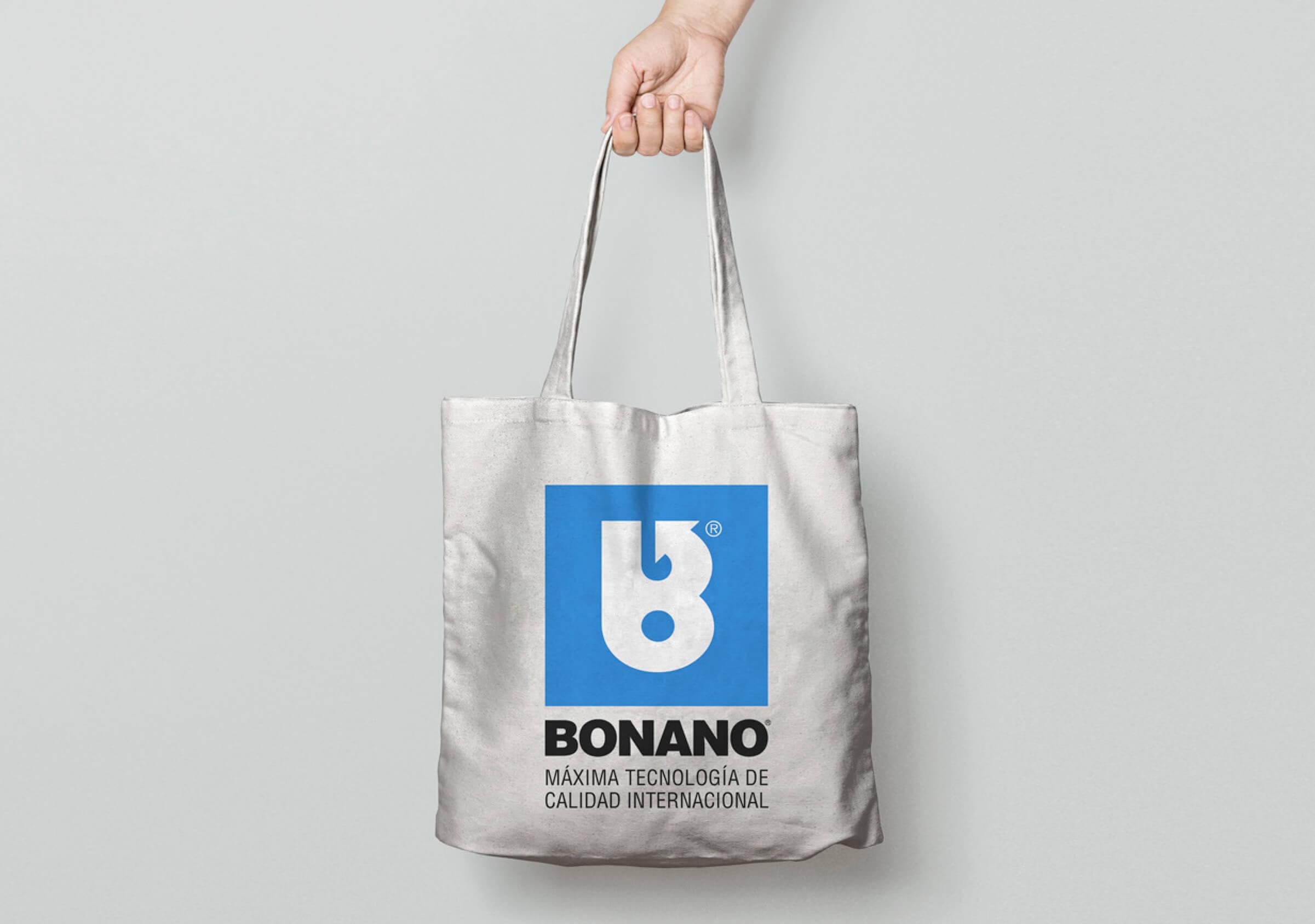
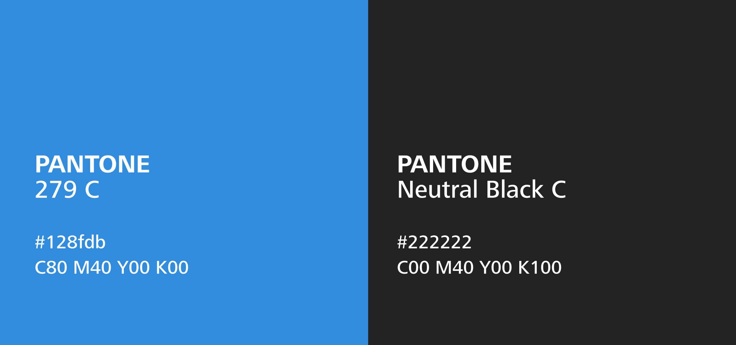
On the other hand, we removed the black outline that the brand had been using in its logo, incorporating a cyan color support that works as a background and allows the color palette to be expanded, to incorporate new shades of blue and gray to the brand’s application.
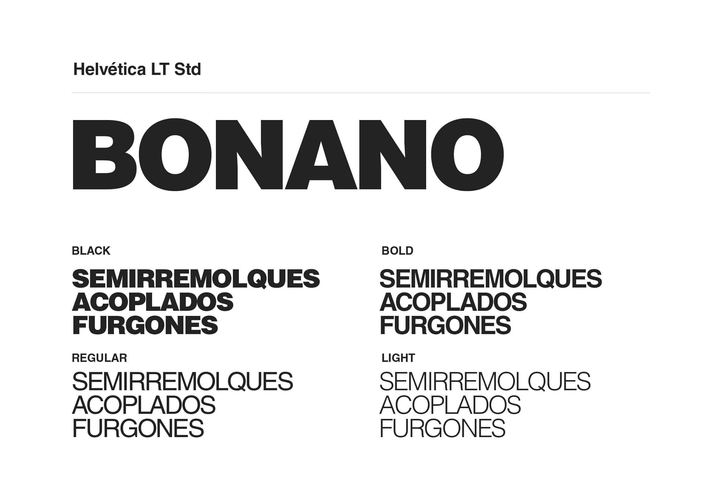
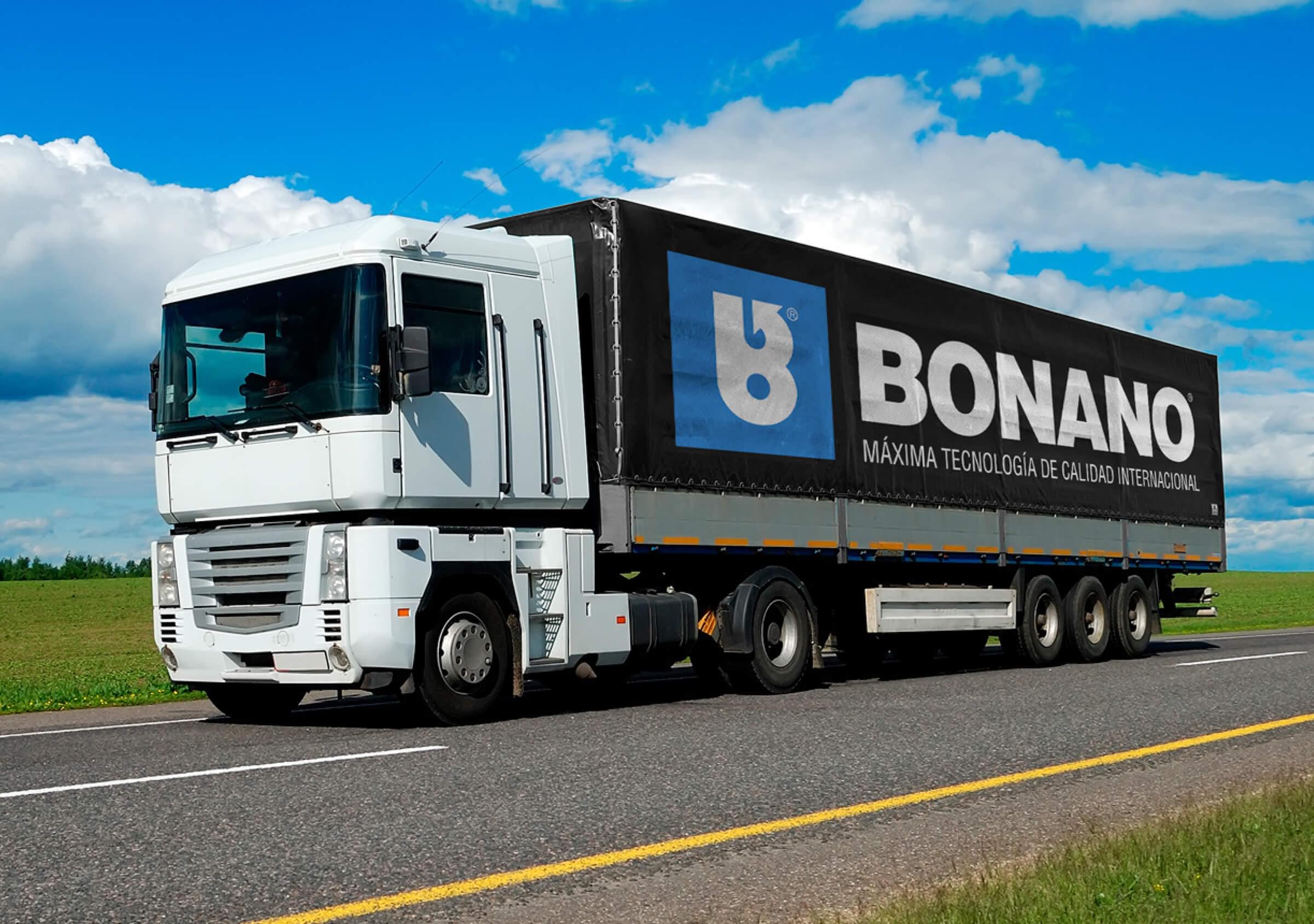
In addition to standardizing the use of the logo, we developed a brand book and defined a typographic system for different applications in communication materials, based on the Helvetica typeface that Bonano had already been using.
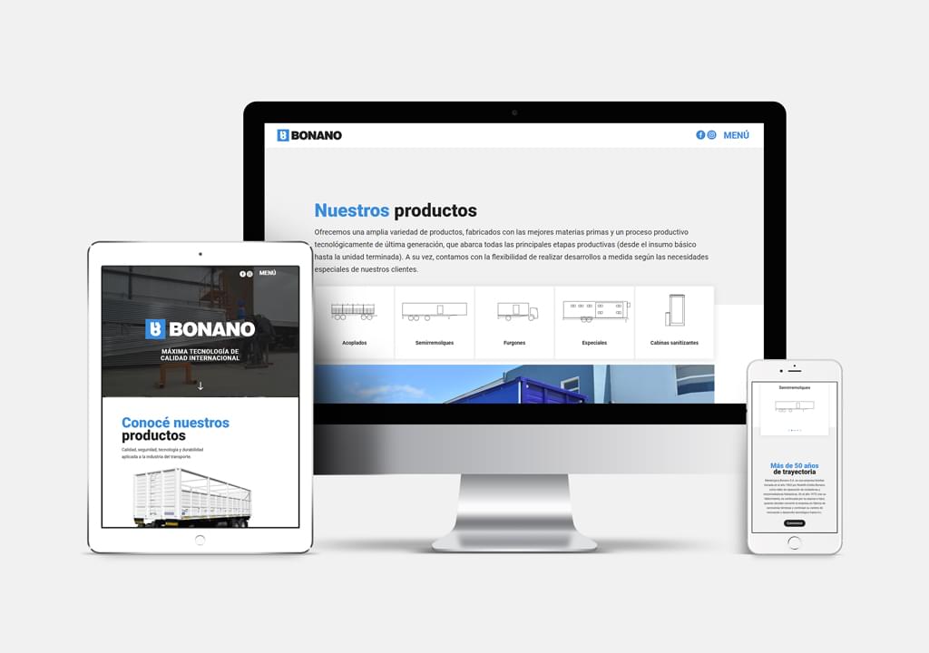
The second part of the project consisted of designing and developing the new Bonano website. The main communication objectives were to highlight the importance and trajectory of the company, as well as showing the wide variety of products that they produce.
The second part of the project consisted of designing and developing the new Bonano website. The main communication objectives were to highlight the importance and trajectory of the company, as well as showing the wide variety of products that they produce.
