- Fuego Yámana
- /
- Blühen
Blühen
Blühen Brewery wanted to refresh their corporate identity to represent a carefully crafted product with personality.
bluhencerveceria.com
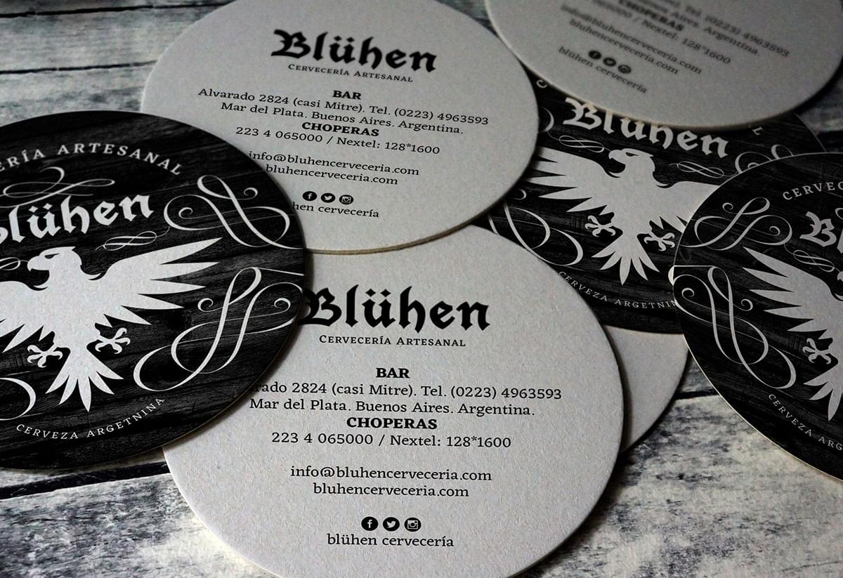
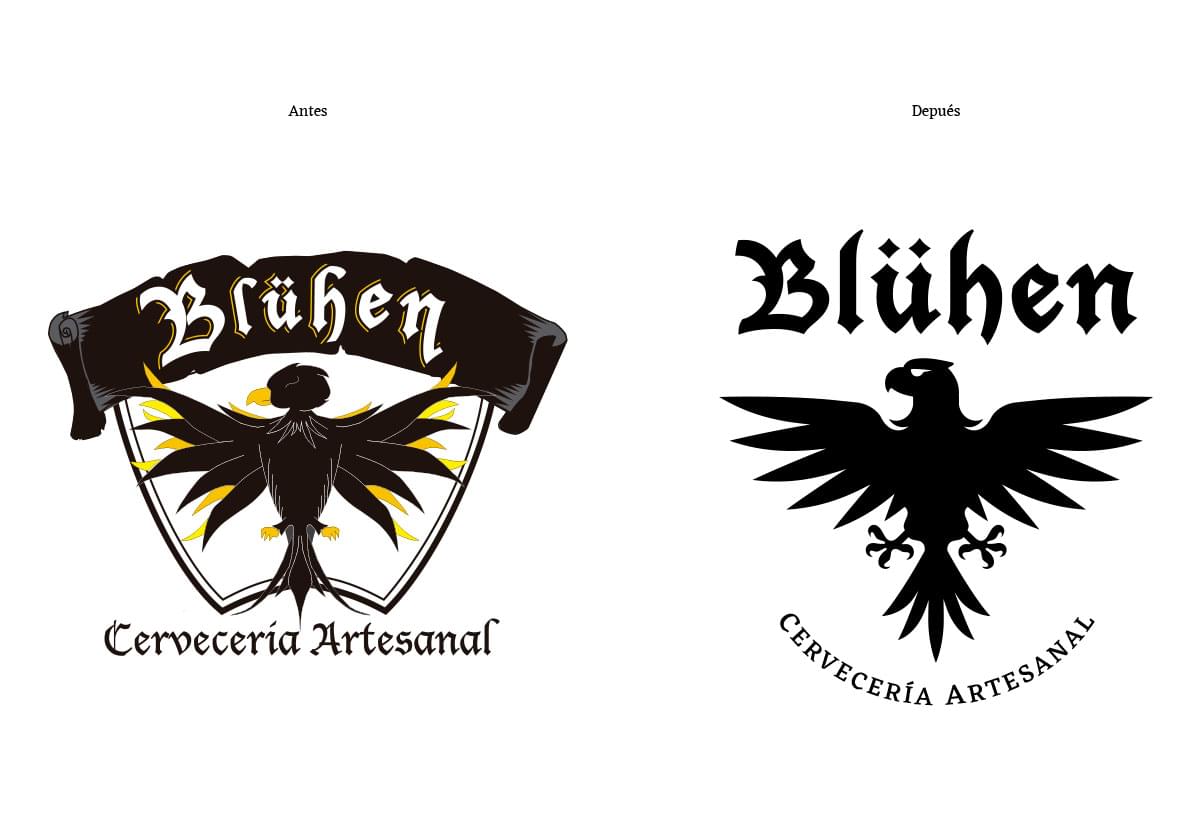
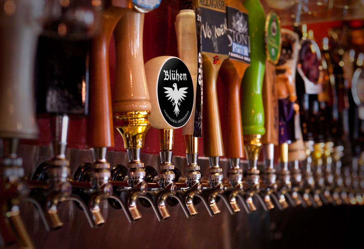
Just as behind each type of beer there is a story full of hours of dedication, preparation, cooking and decision, in this brand refresh we worked on the reconstruction of their visual communication betting on a distinctive and very strong image.
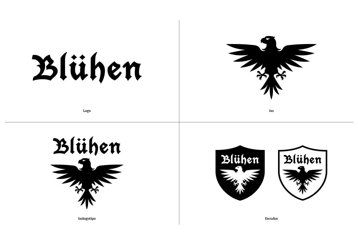
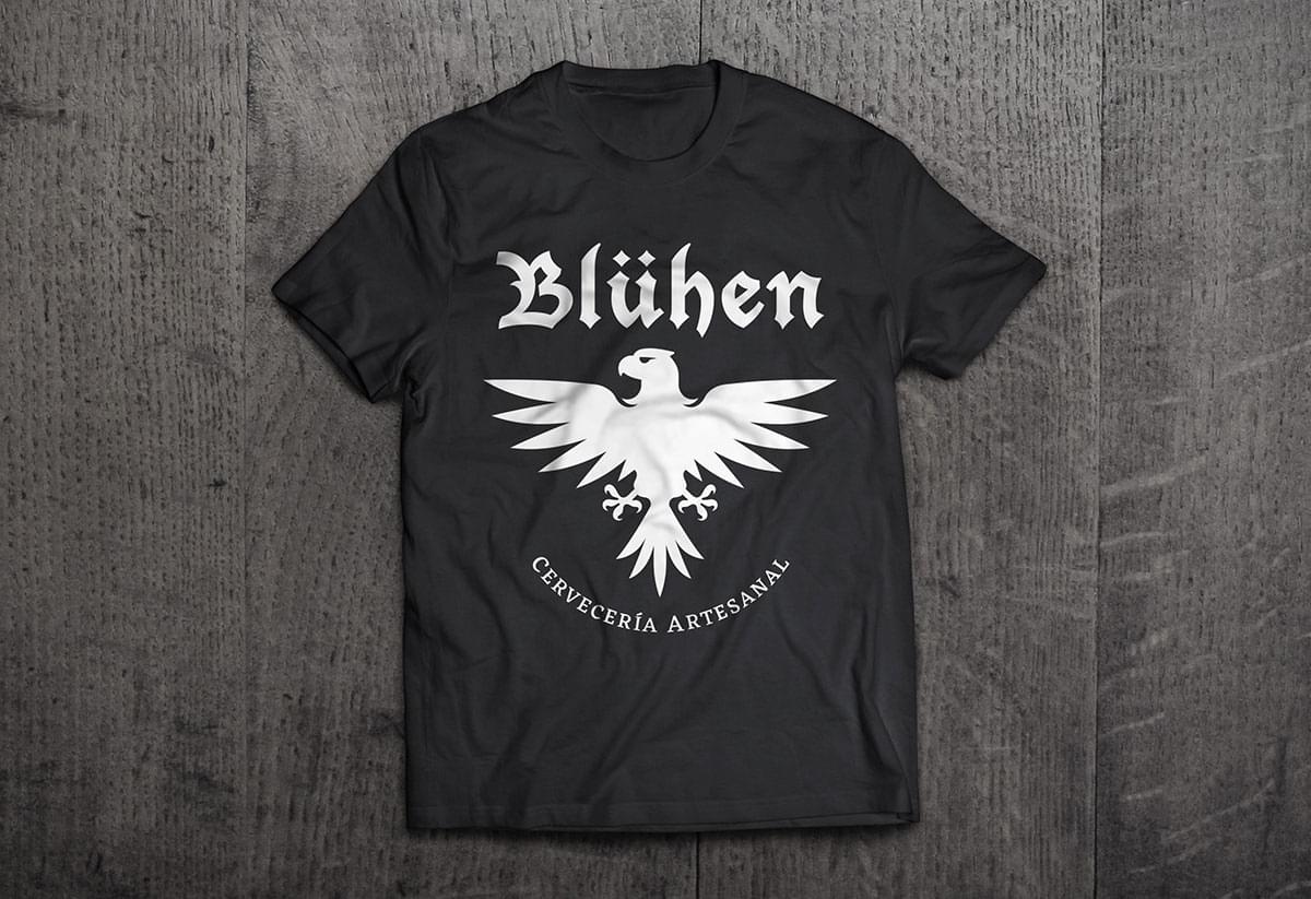
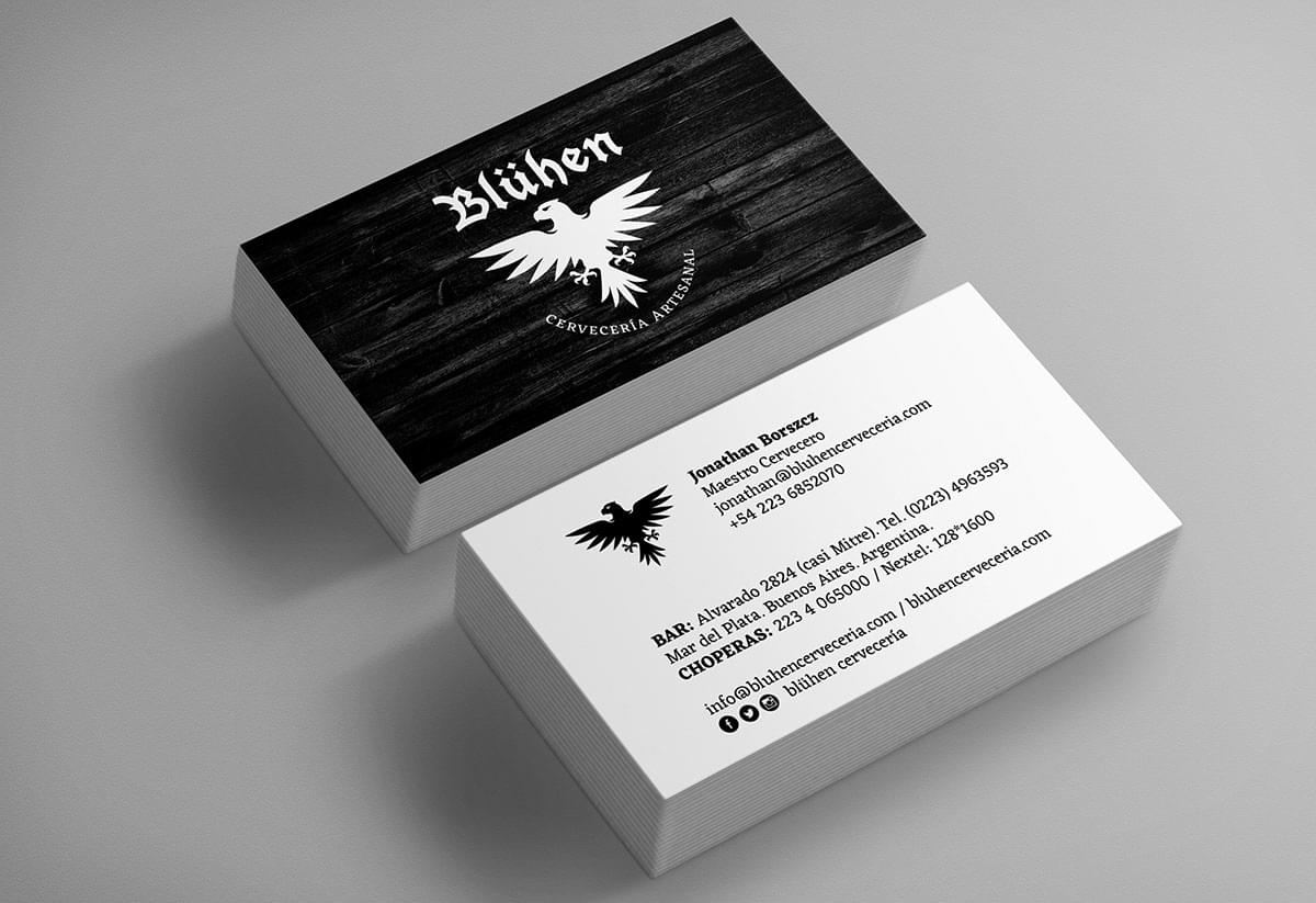
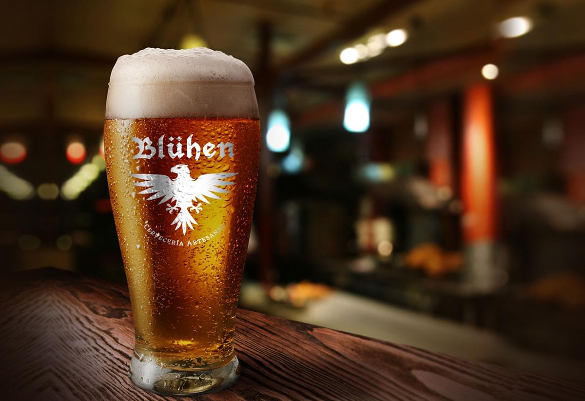
Based on the strong principles and ideas that this brewery has within its nature, but that were hidden or not well anchored to the concept of a craft beer factory, we designed the logo, the symbol and the heraldry to enhance a medieval image and represent a beer that we like to define as “rocker”.
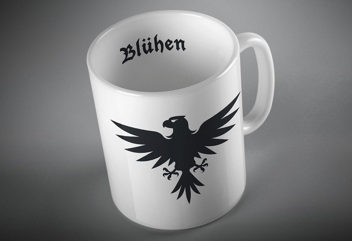
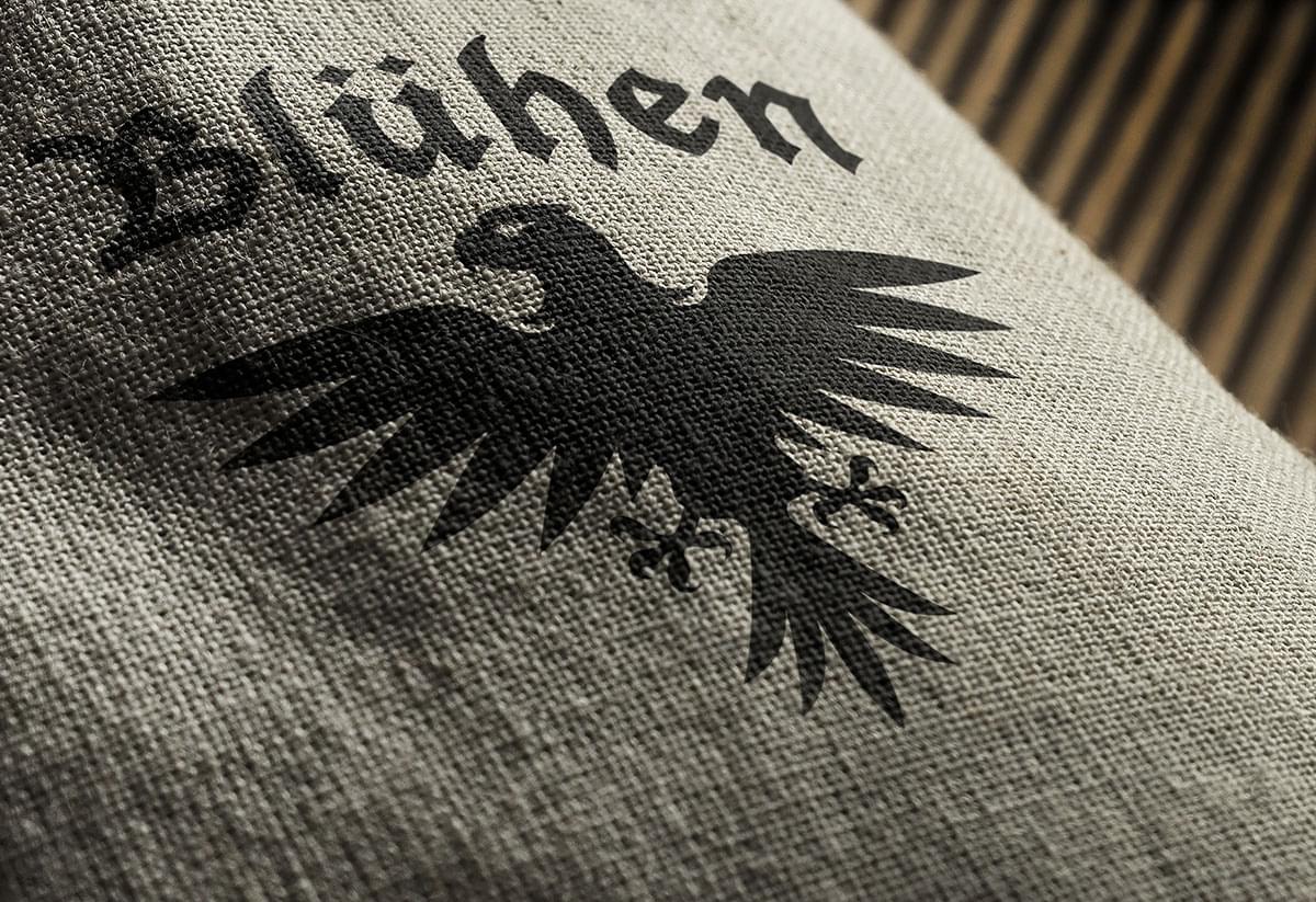
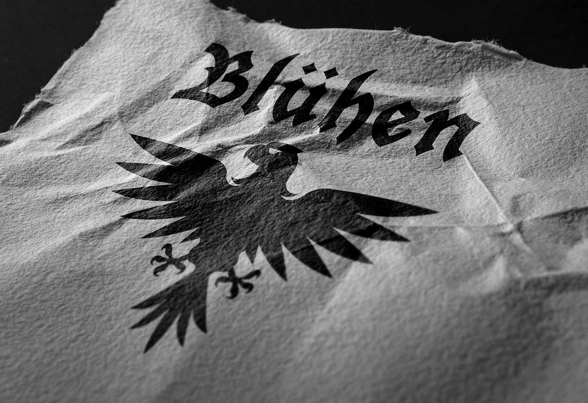
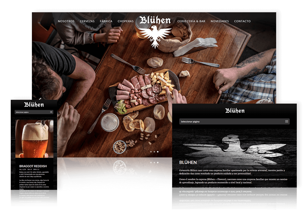
When the time to design the Bluhen Brewery website arrived, we had already advanced a large part of the way regarding the communication style and visual dynamics of the brand, after having developed, its visual identity refresh and the redesign of its graphic system. That is how we took on the challenge of highlighting its distinctive image with all the strength that a web page enables.
The fact that this brewery came to FY looking for branding advice greatly facilitated the construction of the website. We generated a very impressive web page from the typographical point of view, to transmit a message with character, with a black background and imprinted textures. In addition, it is a site that meets responsive qualities, working well on multiple screens.
