- Fuego Yámana
- /
- Alta
Alta
The logistics company Alta Distribución entrusted us with the creation of its visual identity and rebranding, preparing for the opening of its new logistics center and offices.
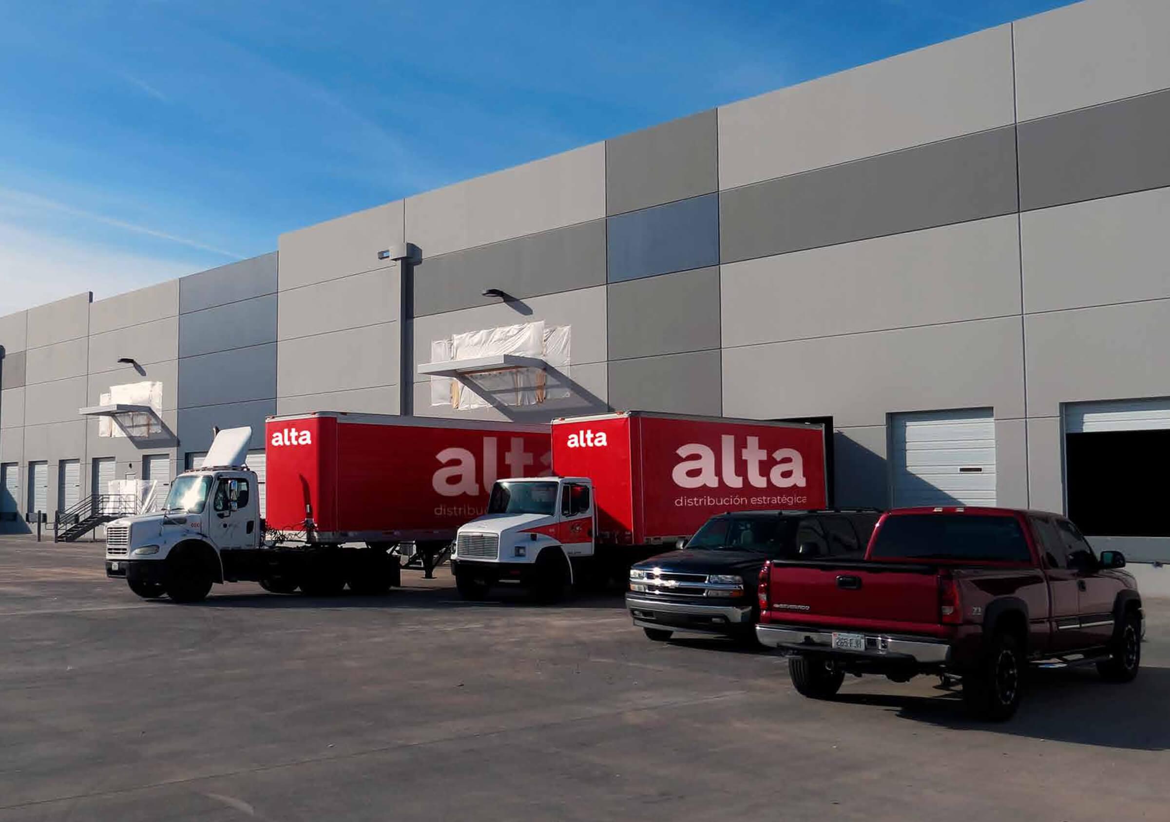
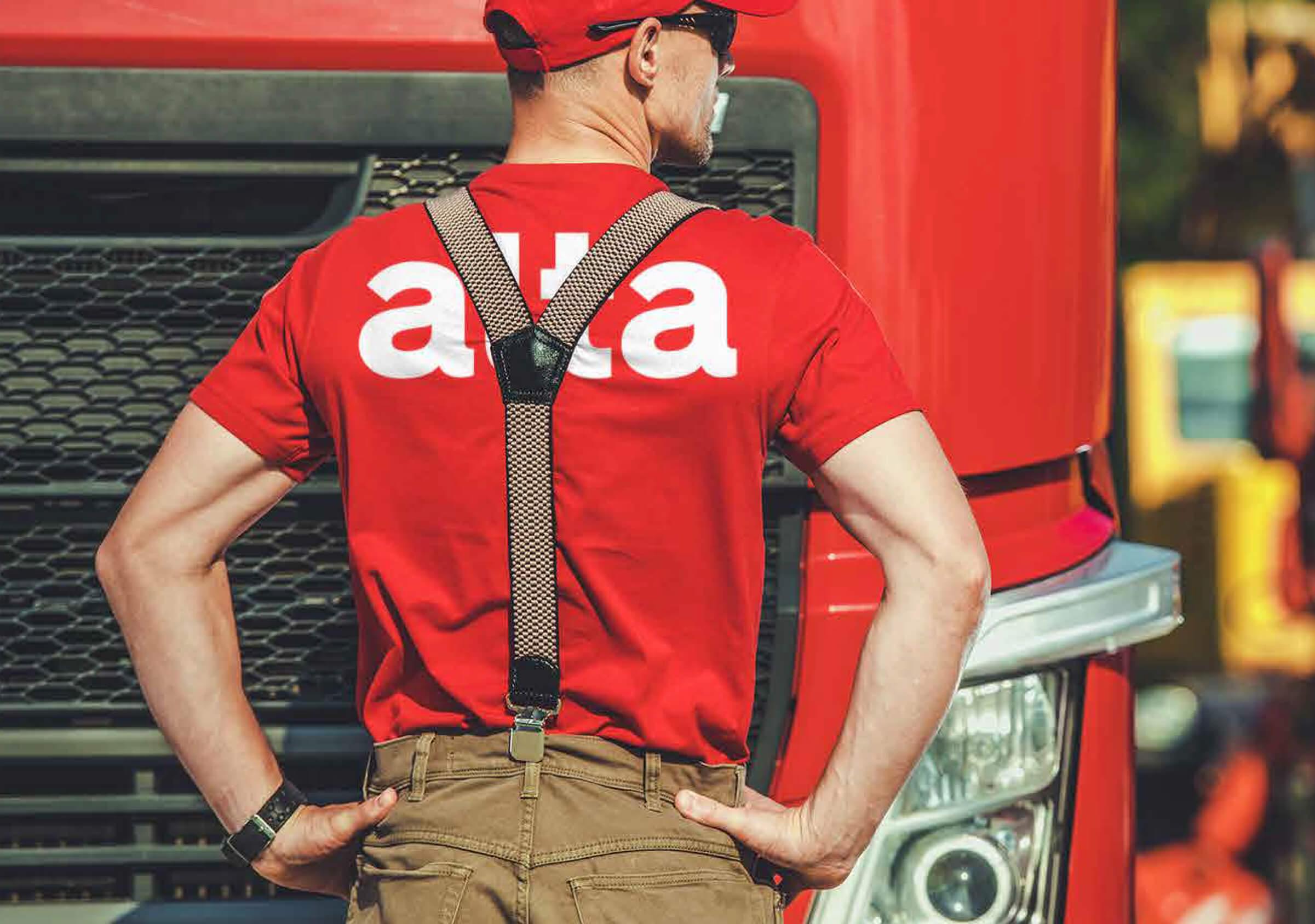
During the brand strategy research and development stage, we carried out a reconstruction of the name, recommending the abbreviation to the word “Alta” anchored, when necessary, to the descriptive “strategic distribution”. This step was important to obtain a more powerful, simple and memorable brand name, in addition to facilitating its readability. On the other hand, the selected tagline allowed to heighten the service proposal.
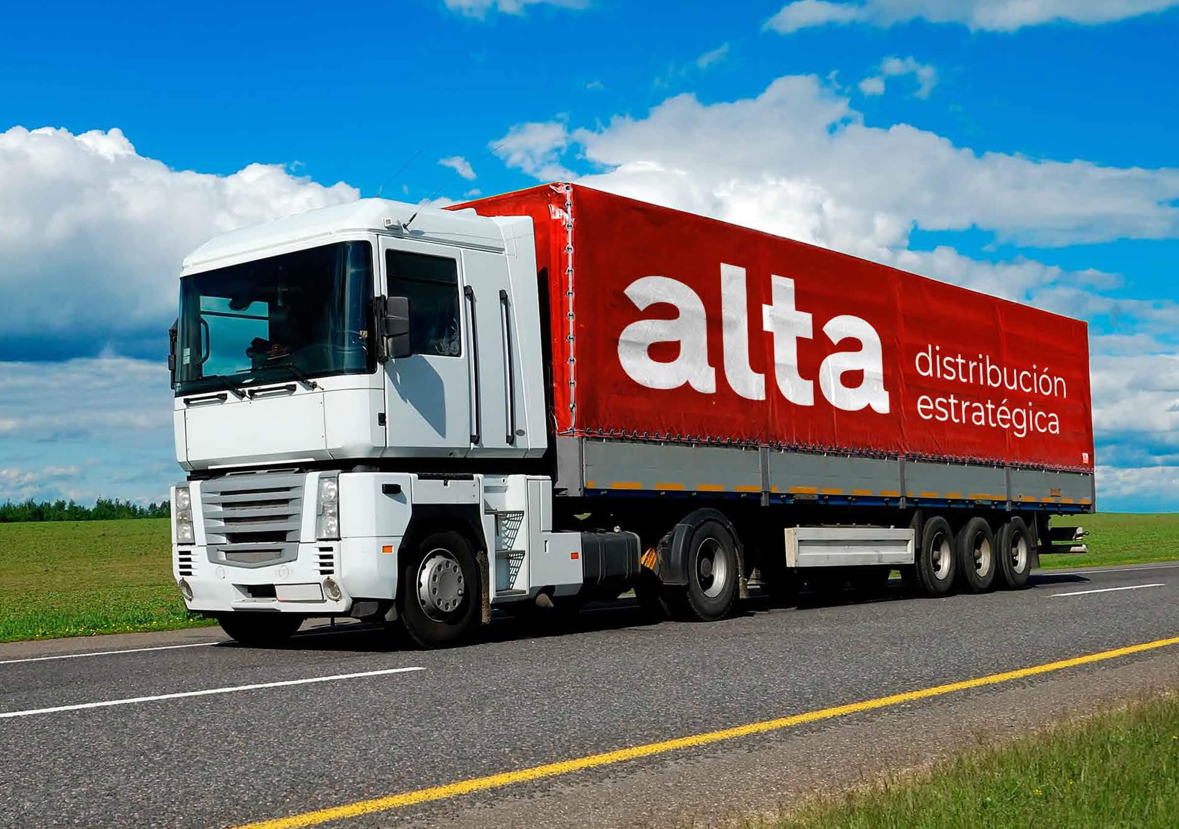
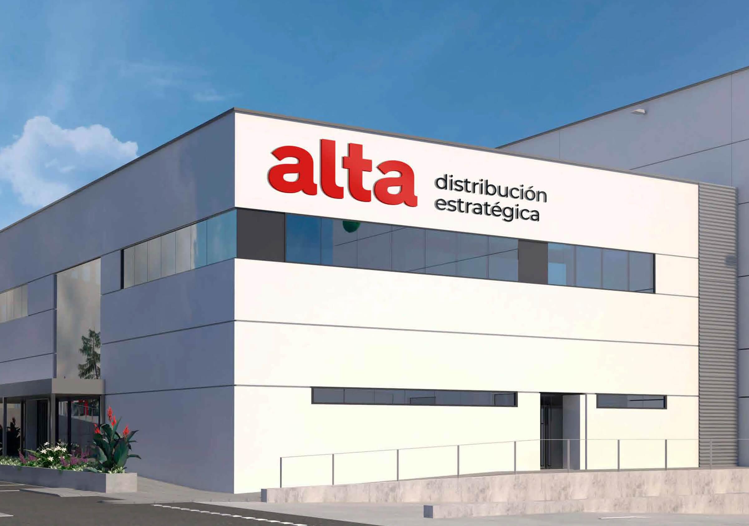
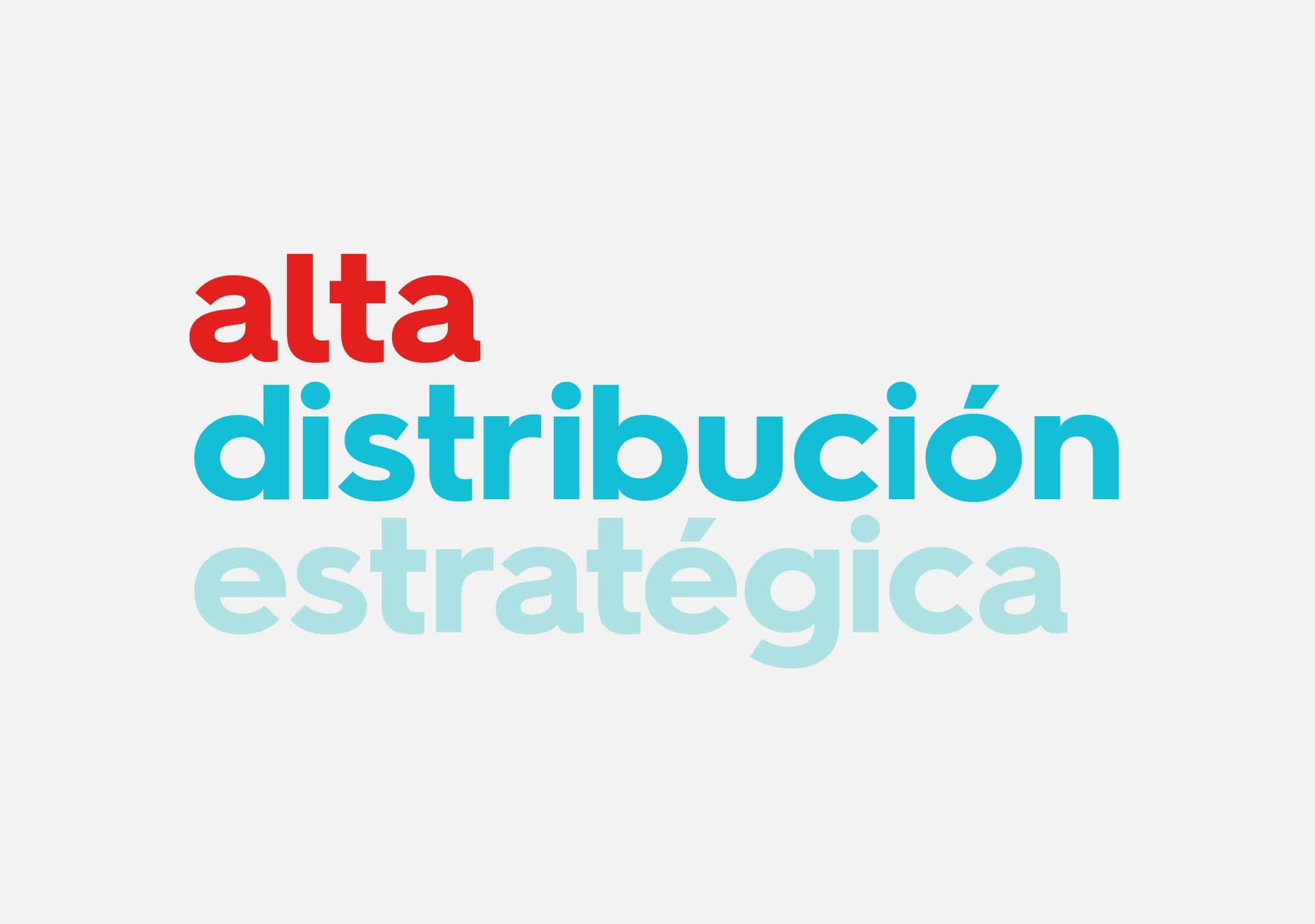
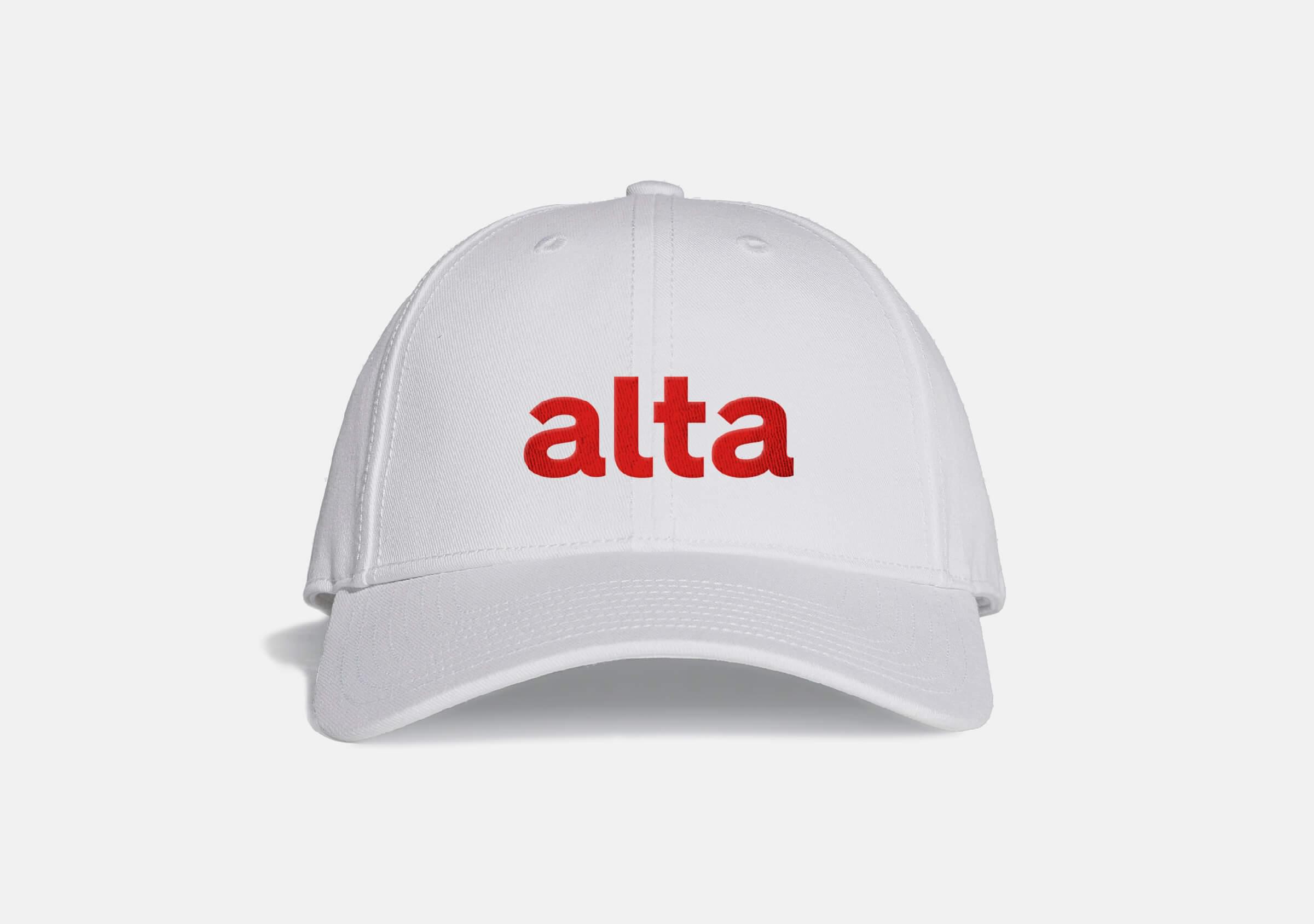
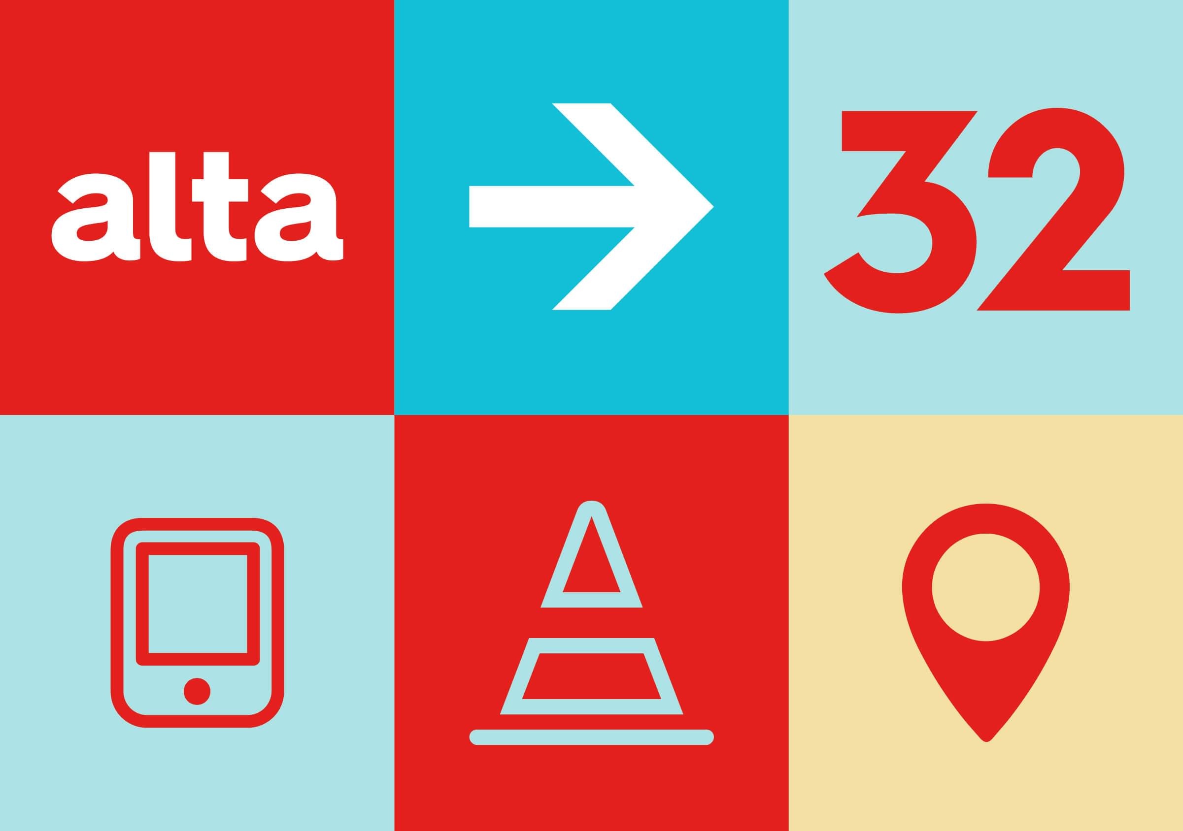
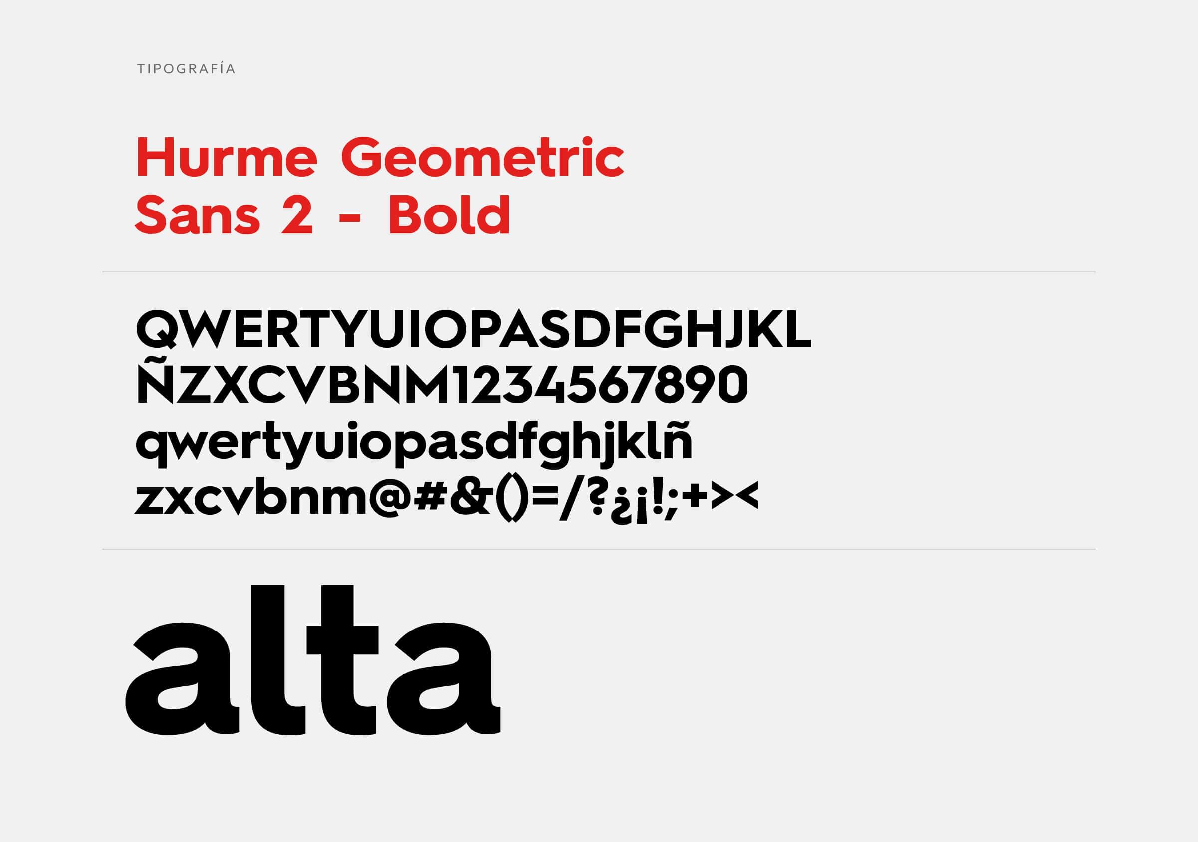
The new brand is one hundred percent typographic, using the Hurme Geometric Sans family typeface in lowercase, which possess a particular character given by the shape of the letters a, l and t, giving a distinctive touch to the brand. This is used as part of the visual language proposed in different applications.
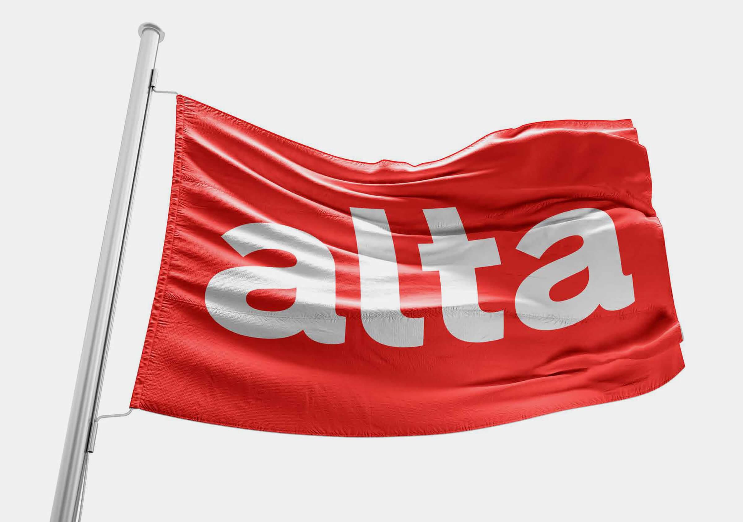
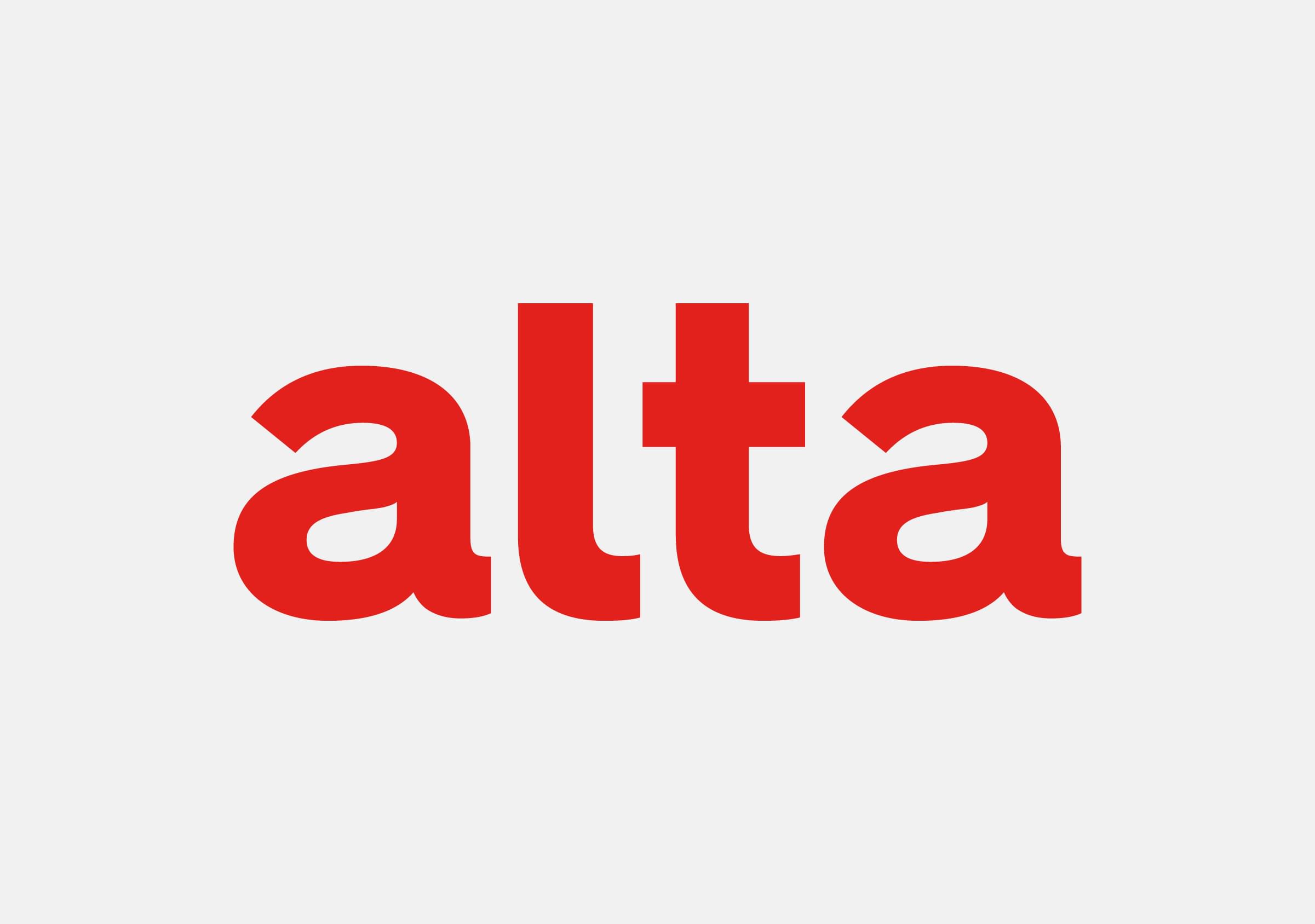
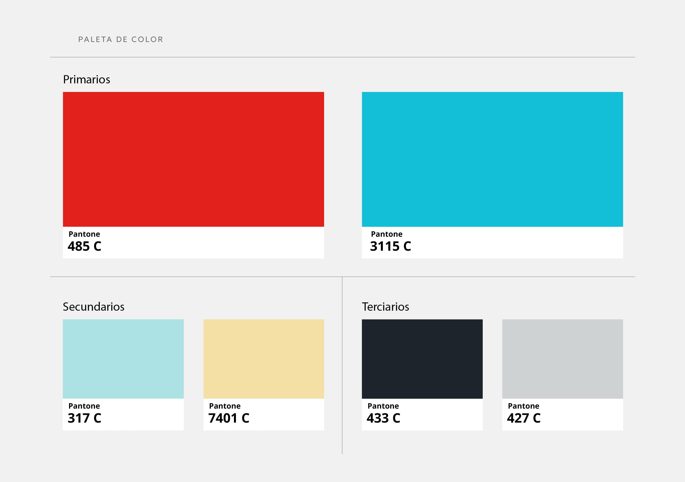
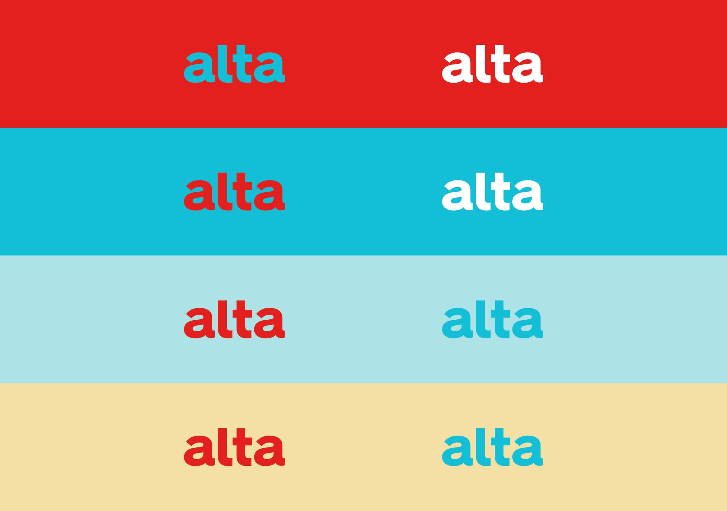
The color palette focuses on red, complemented by turquoise, light blue and pastel yellow that provide versatility of usage, defining a young and energetic brand.
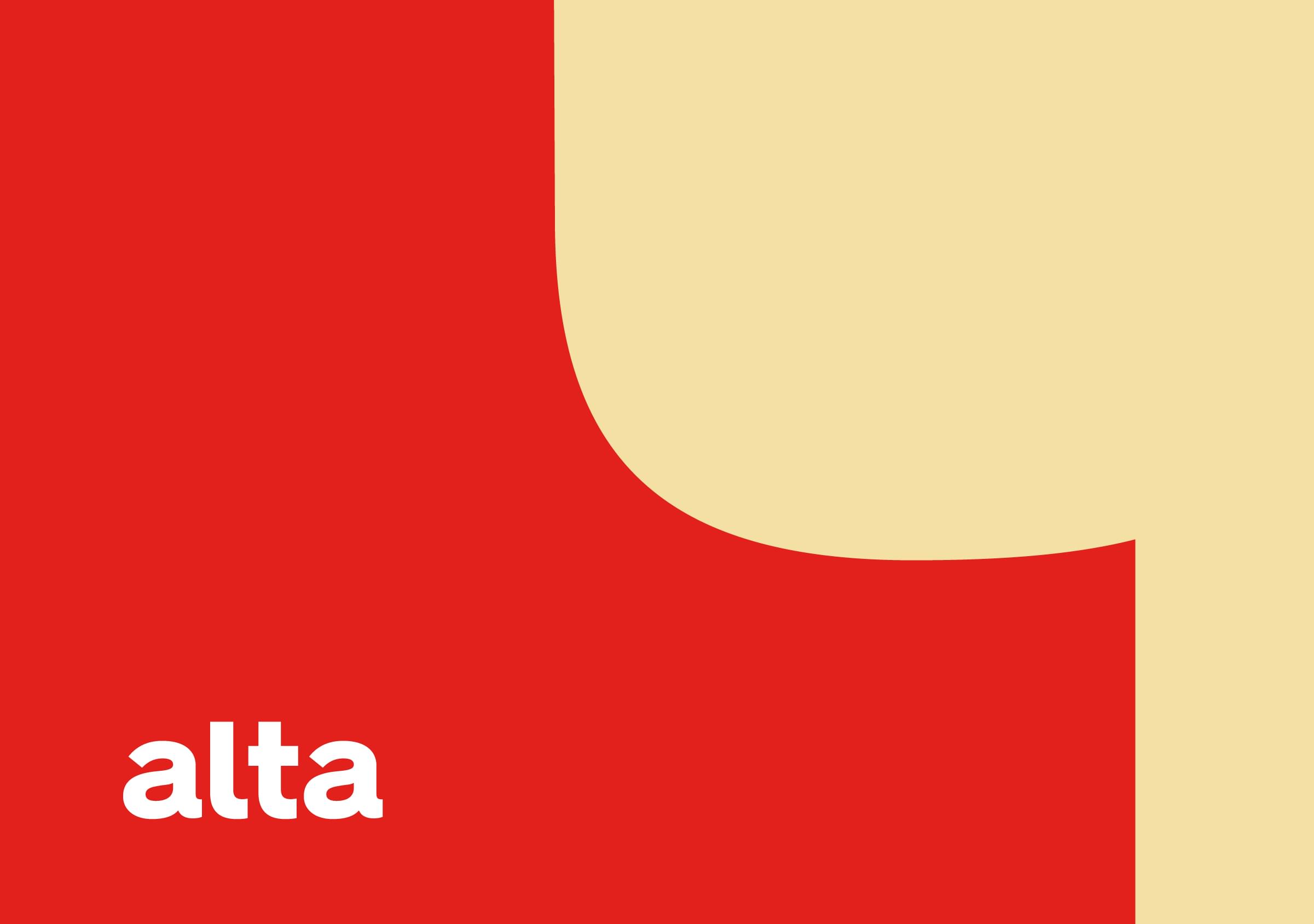
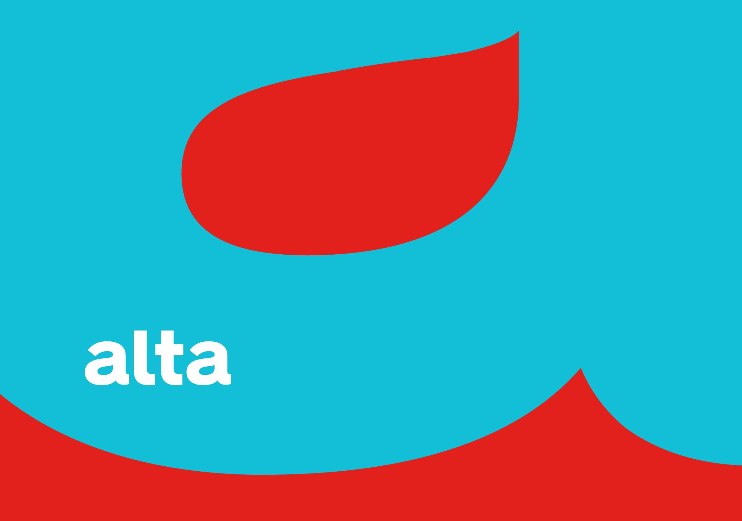
At the same time, it allows the colours to come into play in combination with the morphology of the logotype letters, creating a unique visual language to be applied widely.
