- Fuego Yámana
- /
- Norgreen
Norgreen
Norgreen is a pharmaceutical company based in the Industrial Park of the city of Mar del Plata-Batán. The work we did for them began with a review and optimization of their brand
norgreen.com
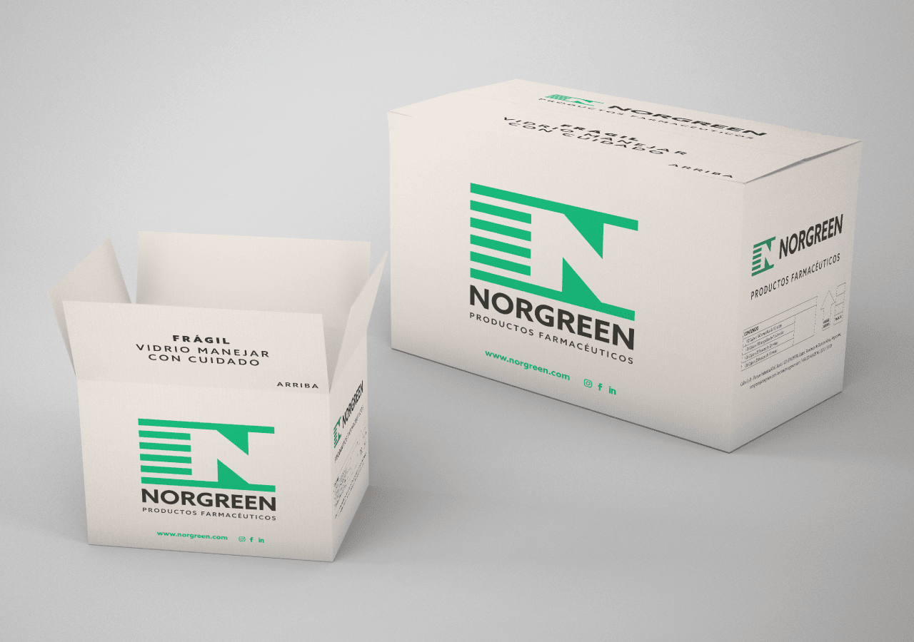
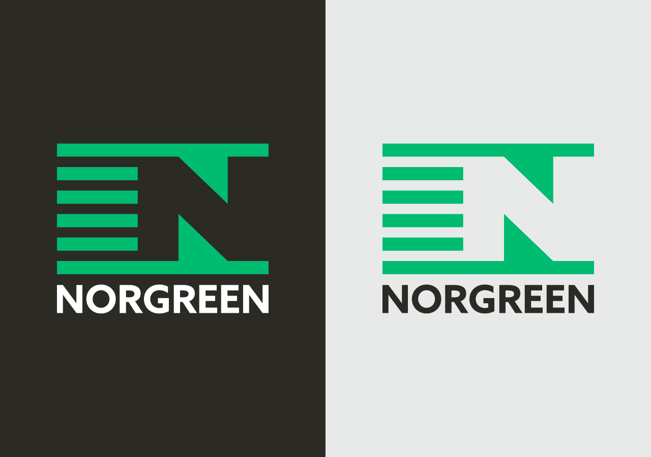
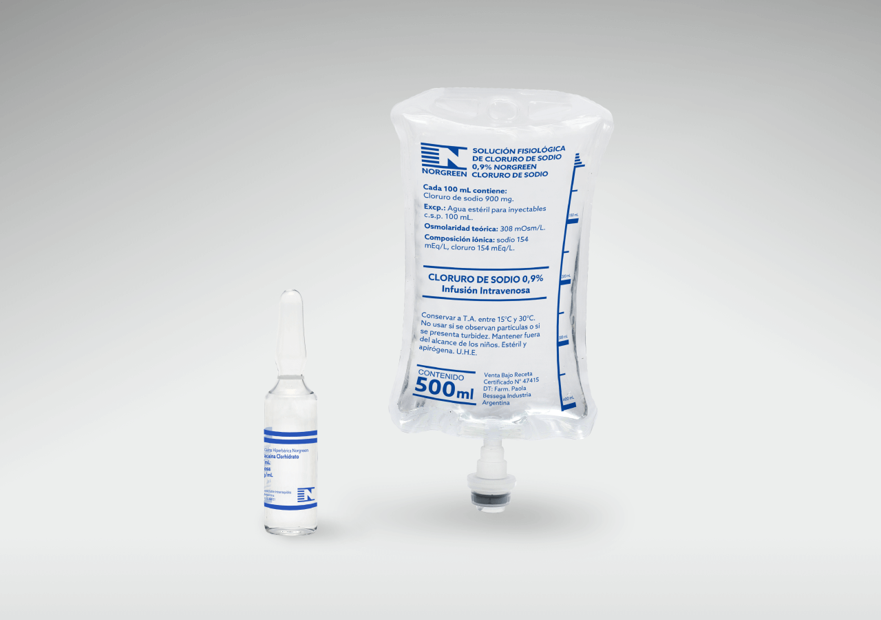
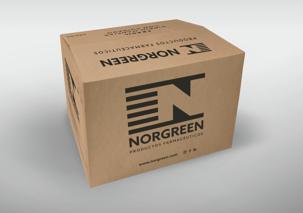
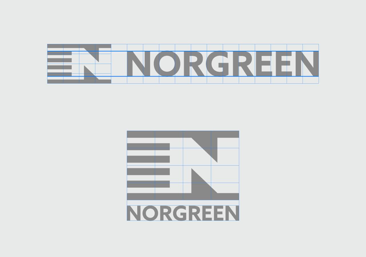
When we started to work with the company, we observed that their graphic brand varied between its different applications (in its proportions, as well as the use of different typographic fonts and support colors).
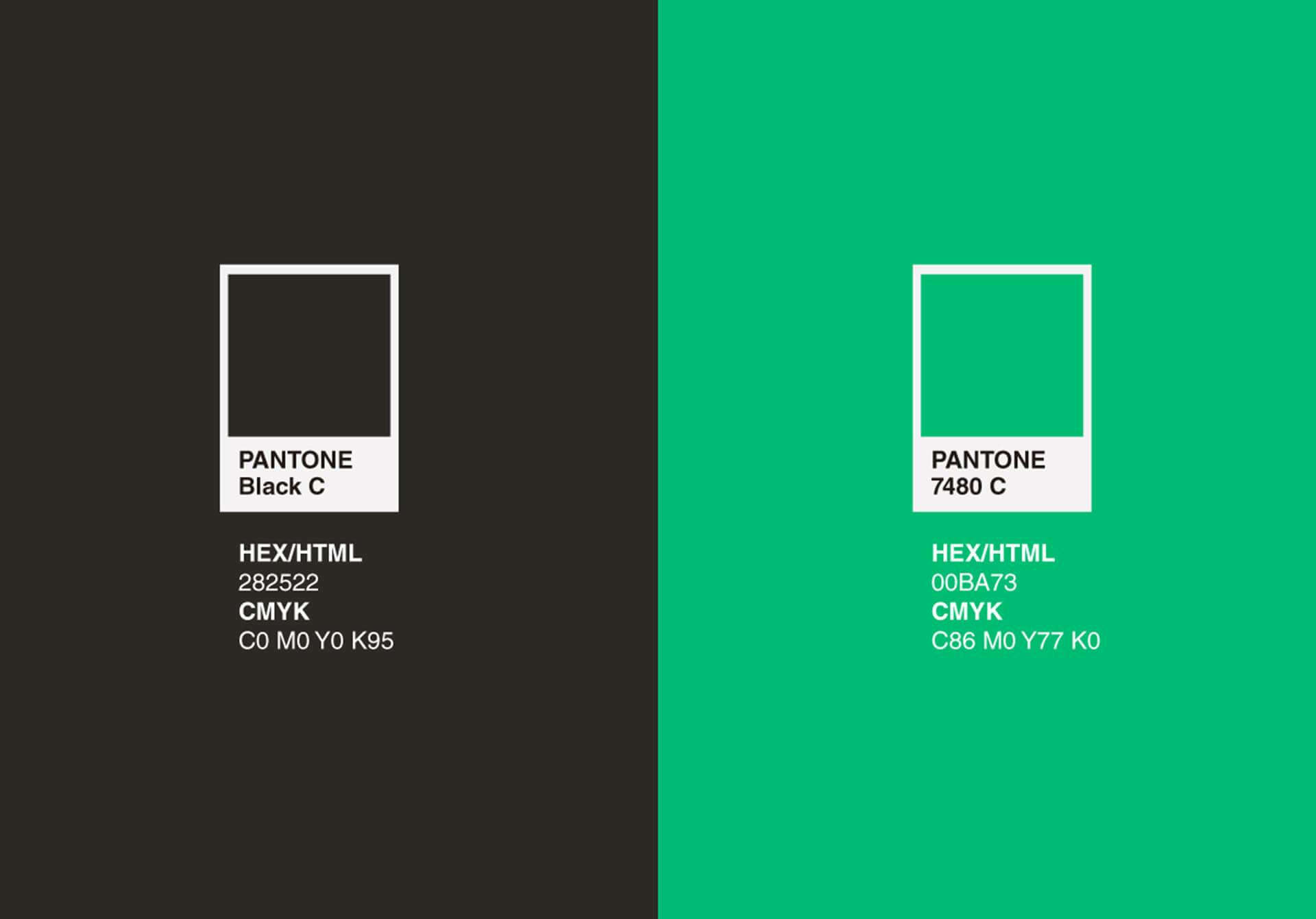
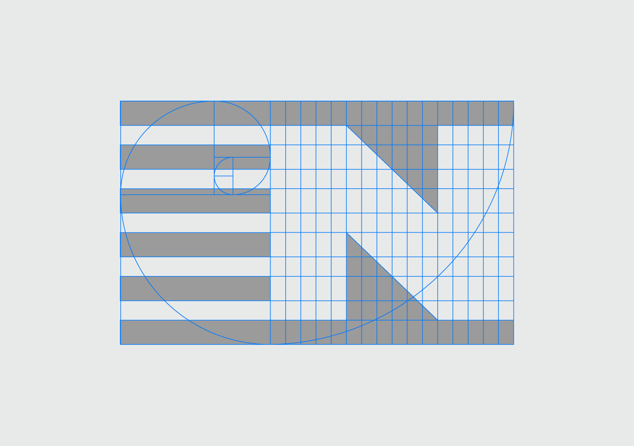
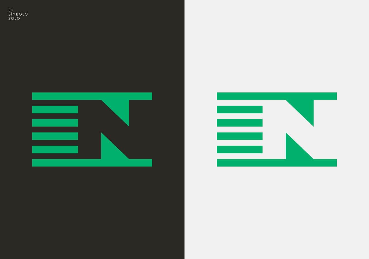
That is why, before we began the web project, we proposed to touch up their visual identity: defining fonts to use, correct proportions and a new color palette, which we reflected in a user manual.
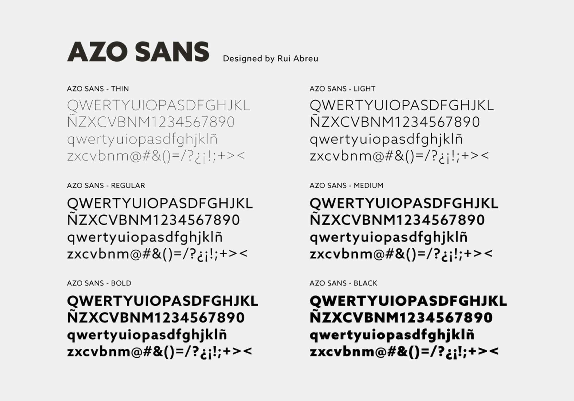
For the selection of typographic fonts, it was of utmost importance to understand the operation and world of applications of Norgreen, as well as the importance of the performance of the graphic mark at small scales (such as its readability in a 15mm ampoule).
Regarding color, we noted that the company was already spontaneously using some green tones in its applications, possibly naturally linked to the name of the company that contains the color green in its composition. That is why we looked for a suitable shade to become part of their brand identity, a green hue linked to innovation and modernity in the medicinal industry.
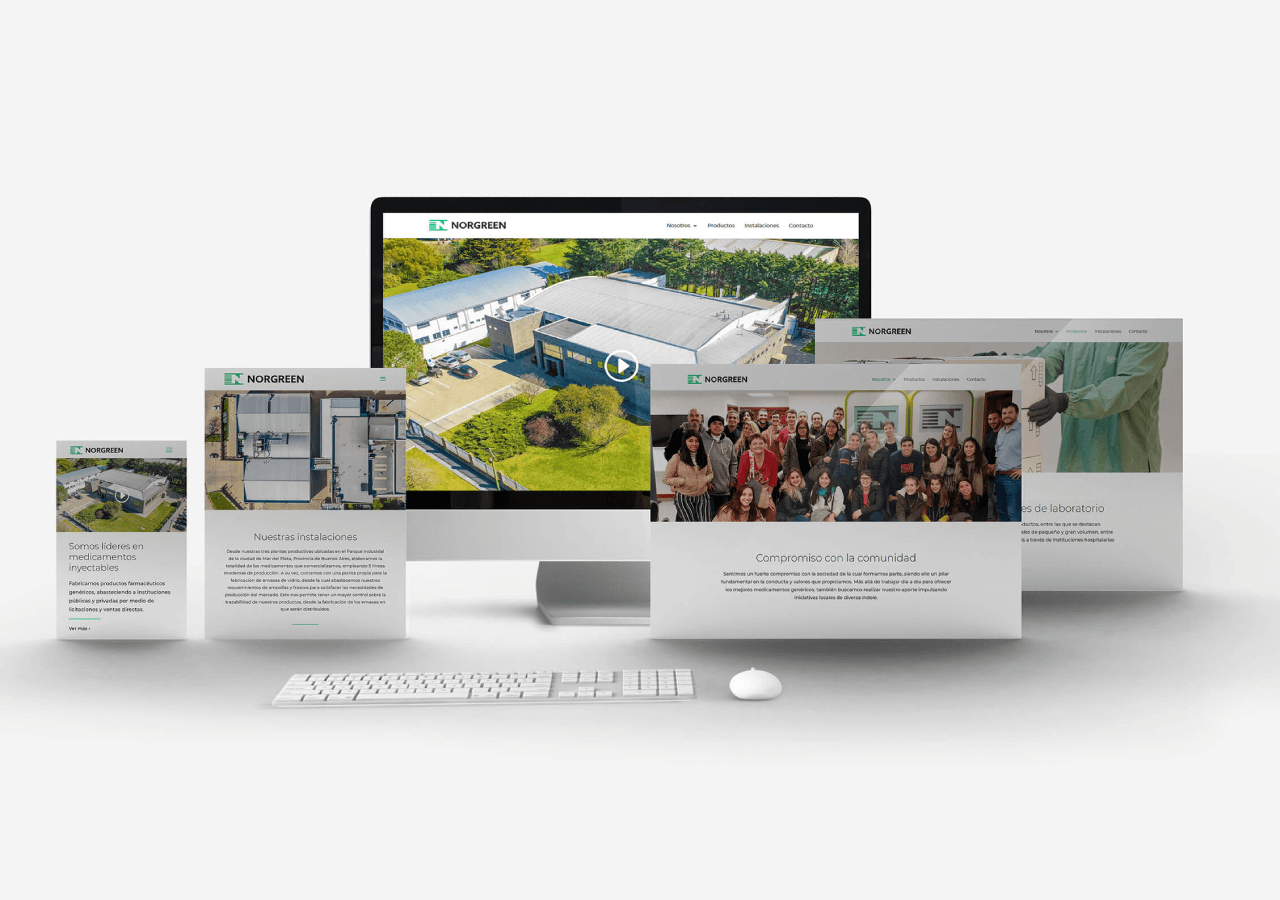
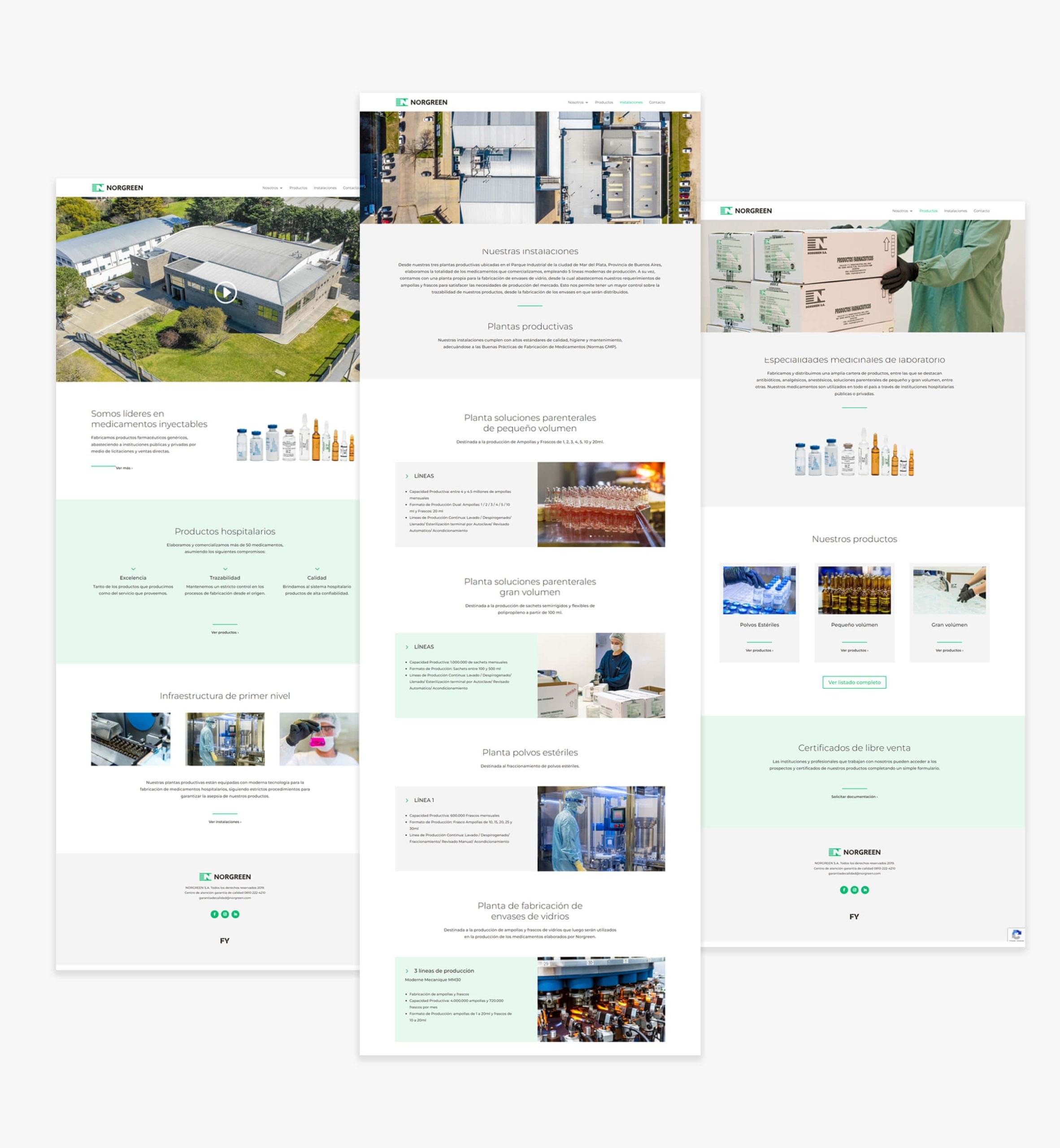
Once the branding stage was completed, we moved on to the website, which main objective was to showcase the important structure and facilities of the company, as well as the rigorous manufacturing processes, focused on the final quality of its products.
To complement the content, we developed two institutional videos, the first one focused on the development and traceability of its products; and the other, making the company and its way of working known through the voices of its protagonists: employees from various areas.
