- Fuego Yámana
- /
- MFS
MFS
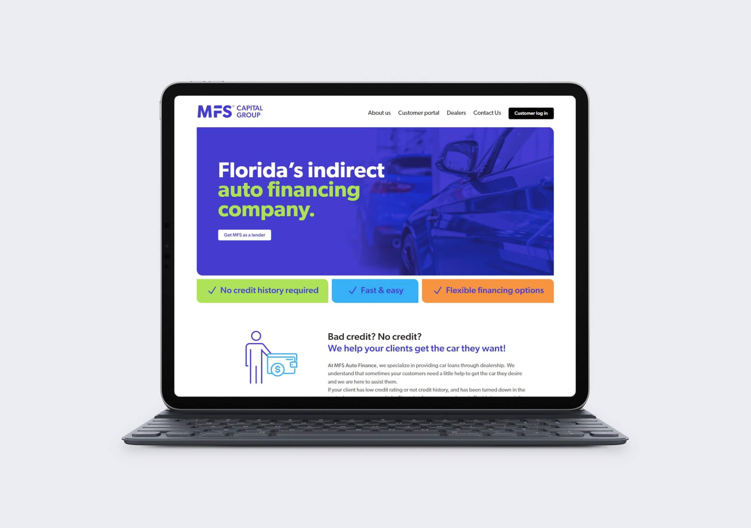
MFS Capital Group approached the agency looking for a rebranding and website to offer its vehicle financing services in Florida, USA.
mfsautofinance.com
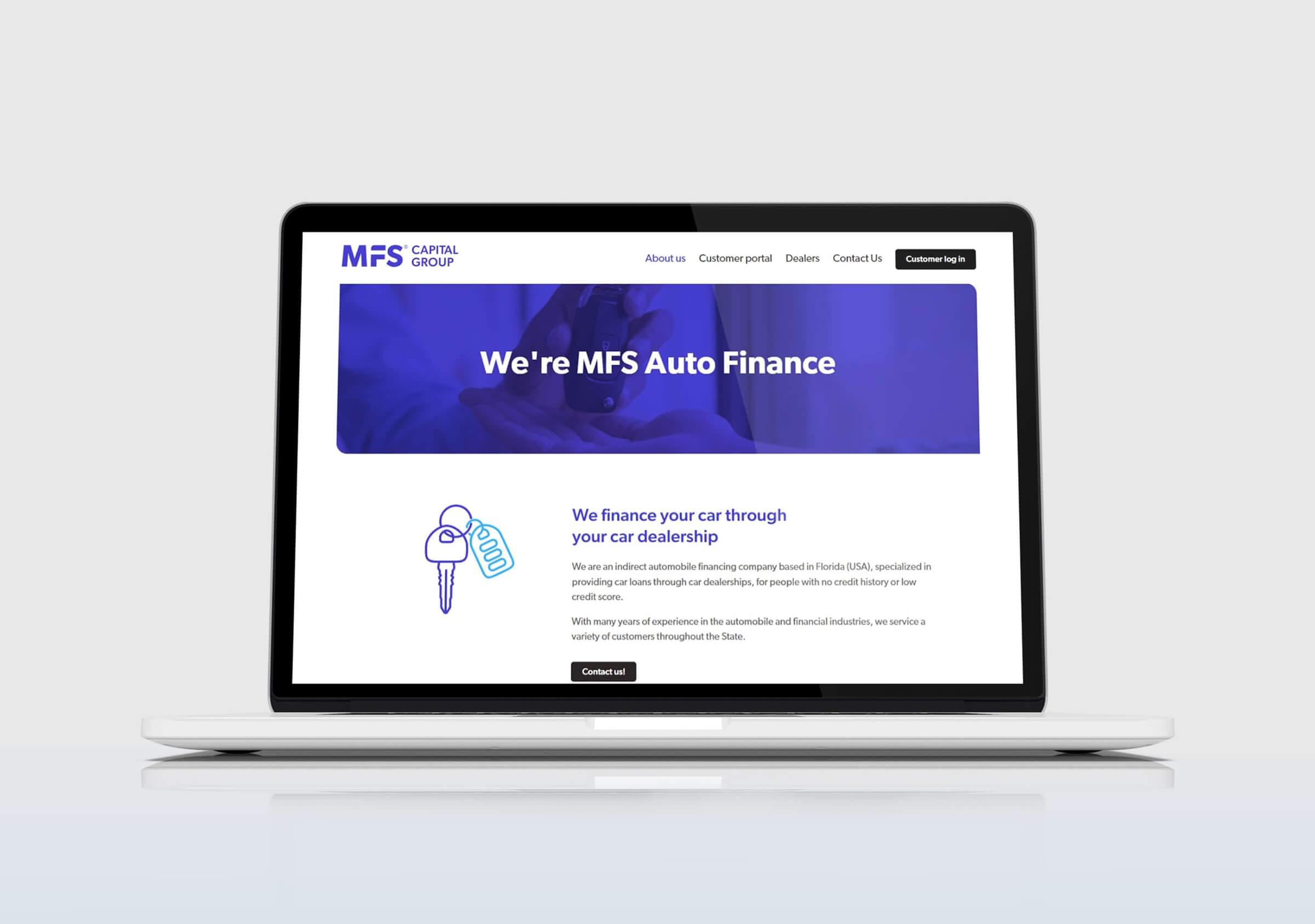


The objective of the project, from a visual communication standpoint, was to make the company project a modern and digitally friendly image.
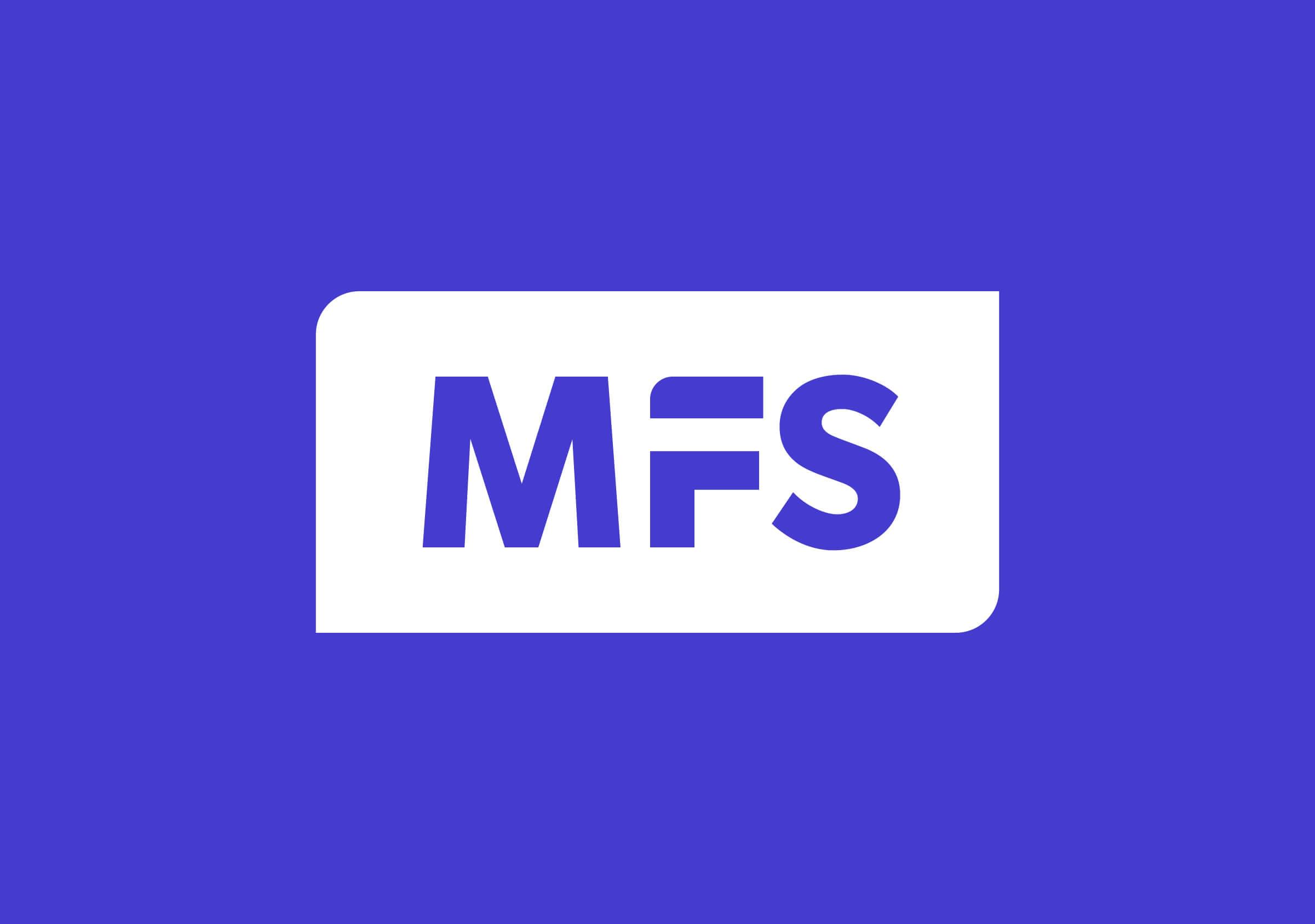
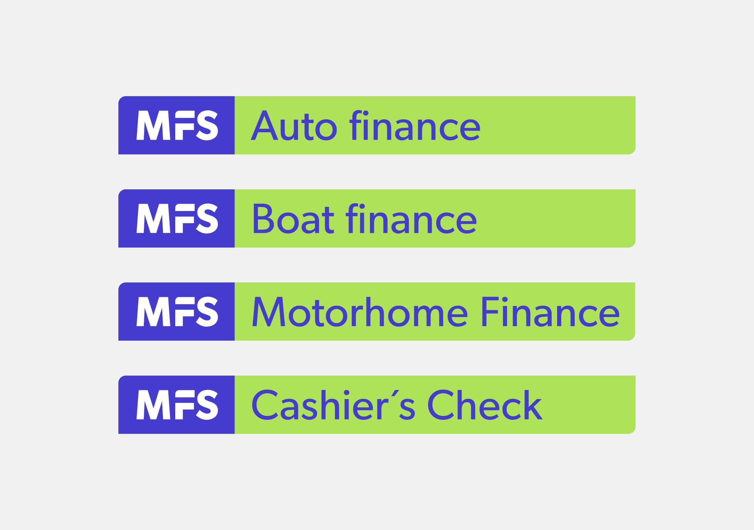
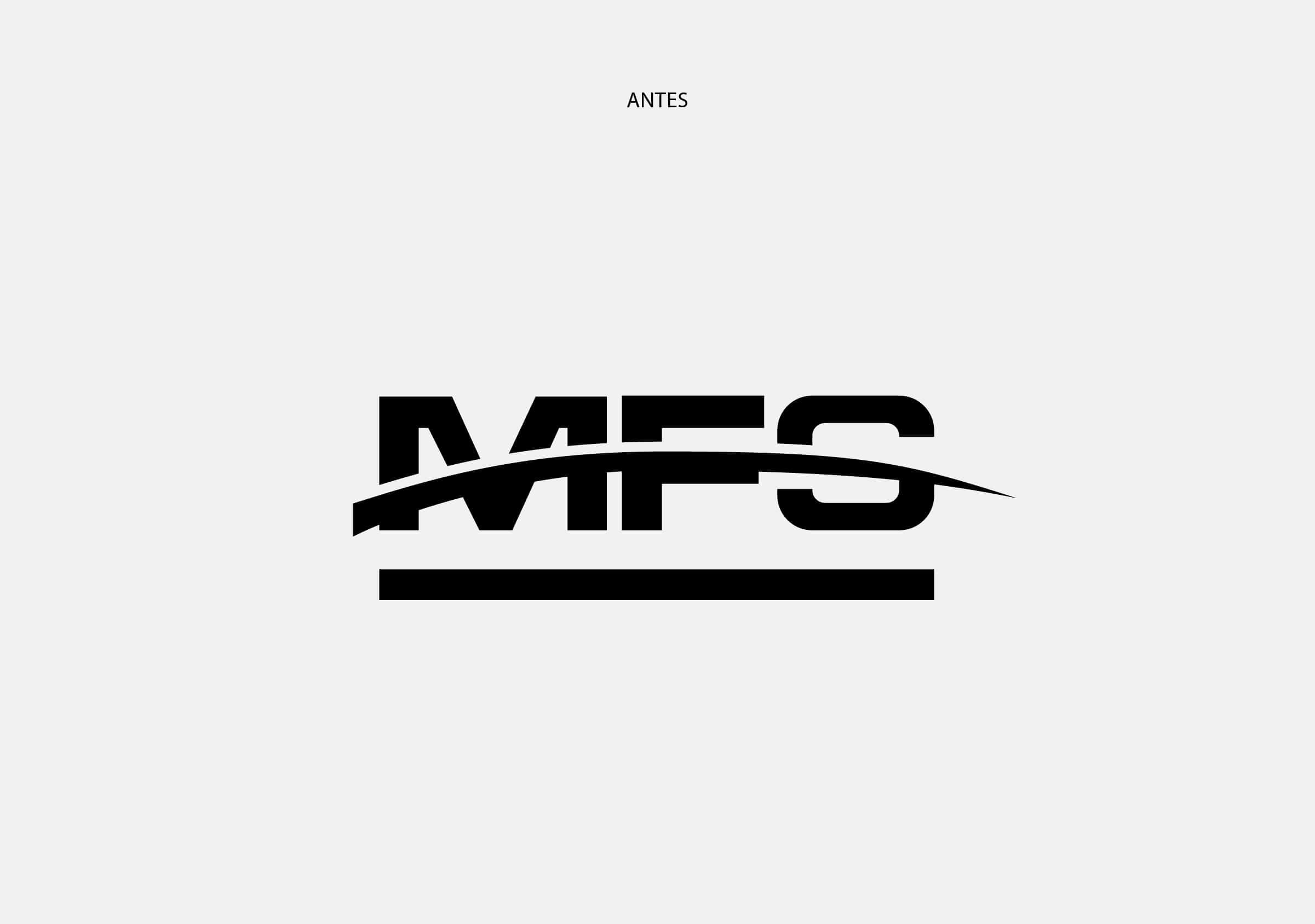
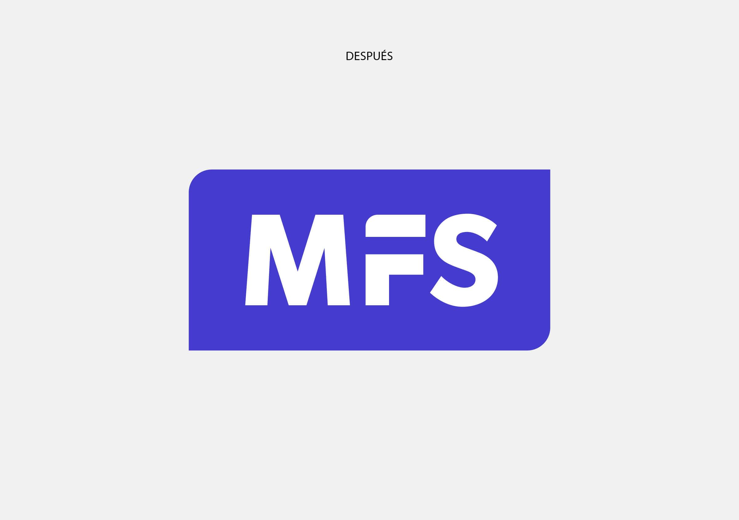
We resolved the new graphic brand of MFS with a sober, legible and compact logo, which contains a small gesture that marks a horizontal path. This line reflects the DNA of the company, as a facilitator of possibilities. “The path to your dreams” is the phrase that accompanies and makes visible the relationship that exists between what the company offers (financing) and the possibility that its beneficiaries have of achieving what they want (such as, for example, buying a car).
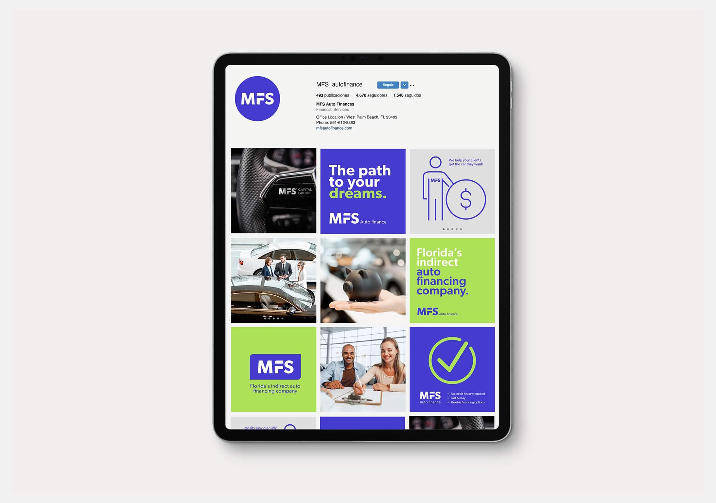
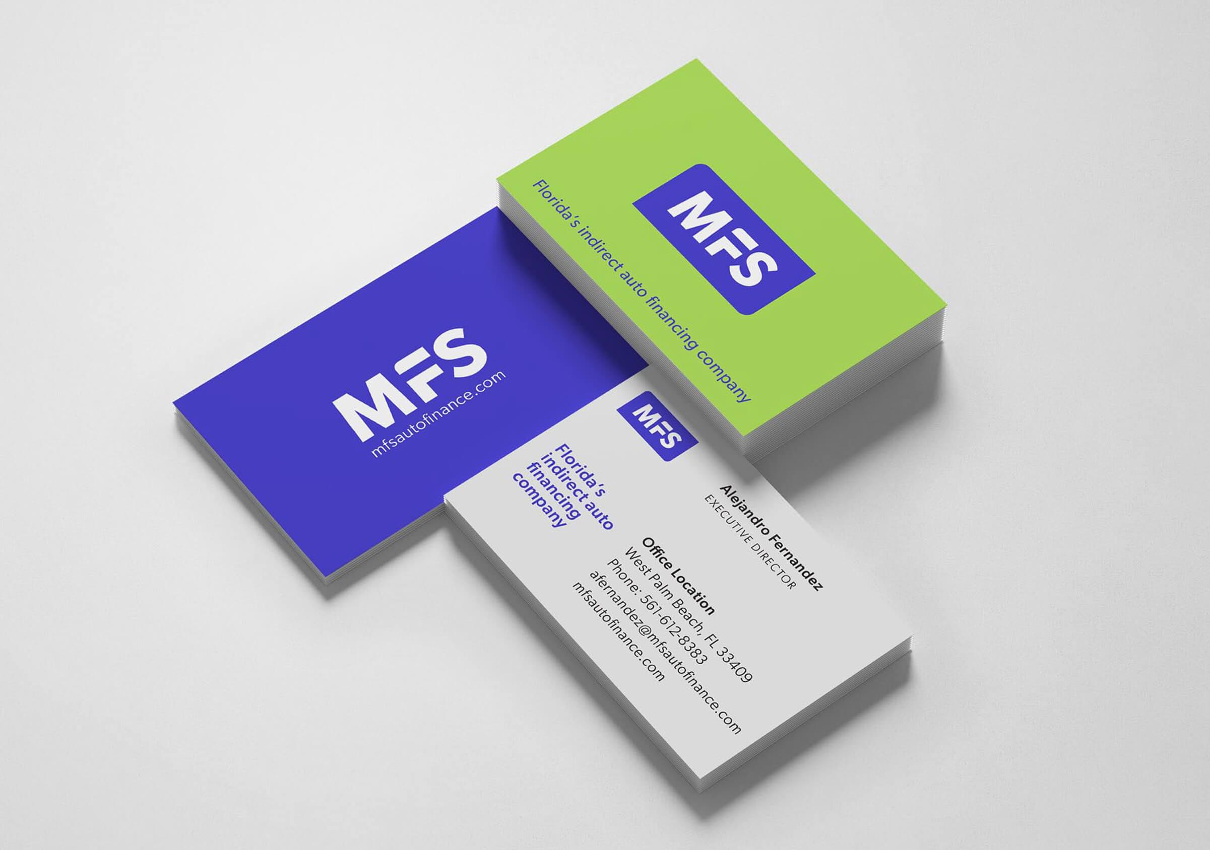

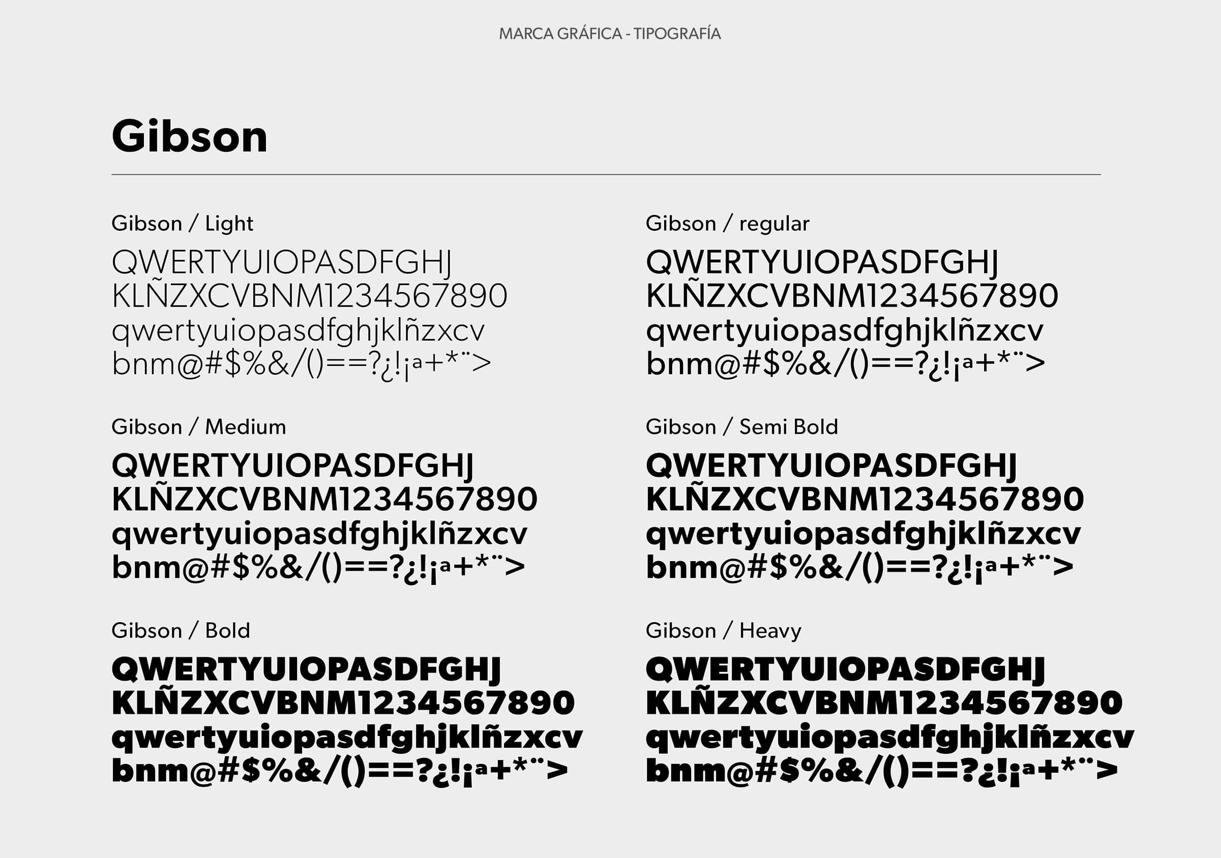
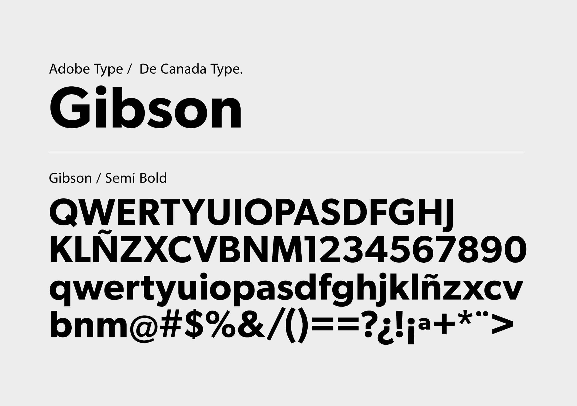
The typeface used is from the Gibson family, with an adjustment to the letter F. The upper left corner is rounded to achieve a friendlier and closer image, while also being complemented by the curves of the container that is presented as an alternative use of the brand logo.

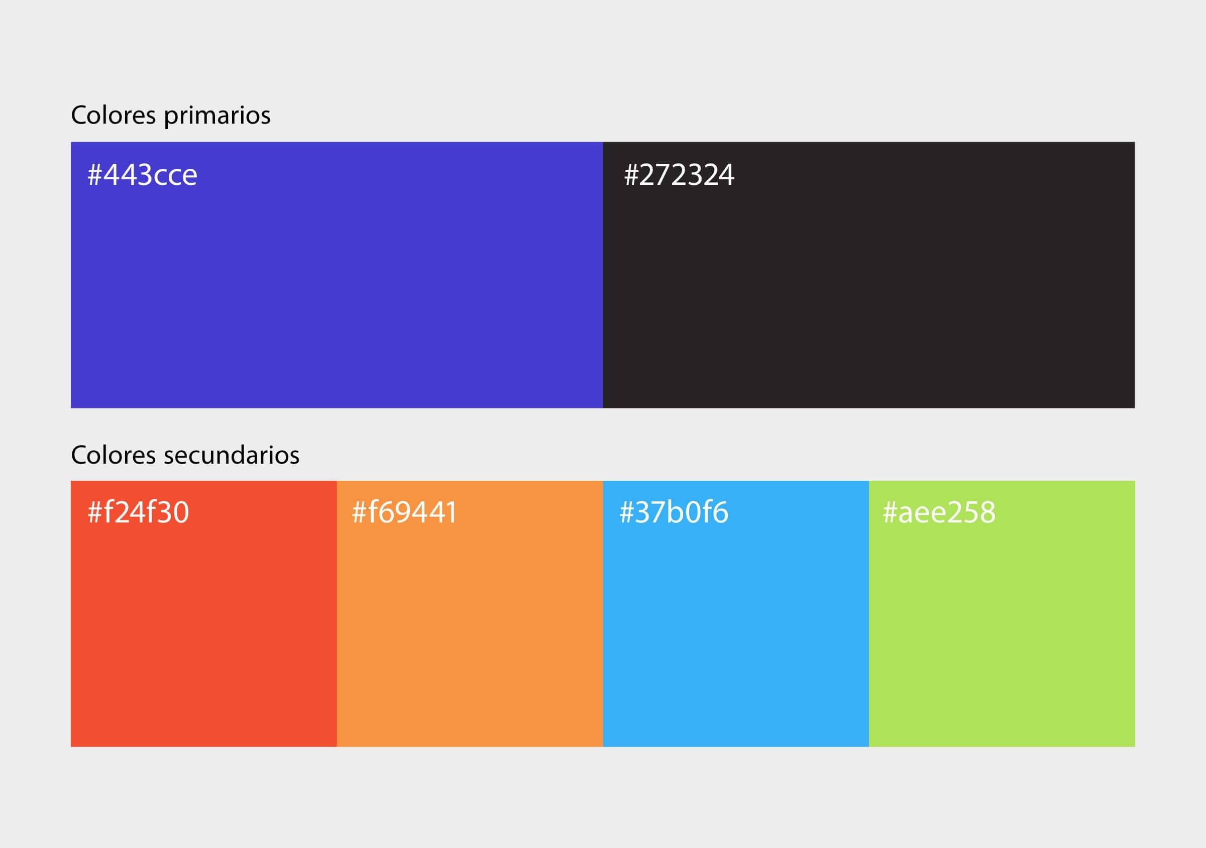
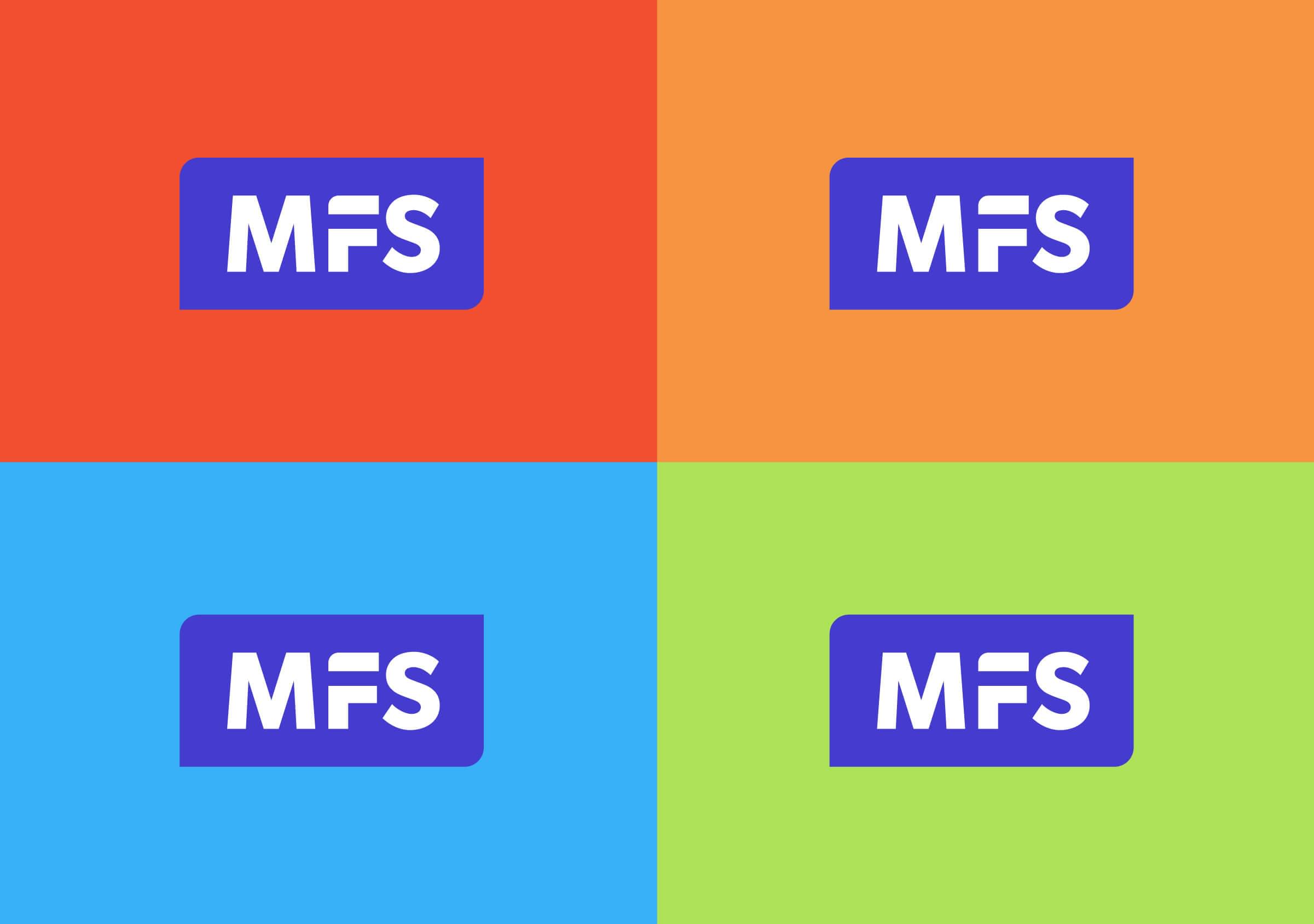
The color palette consists of the primary blue and four high-shock, disruptive secondary hues that shine beautifully in the digital environment.
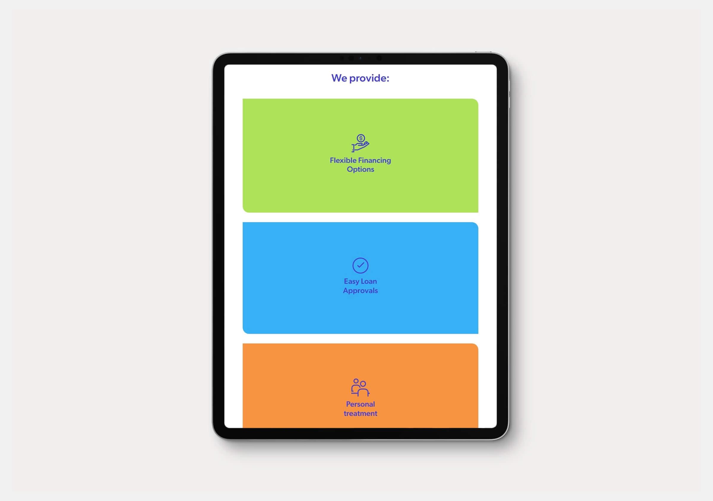
The website is modern, with a lot of air, application of secondary colors and use of photographs and icons to enrich the content. As a result of the rebranding and the new company website, MFS achieves a more pregnant, distinctive and digital brand than the original.
