- Fuego Yámana
- /
- Imhoit
Imhoit
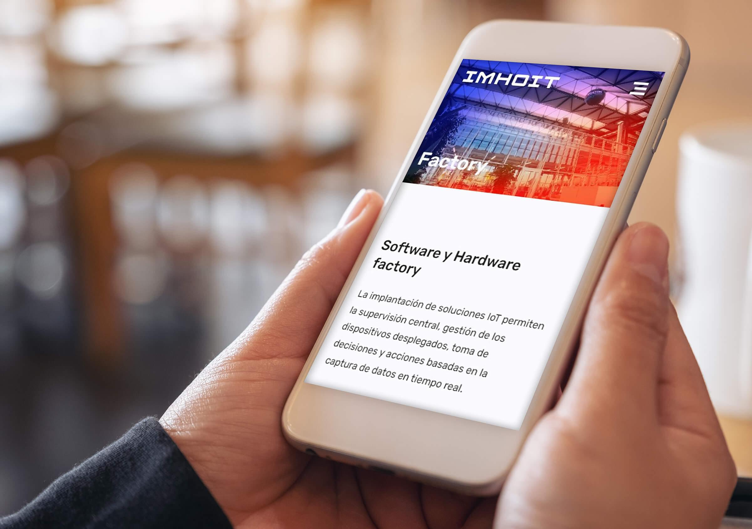
A new brand in the ICT world with a visual identity that combines the modern and innovative with the origins of computing. Inspired by retro brands and, at the top of the pyramid, NASA, we designed the branding for Imhoit. Then we gave birth to its digital universe, with the creation of photographs, videos and the website.
imhoit.com

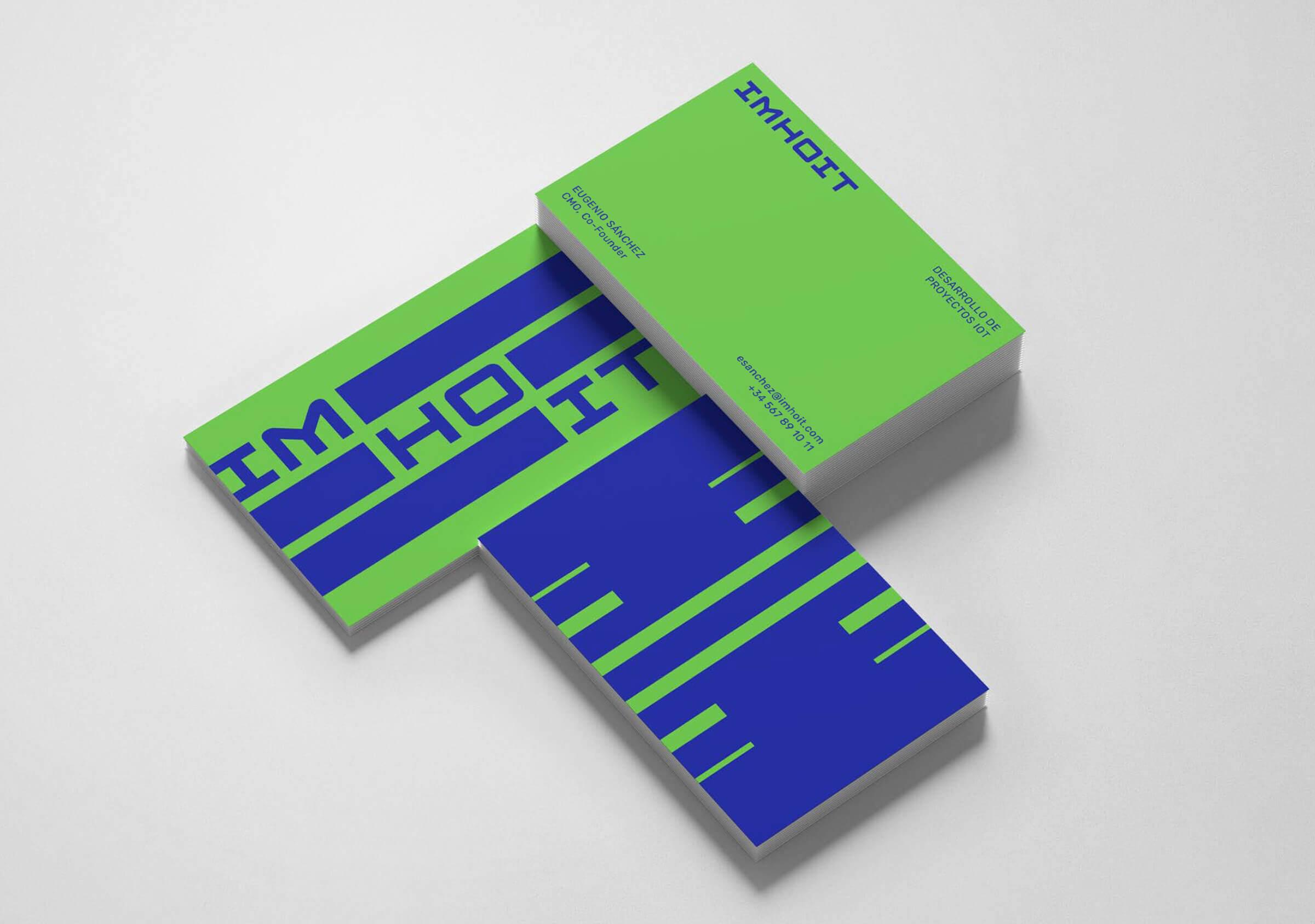


Imhoit is a company based in Barcelona with headquarters located at DFactory technology hub, that specializes in the development of IoT projects from start to finish. The fist project we started working with them was their branding.
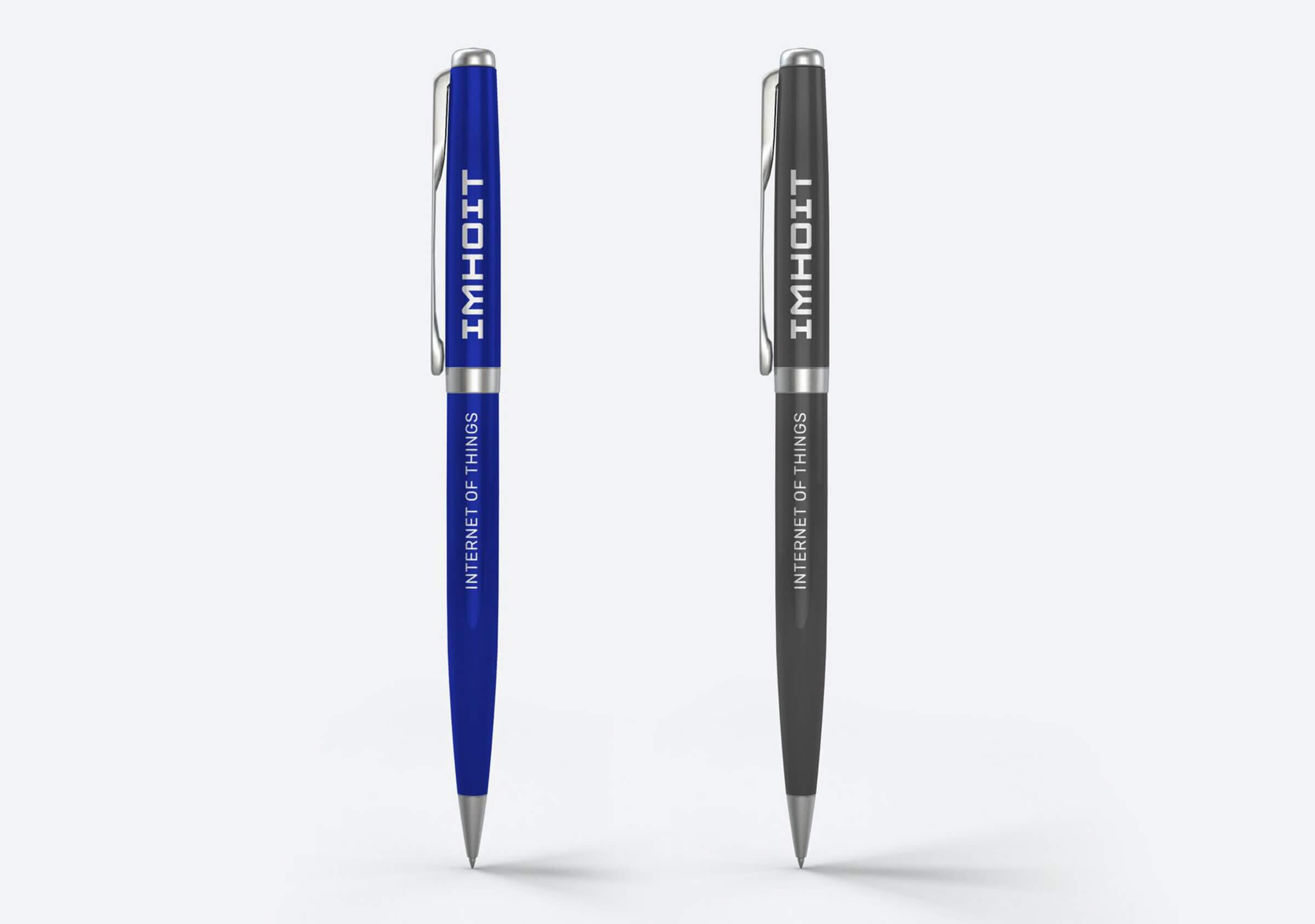



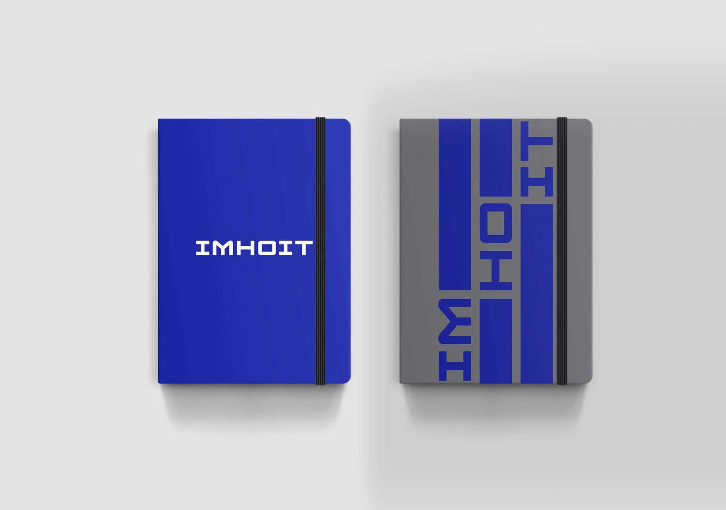
As part of the graphic brand strategy, we went in search of a logo with a distinctive typography that would allow the initial “I” to be extracted to be used as a symbol, and that would possess correct legibility, without being confused with a letter L.

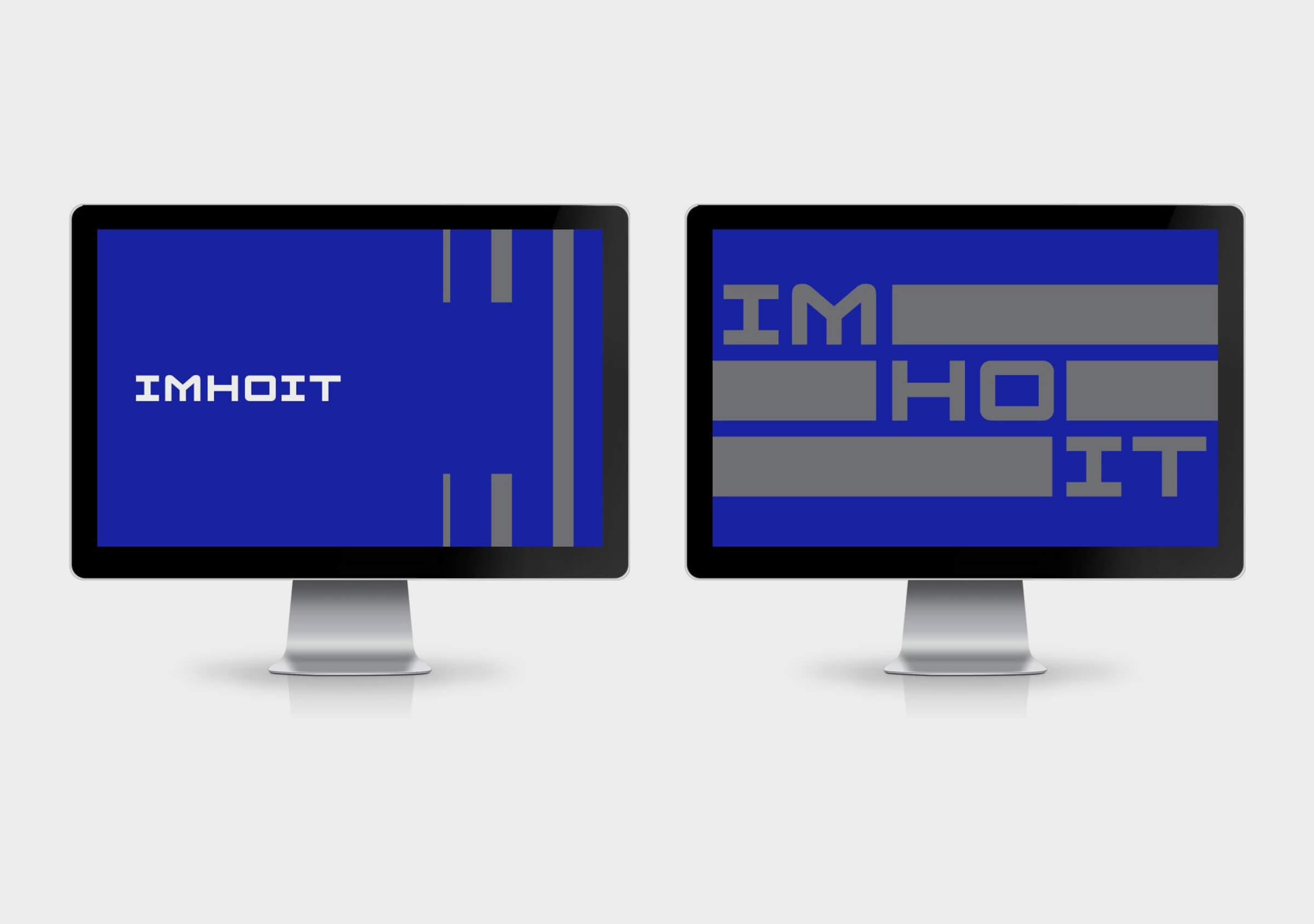
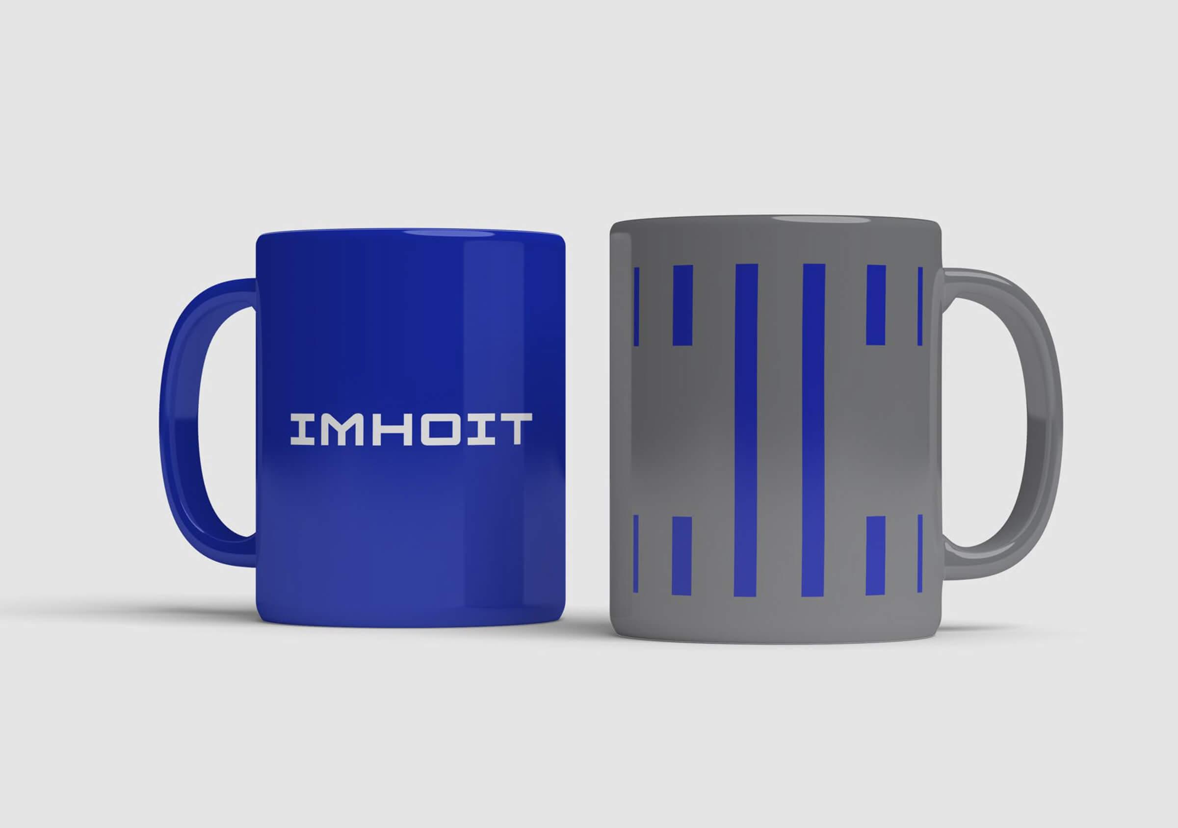
We selected a typeface loaded with uniqueness, due to the singularity of its characters and for the retro technological style it possesses. Combining the elements of design, we created an avant-garde image that carries in its spirit a reminiscence of the beginnings of informatics and computing.

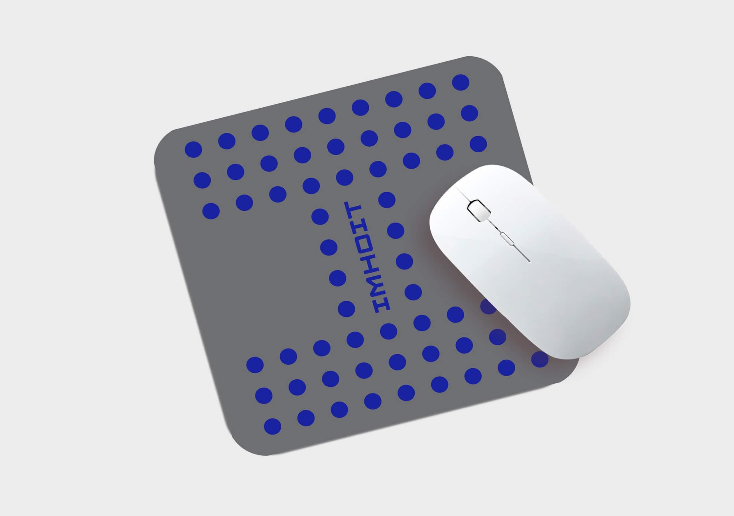
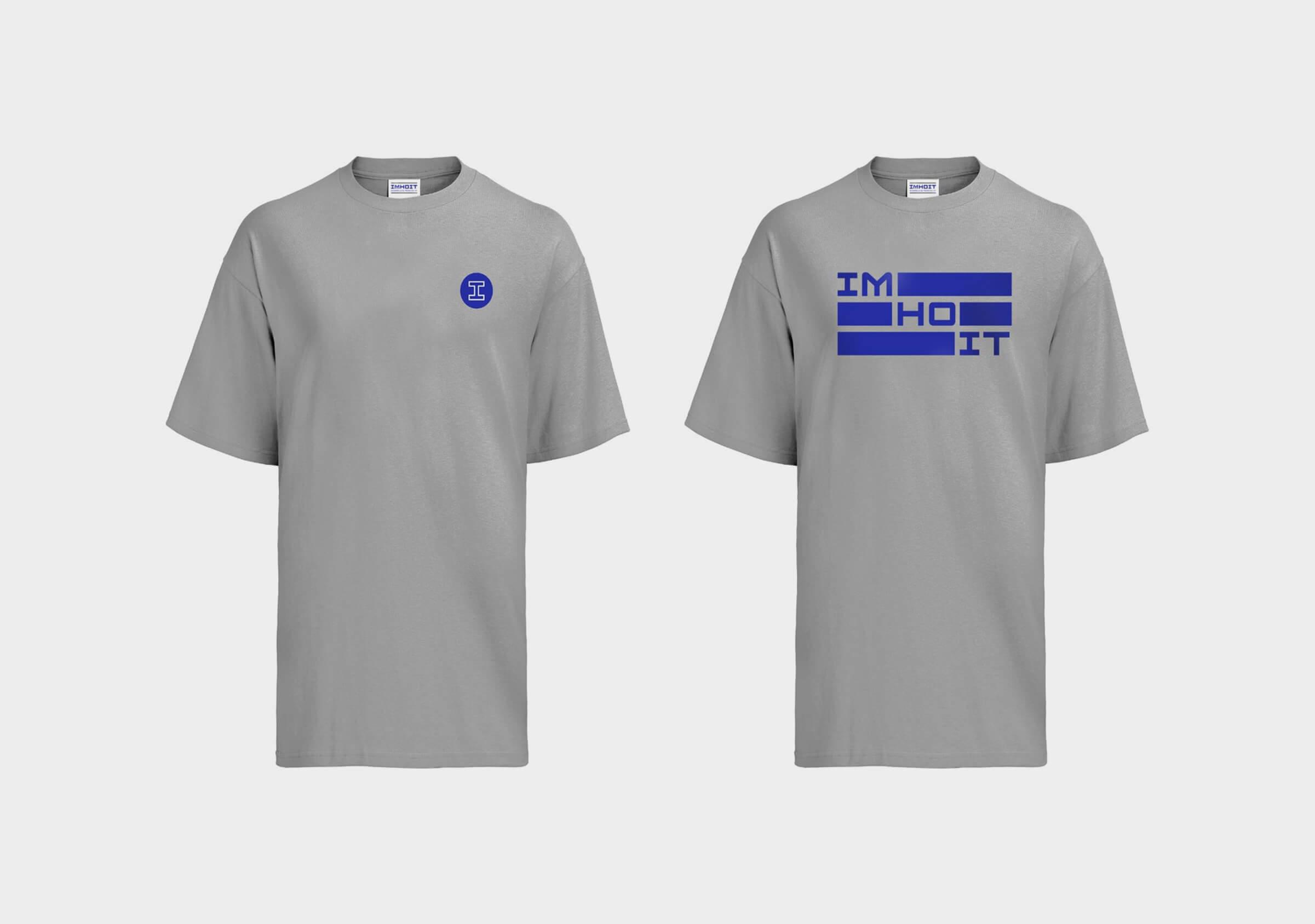
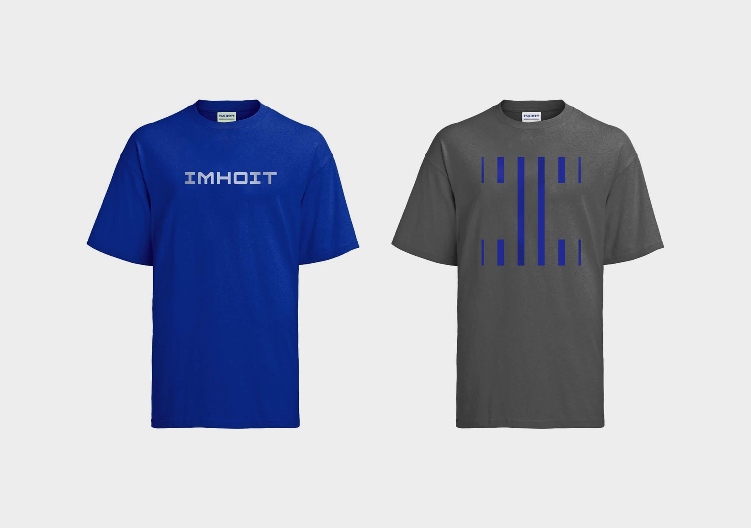
It enriches and provides identity to the brand from the morphology of the I, proposing a game of lines and plots, which become part of Imhoit’s own visual language.



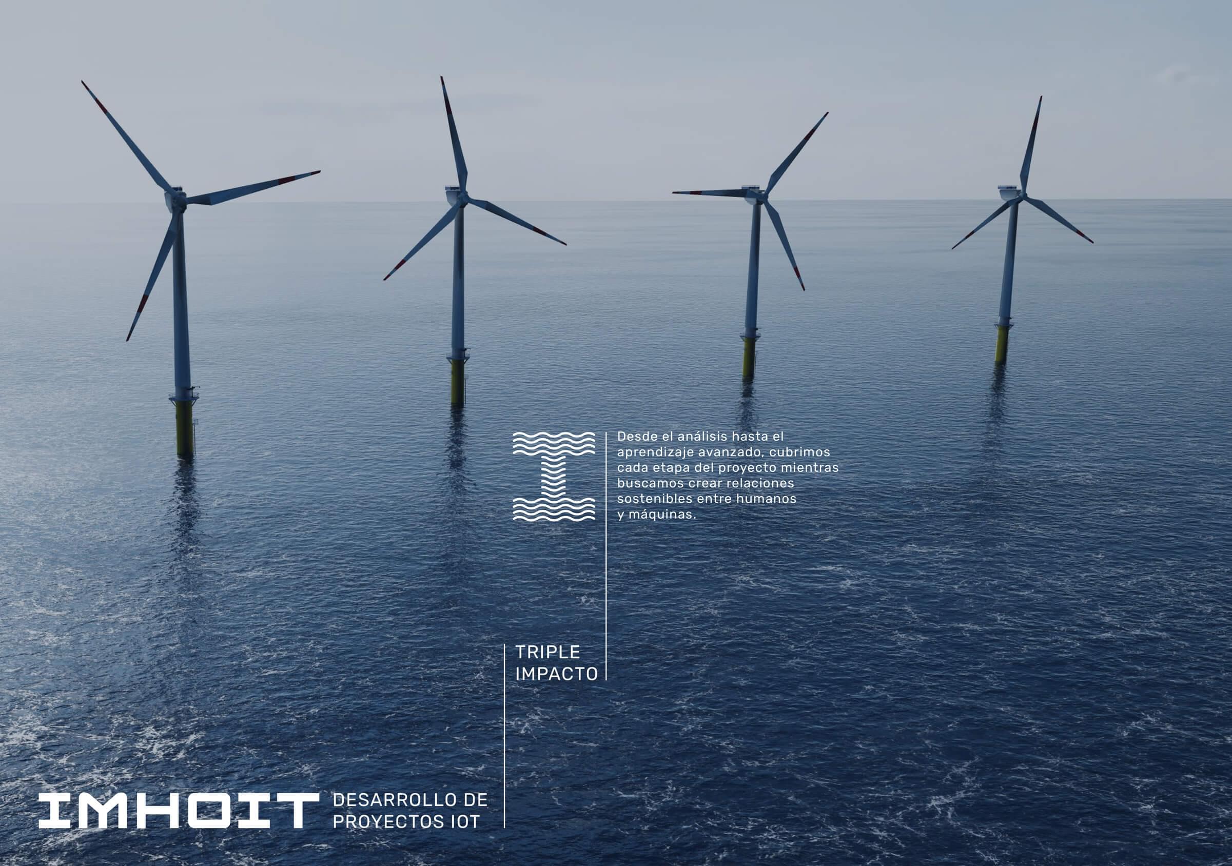
The company video created by Fuego Yámana showcases the outstanding facilities of DFactory innovation hub and Imhoit’s offices within. Incorporated into the webpage, it enriches the content adding movement and realism.
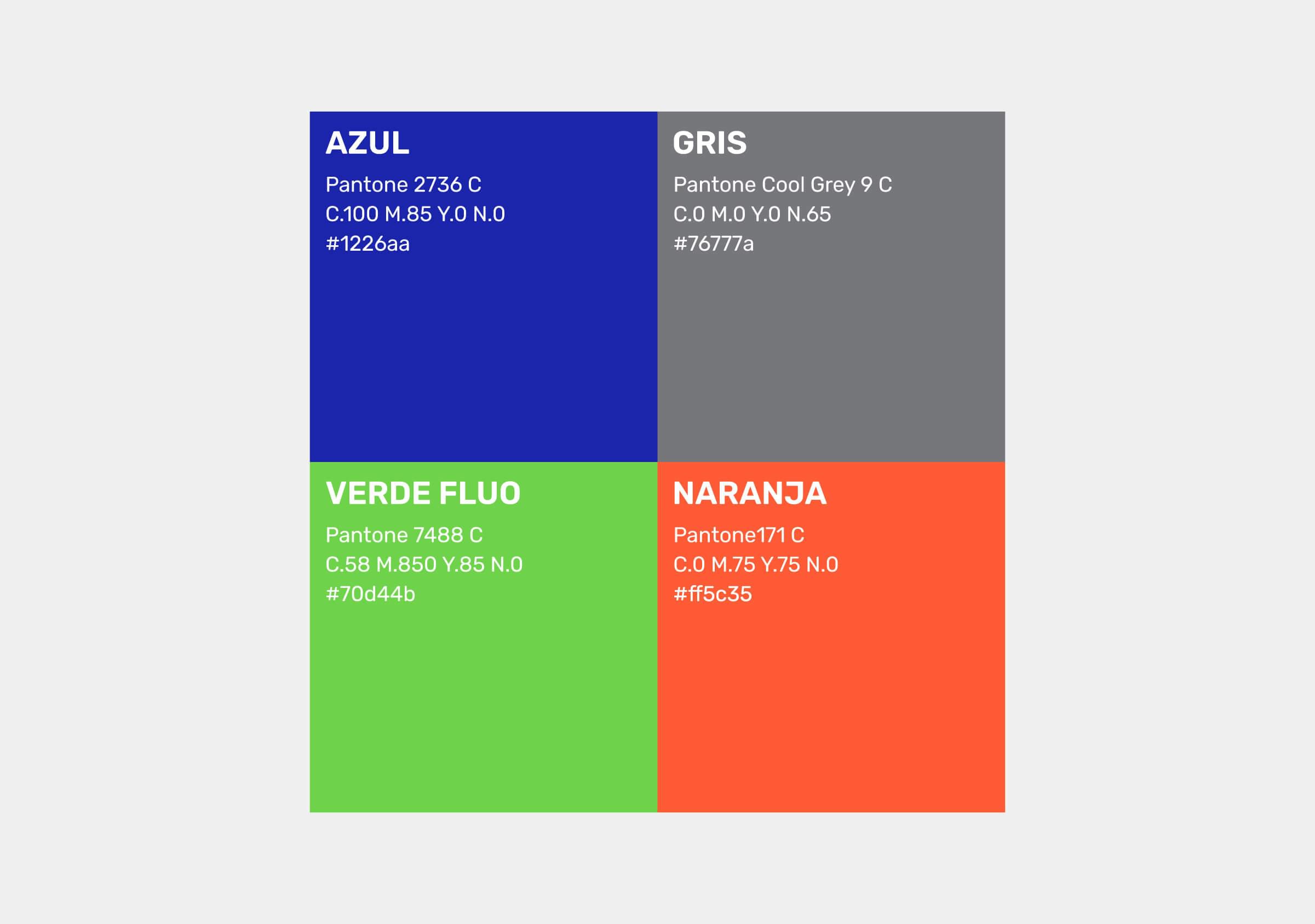
The proposed color palette is composed of an intense blue tone and a silver gray, which are combined with a garish green and orange to generate shock and liveliness.
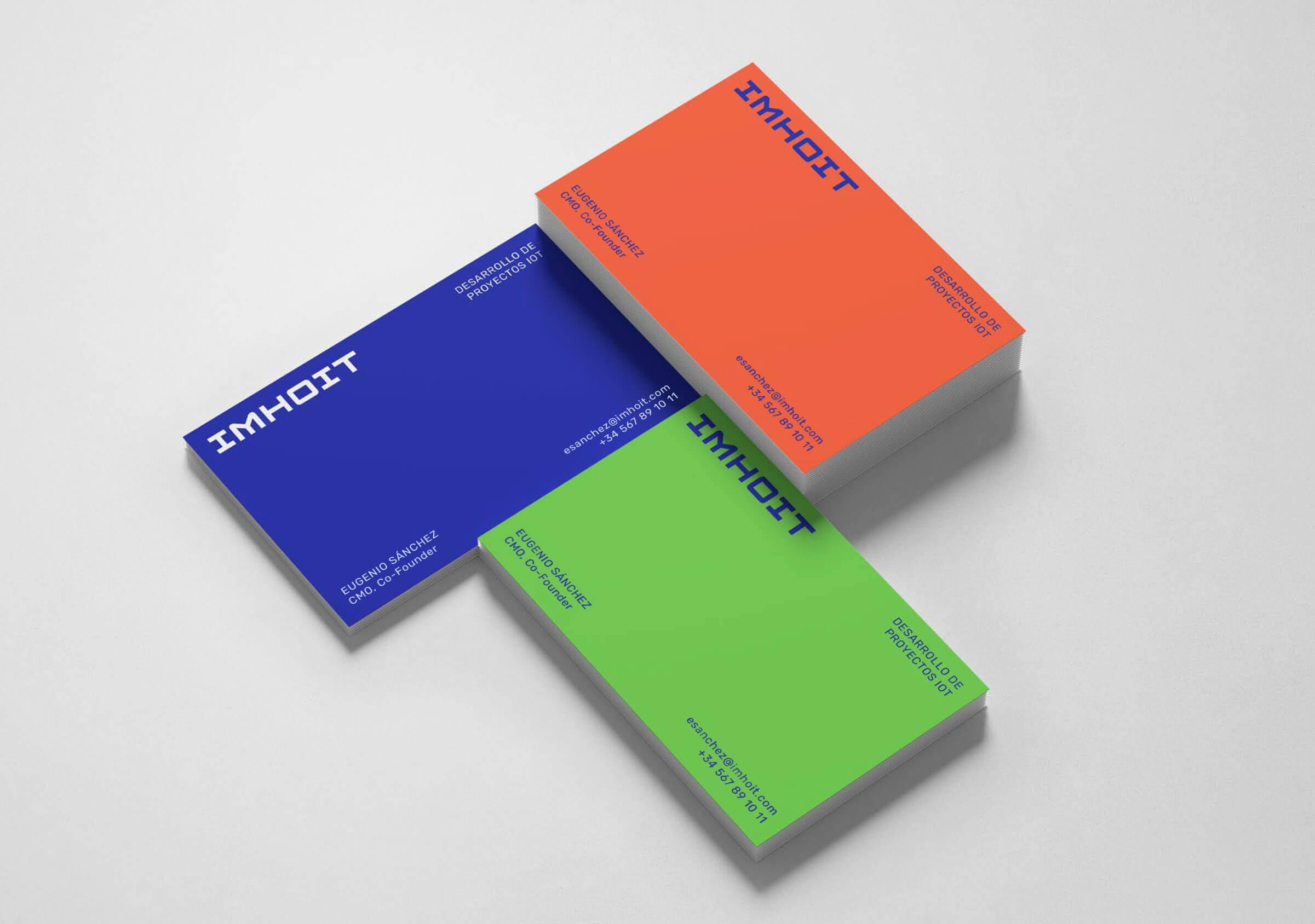
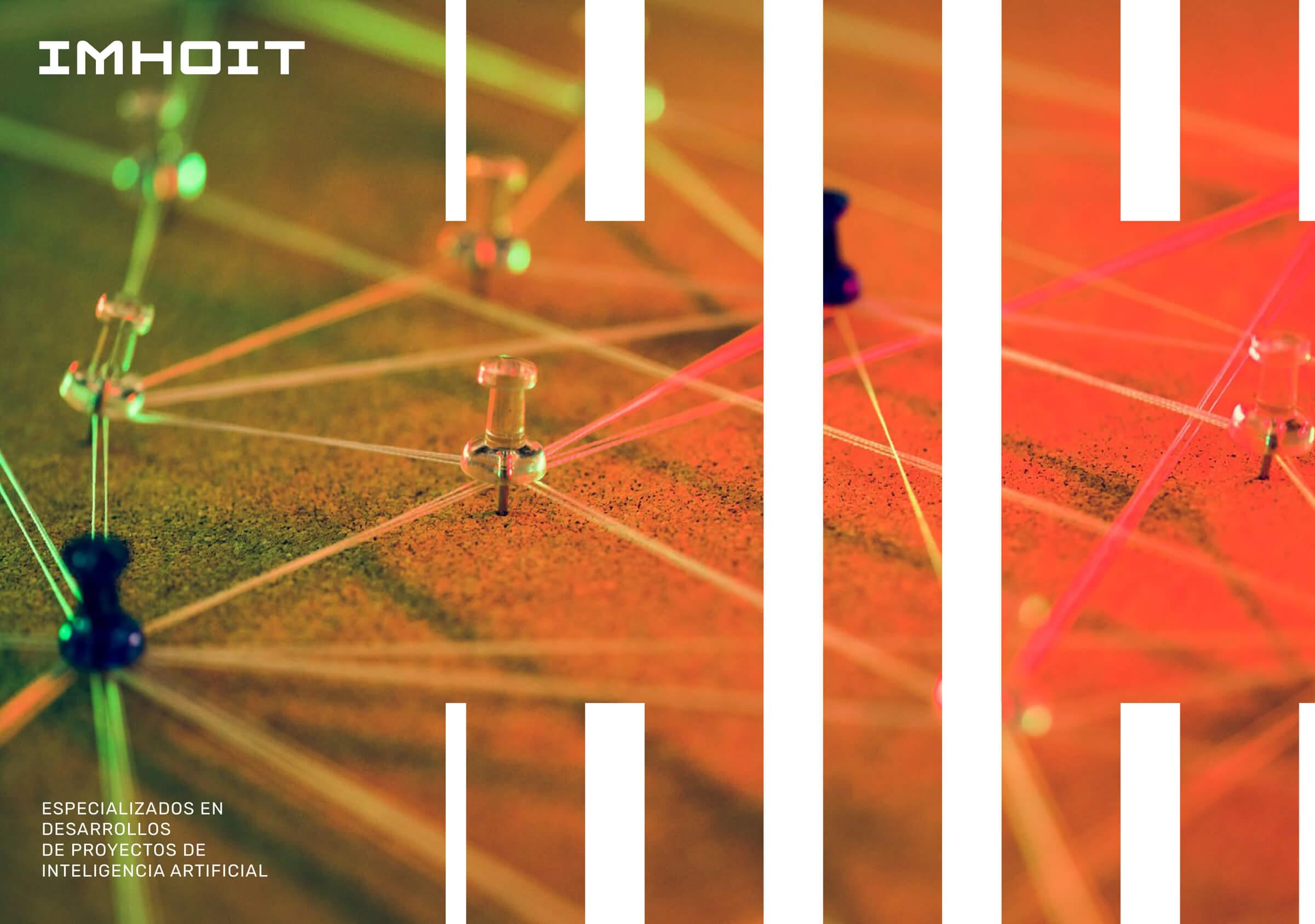
On the web page, we used banners with video, dynamic gradients and graphics that allows users to navigate the content in another way, avoiding the overload of texts by solving the display of information with tabs and accordions.
The site is easy to navigate, dynamic, professional and modern, just as the client had requested.
