- Fuego Yámana
- /
- Advancio
Advancio
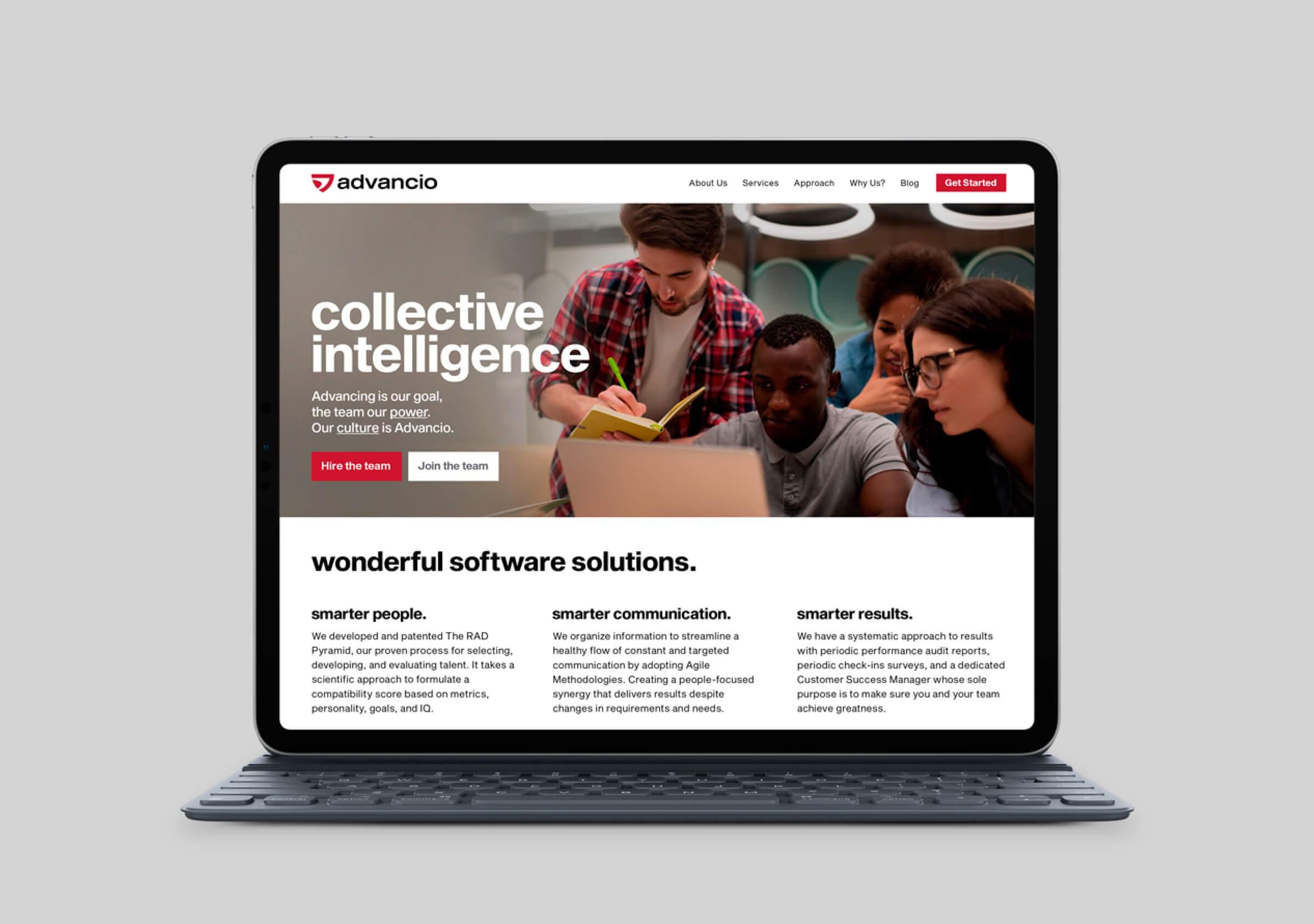
Advancio is a software factory with global presence and headquarters in Los Angeles, USA. With a careful but monotonous brand lacking in singularity, they came to the agency looking for a rebranding motivated by their 10th anniversary.

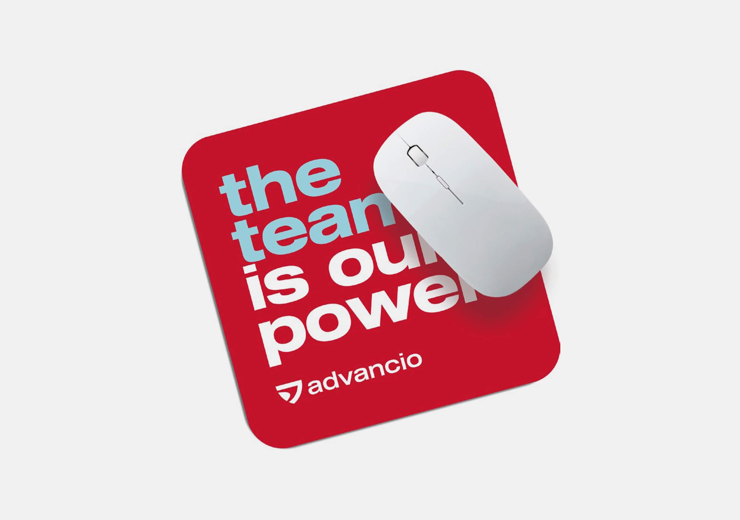
Their goal was to achieve a modern image that reflected the maturity of the company, while attracting young talent.

The initial work focused on bringing out the unique essence of the company, to be used as the basis for the new brand concept.
For this, we built the DNA matrix of Advancio and complemented it with an internal survey, to find out the perception of its employees about the company and their work there.
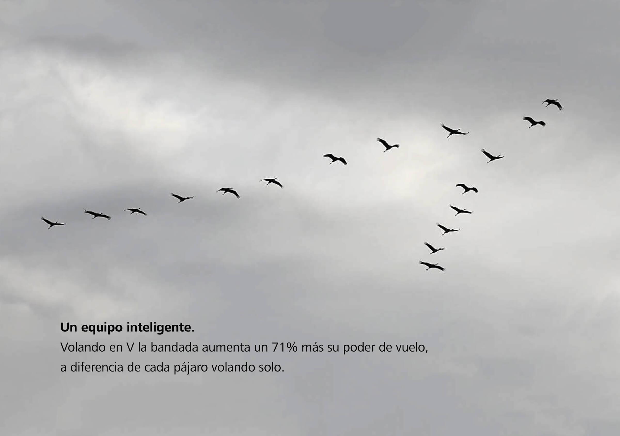
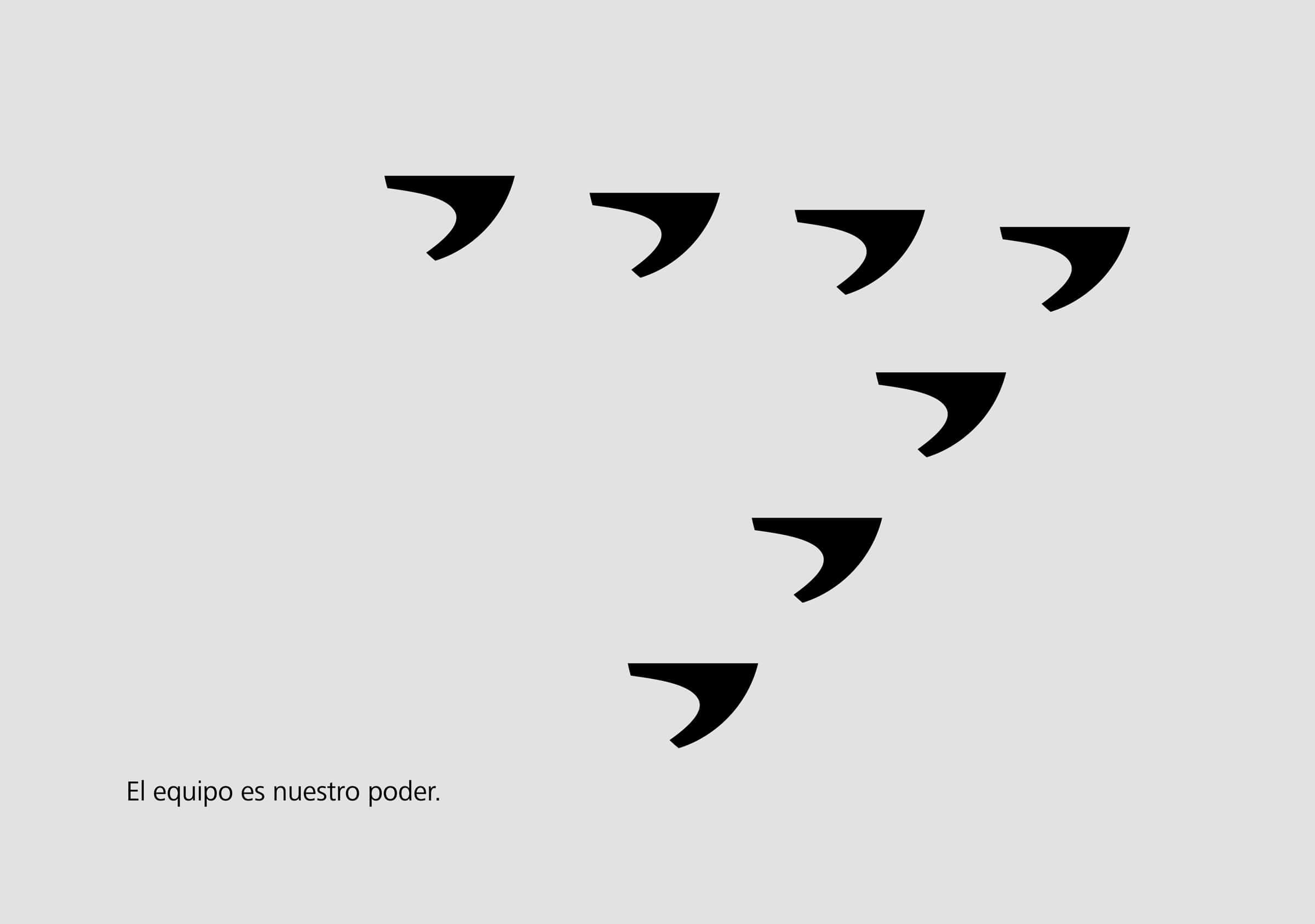
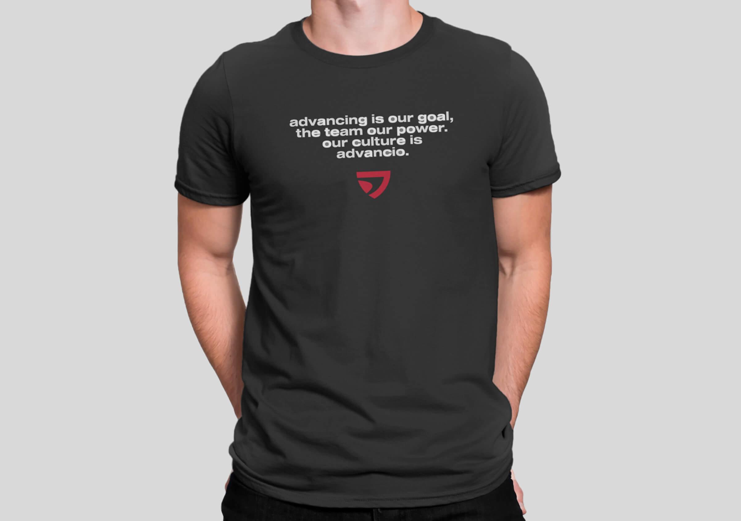
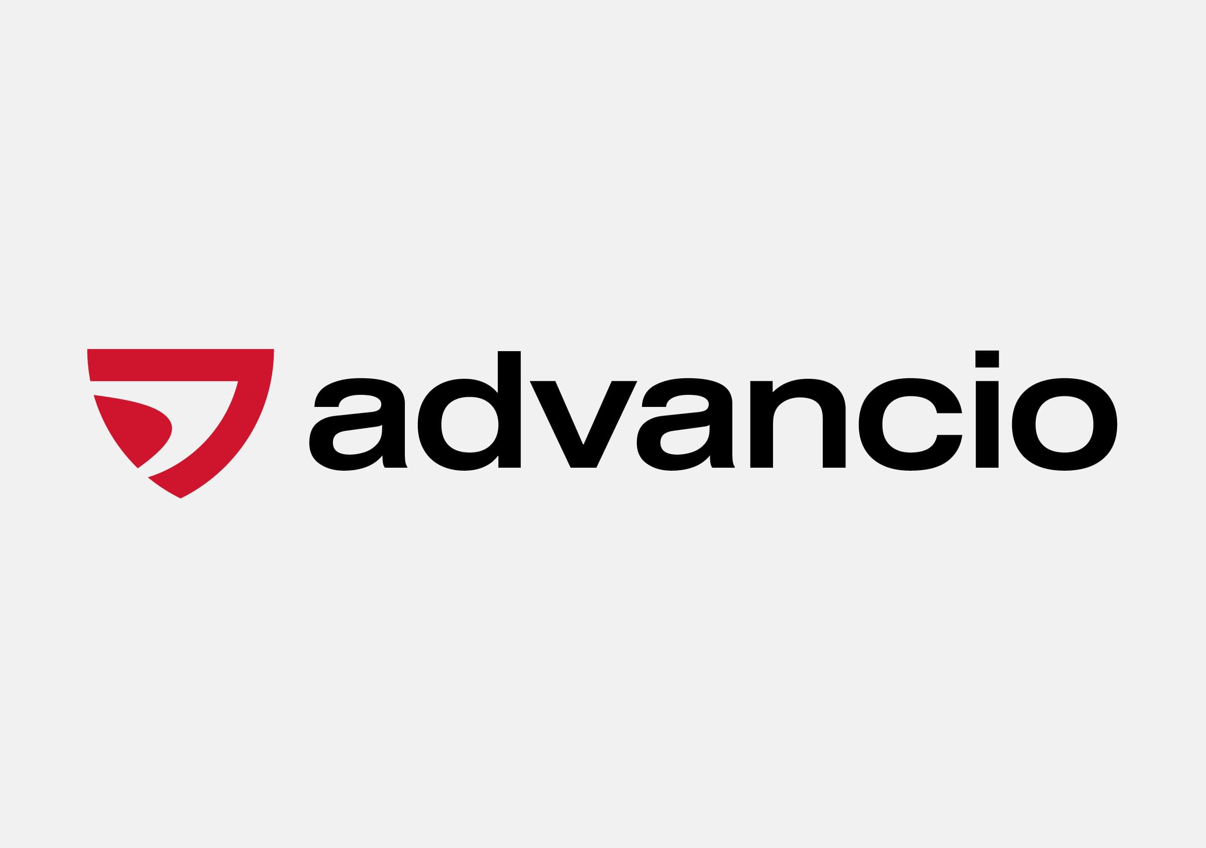
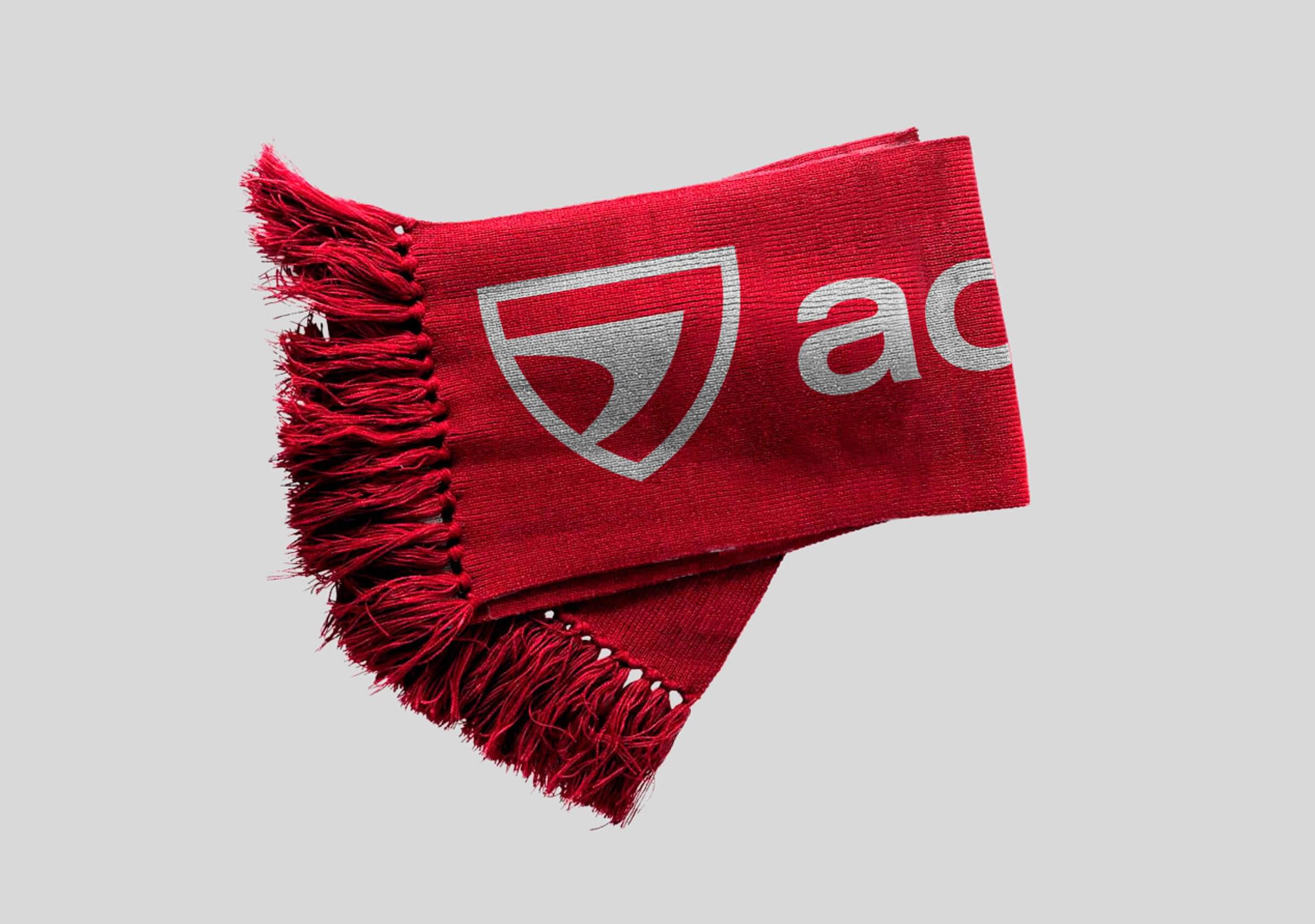
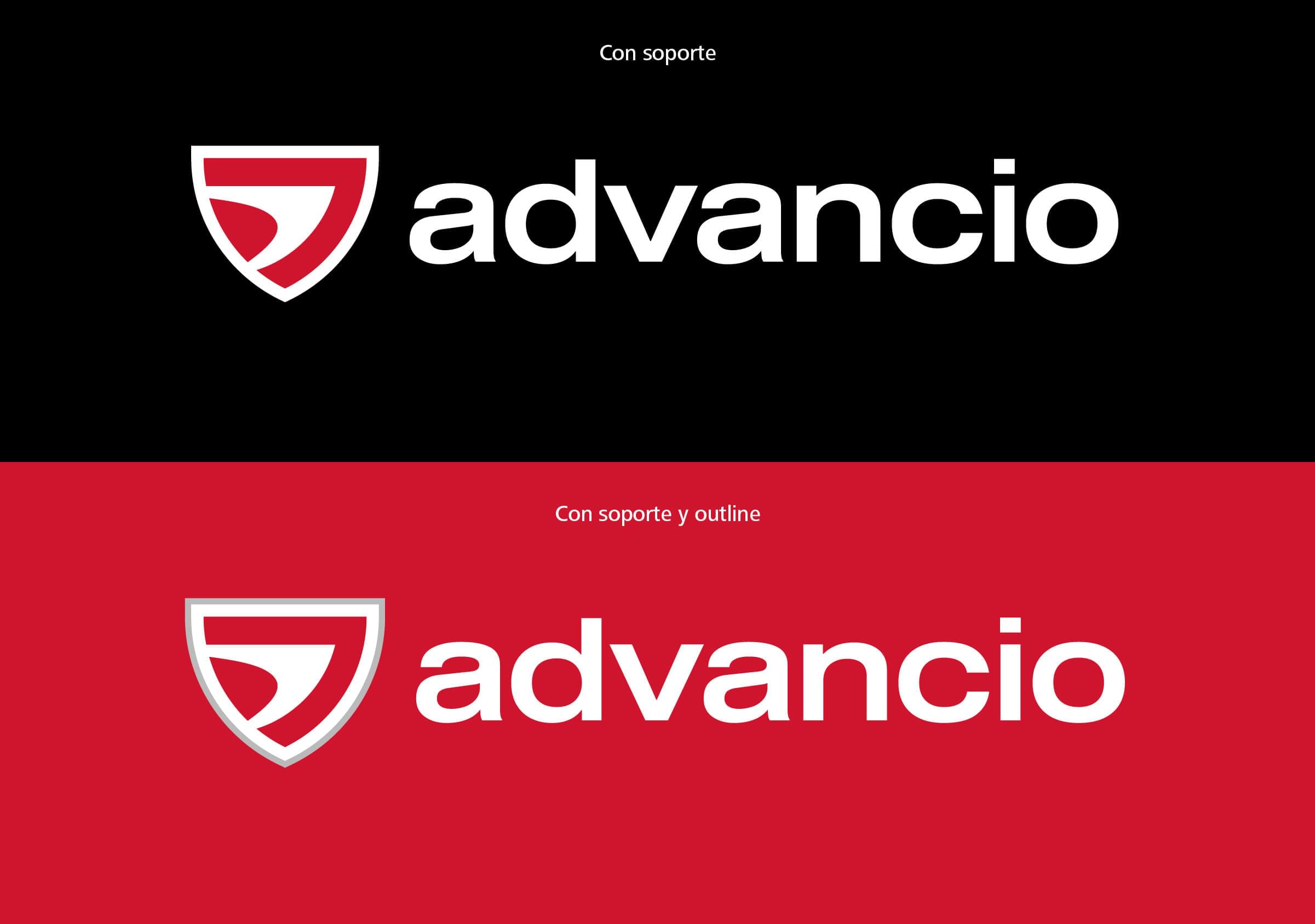
This is how we created a brand made of a symbol + logotype, inspired by the concept of ‘team’ that emerged as a backbone to the essence of the organization.
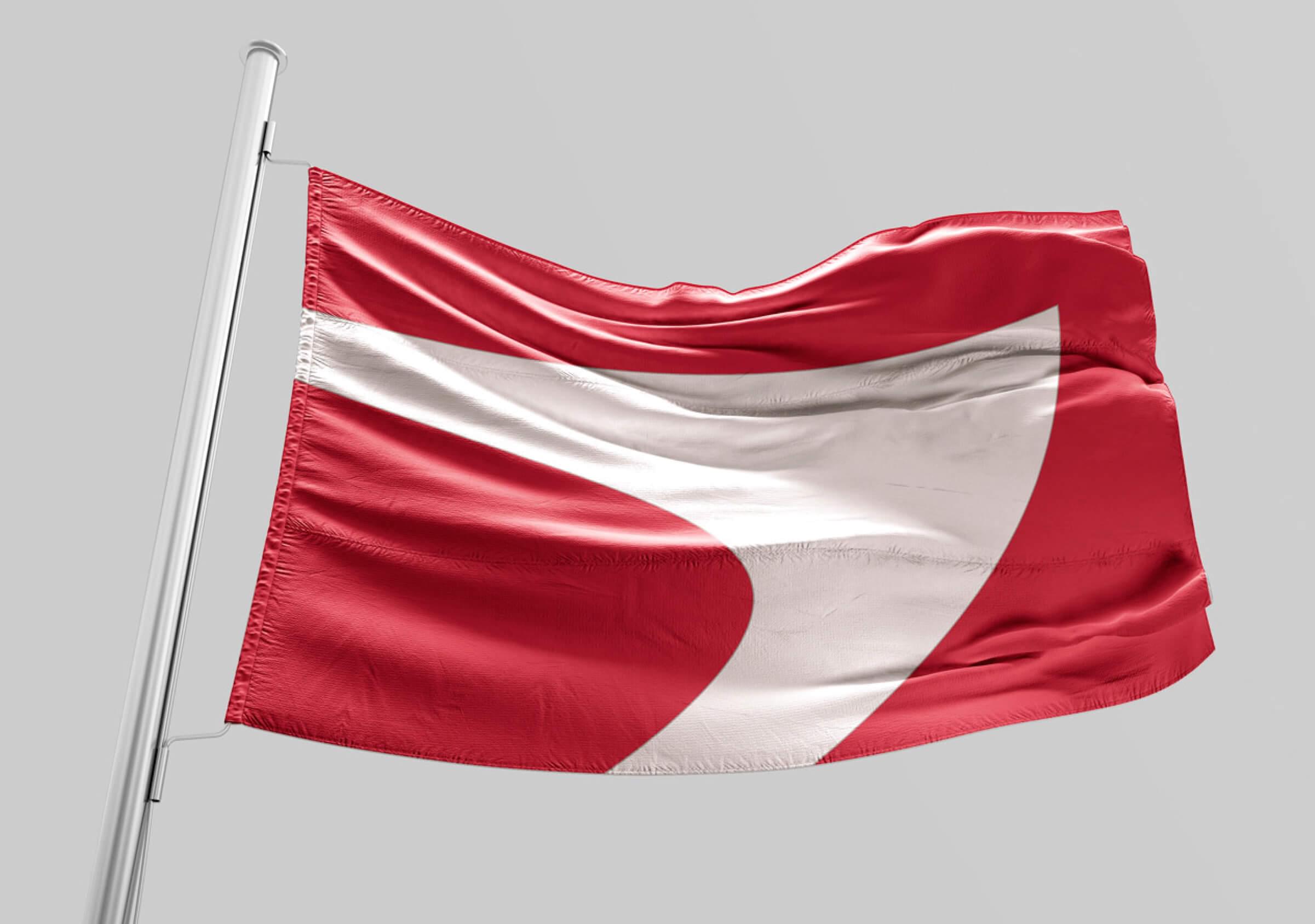
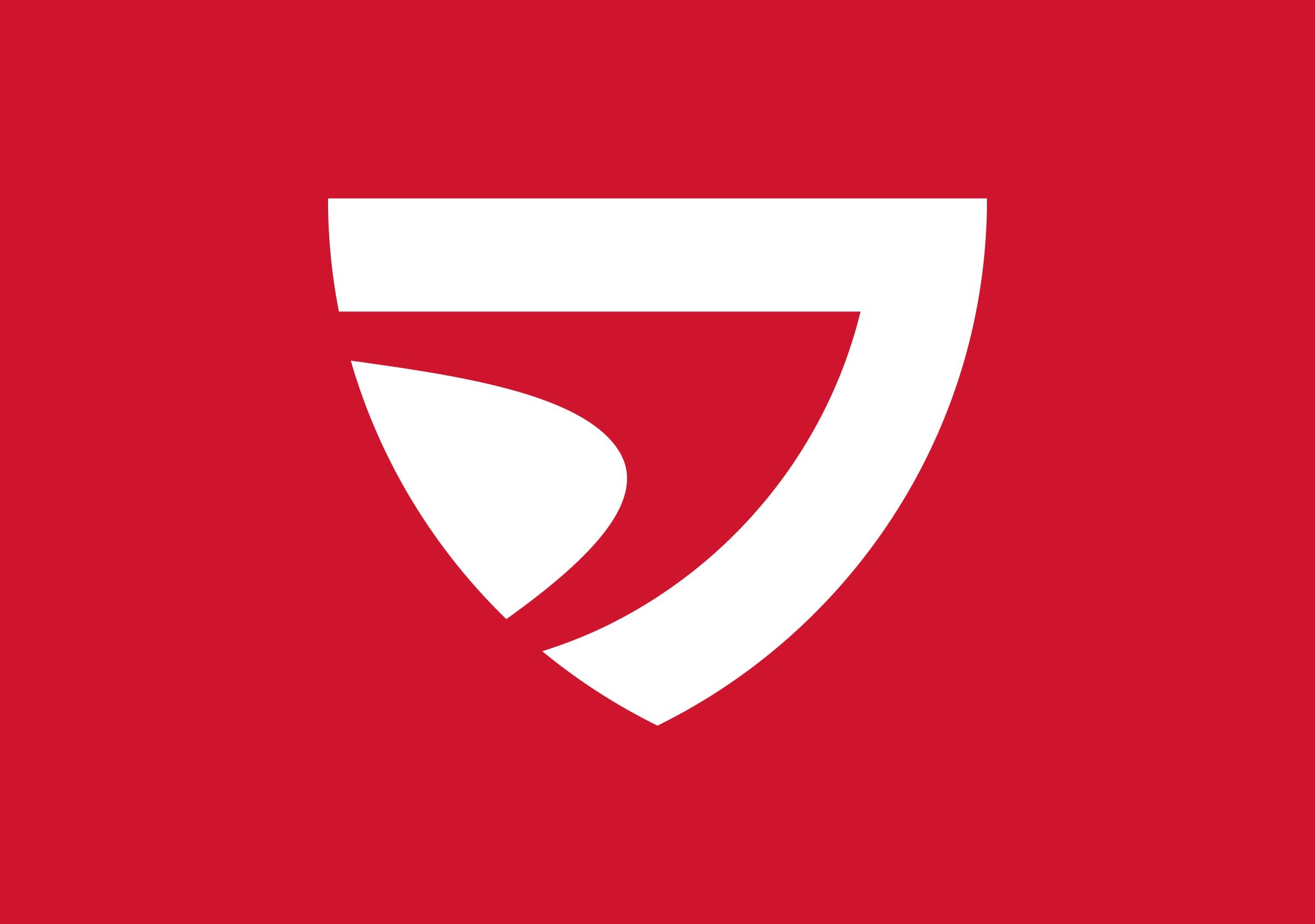
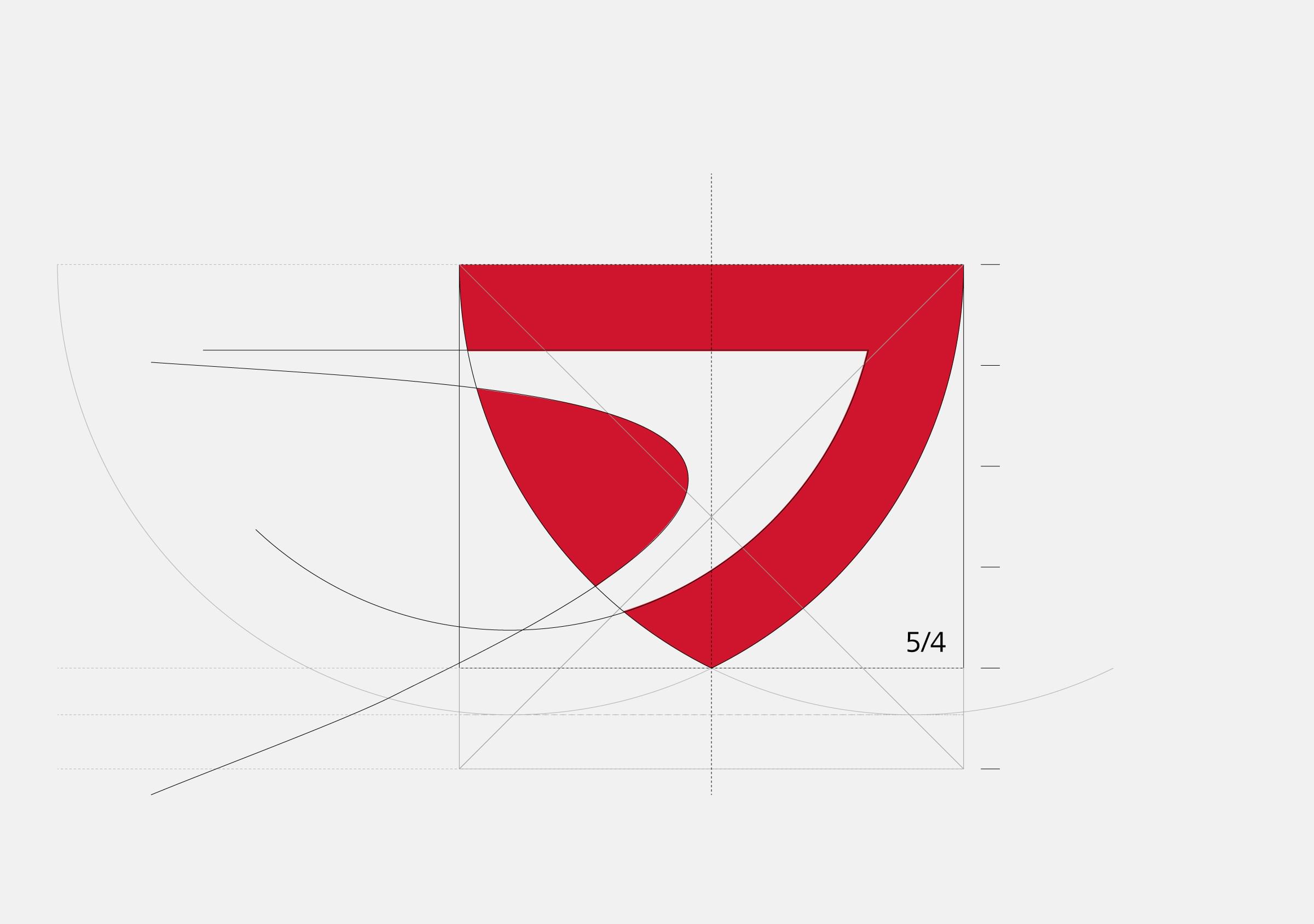
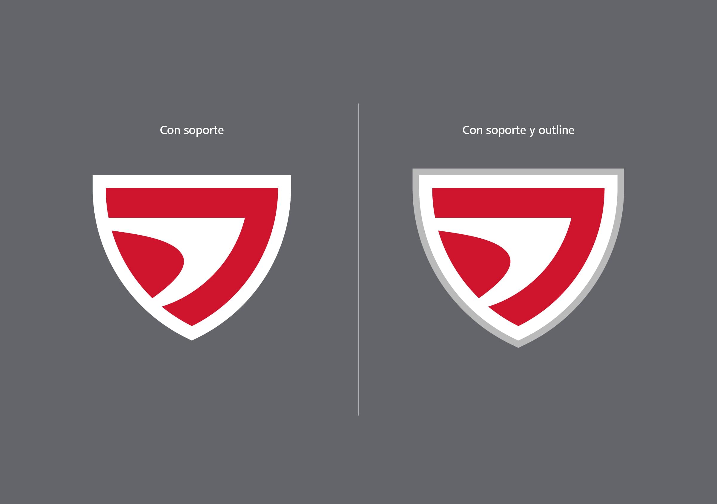
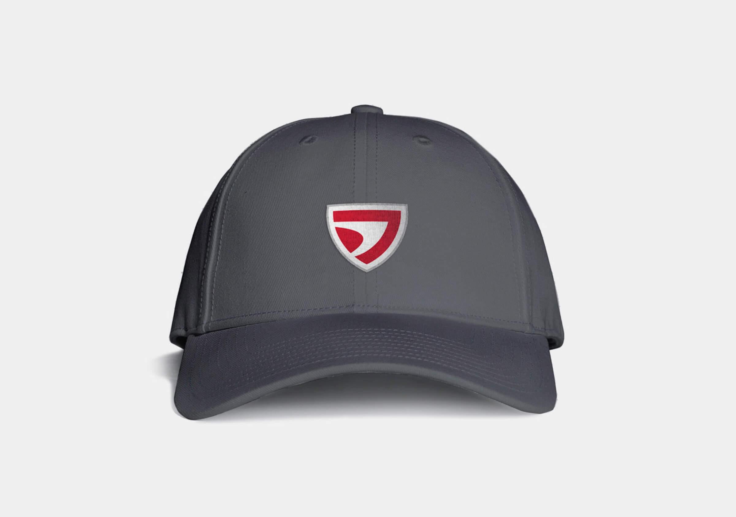
The designed isologo has a heraldic shape, similar to a shield, like those that identify regions or teams. In the corner it is stamped by a kind of arrow that is born from the idea of a flock of birds flying in a V formation through the sky.
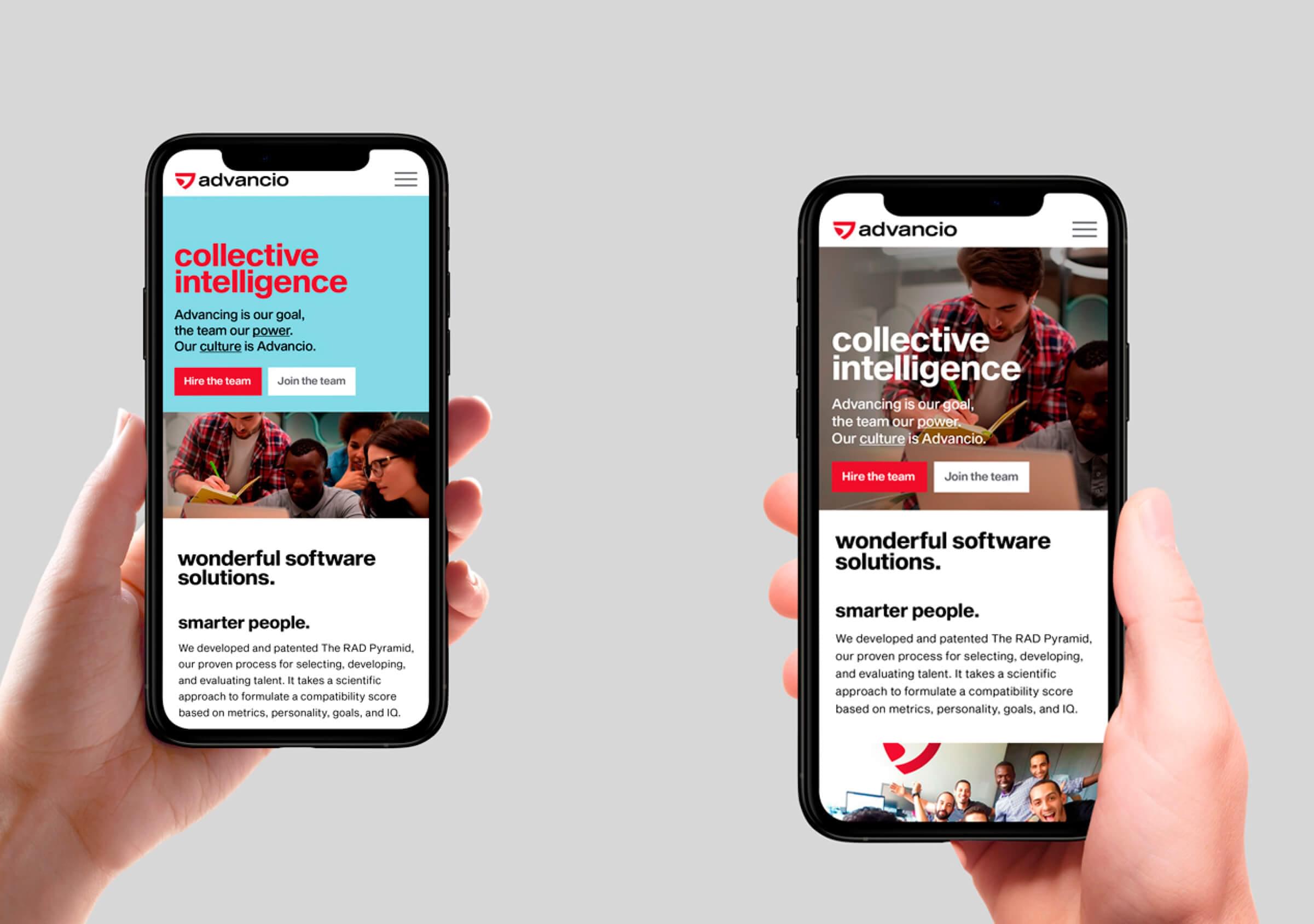
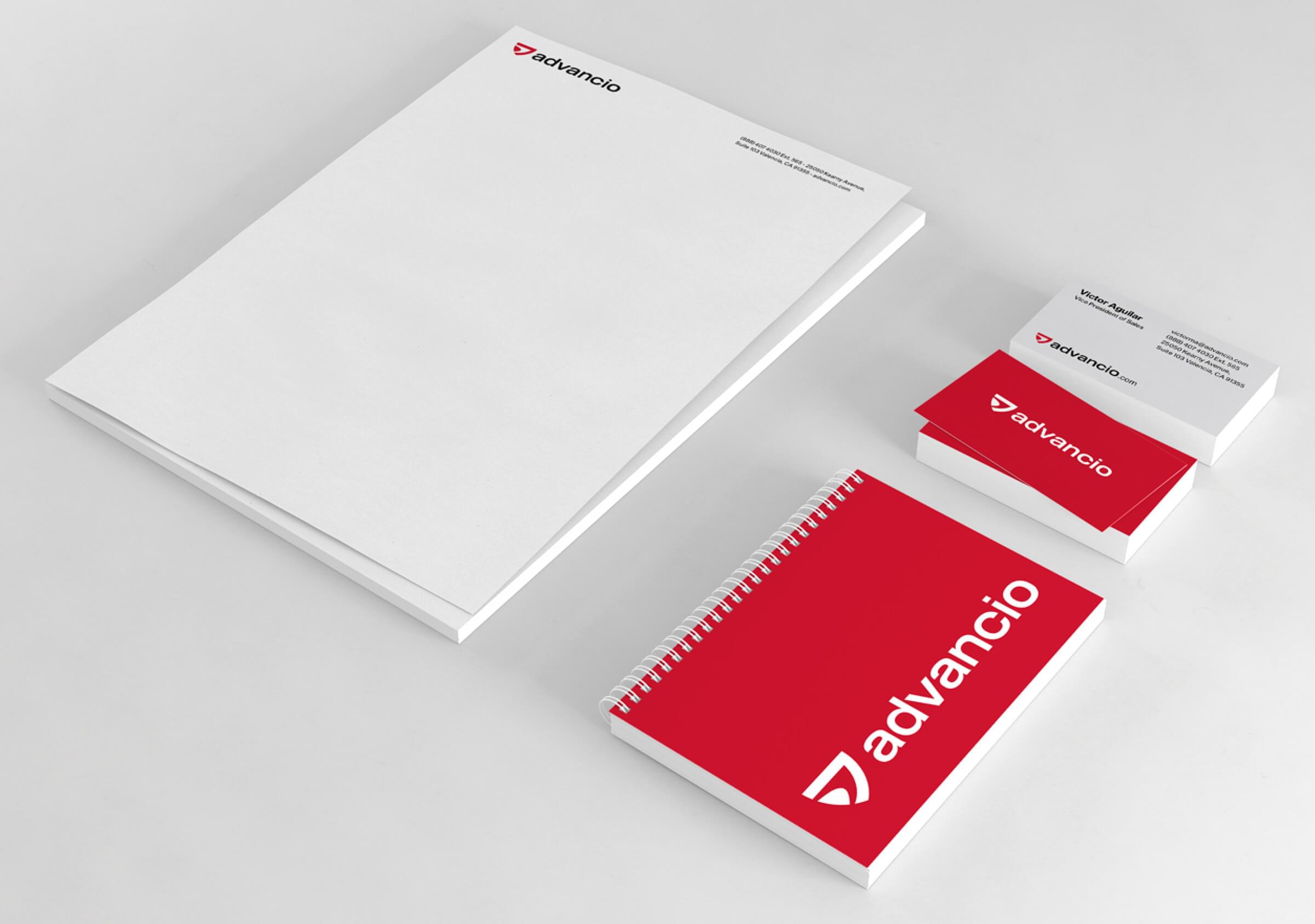
The selected typeface is Sequel Sans Serif: powerful, current and with good legibility.
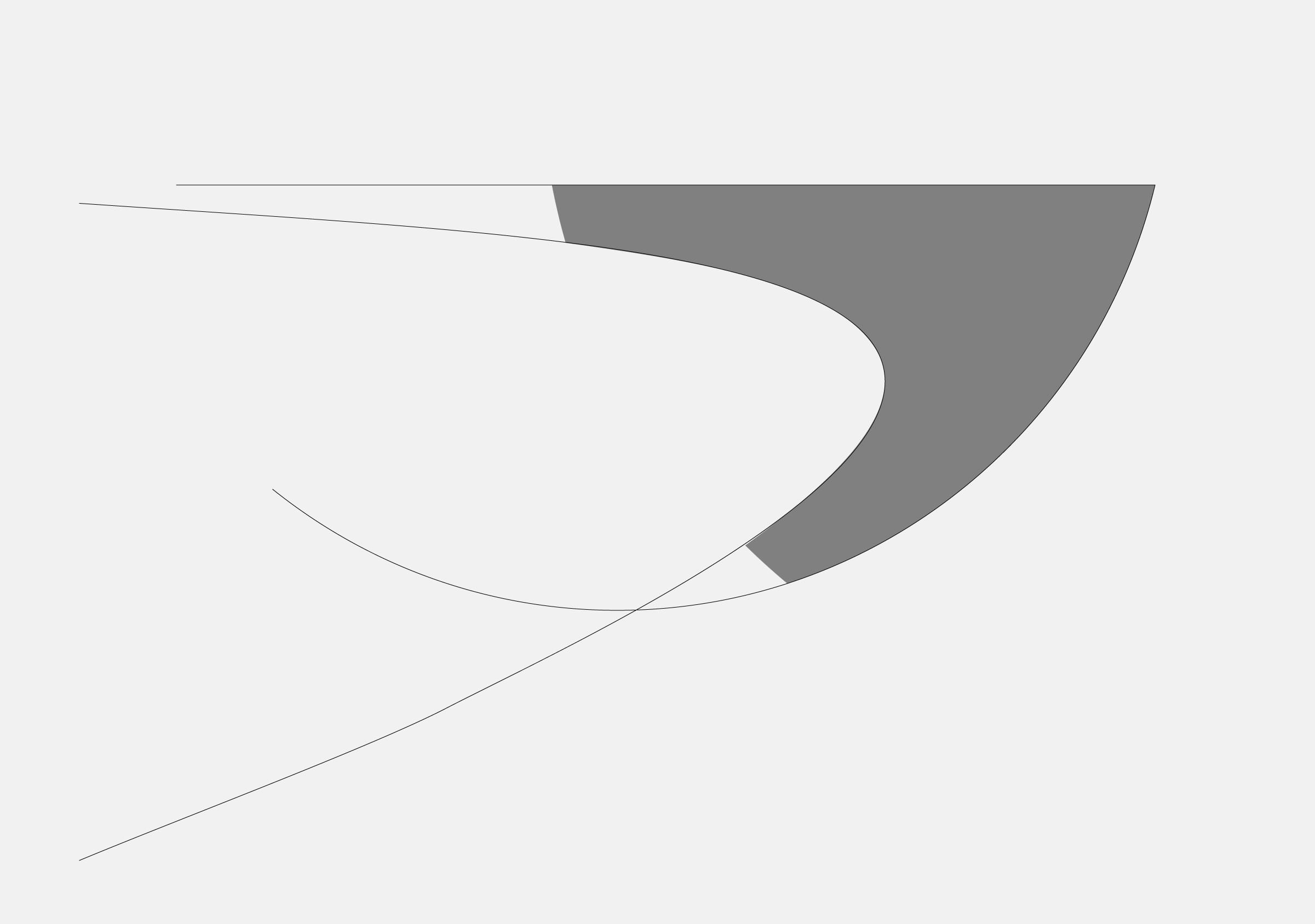
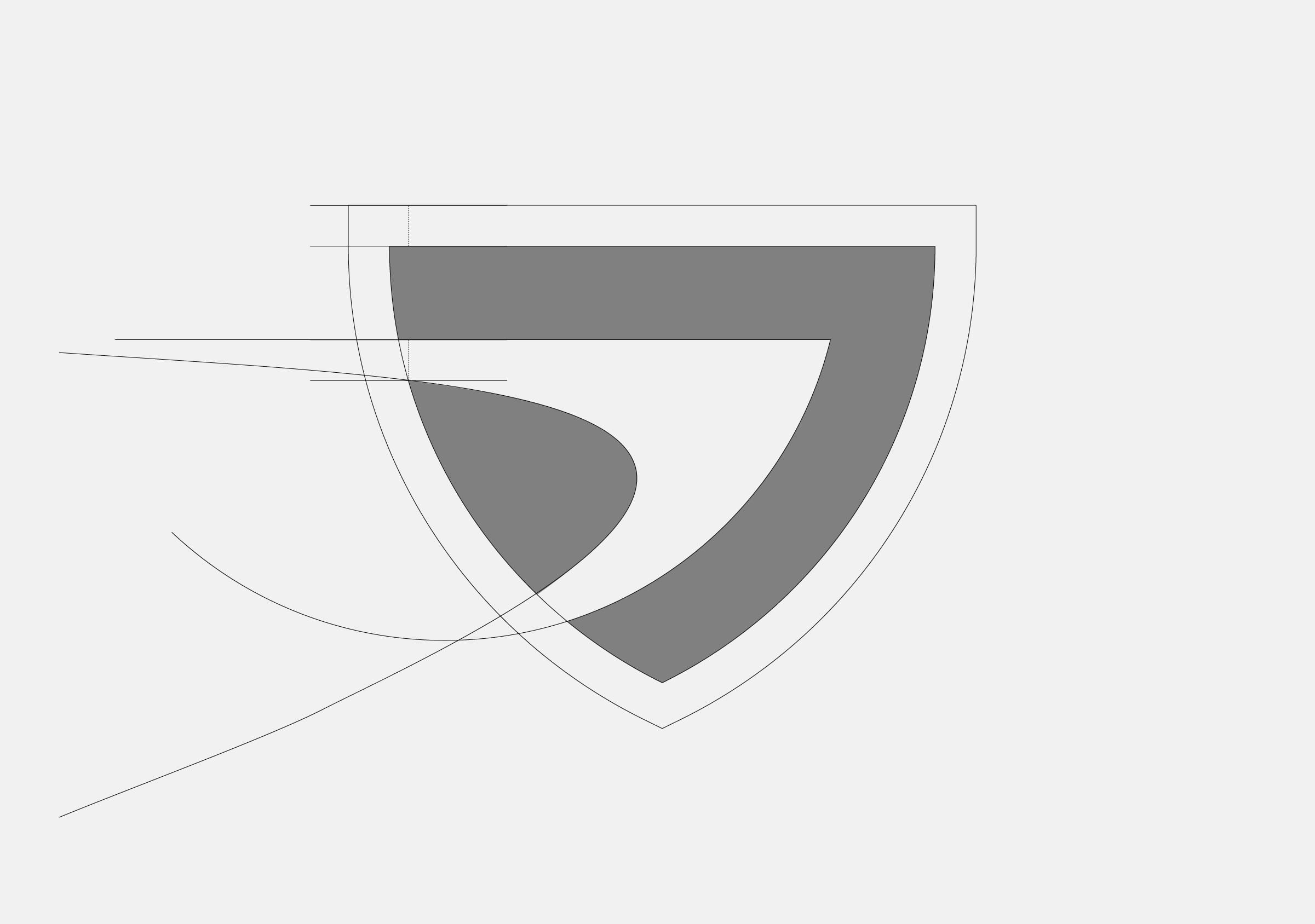
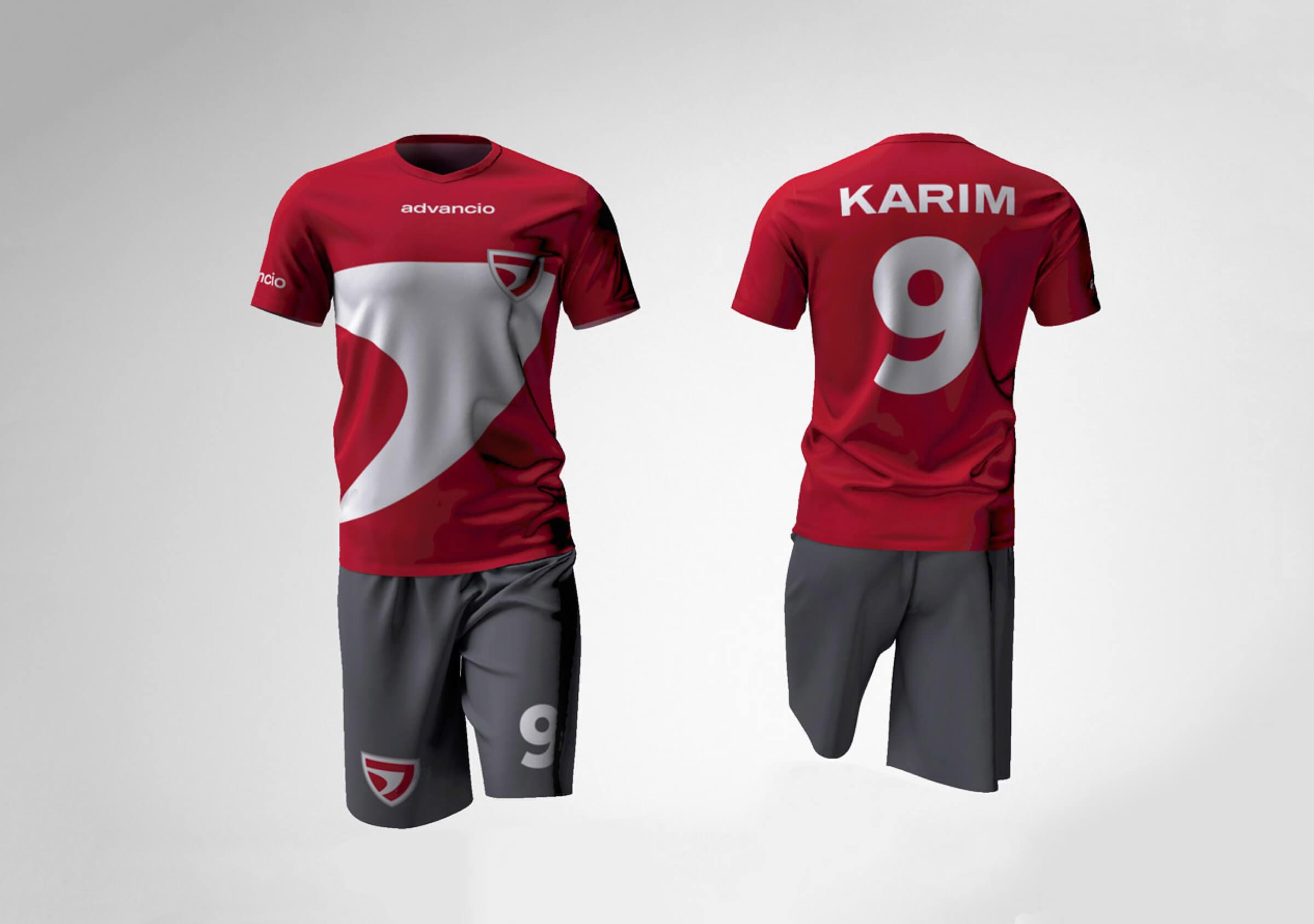
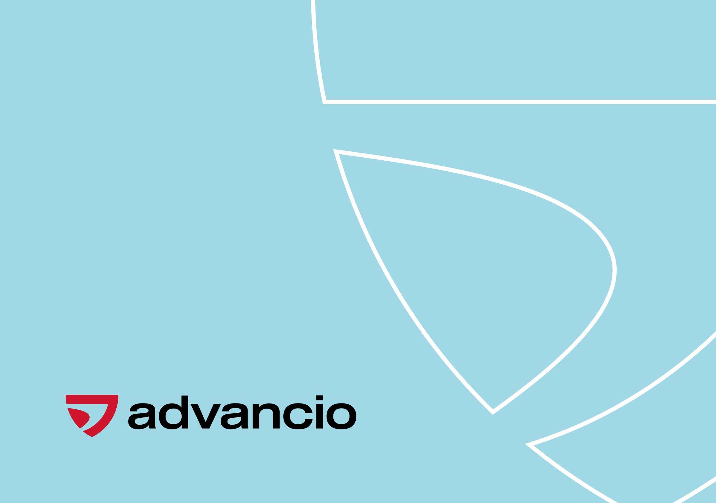
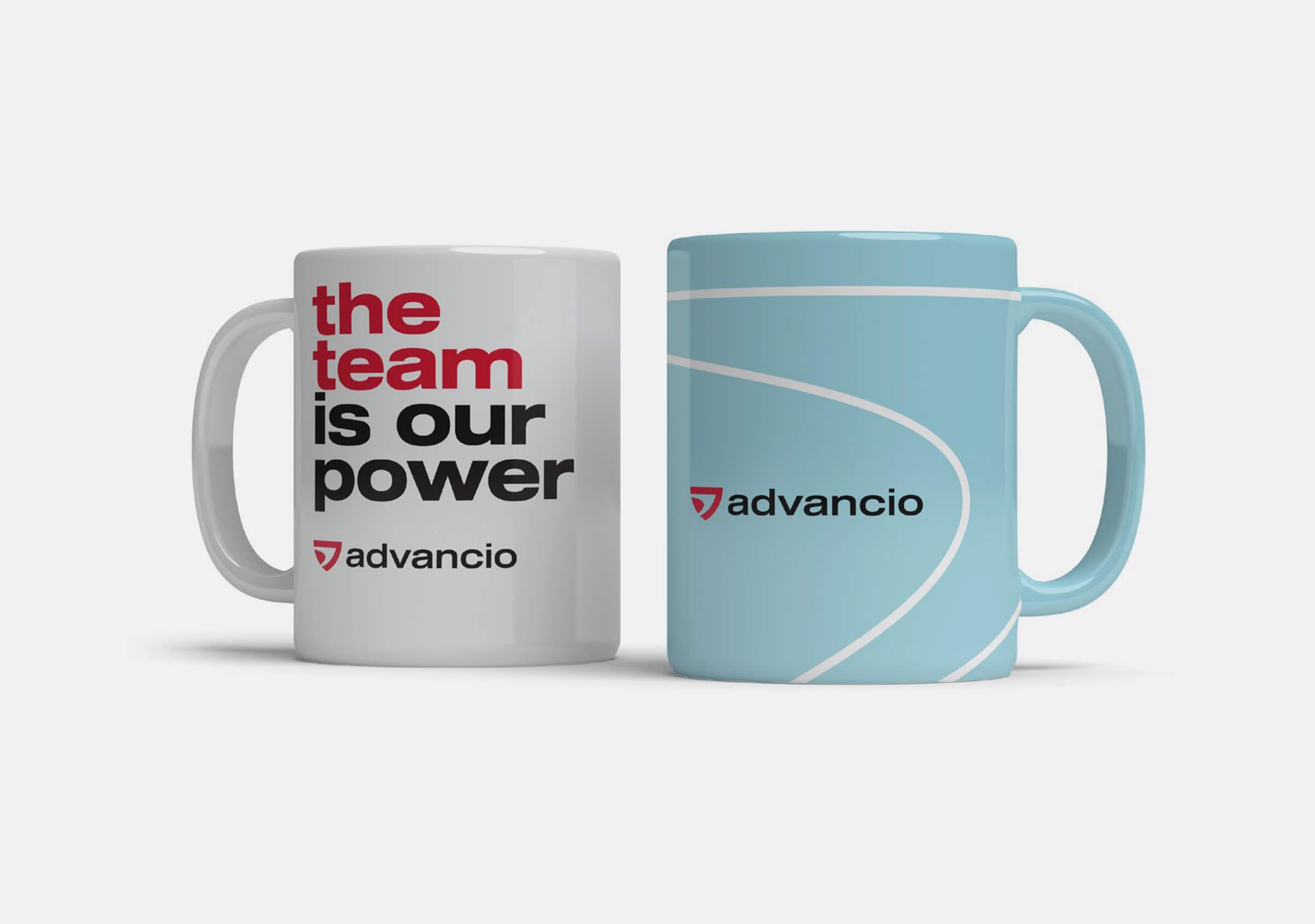
Red and black are still at the heart of the visual identity program, but they are complemented and softened by the addition of light blue.
For its part, the expanded and liberated color palette, along with lines and patterns inspired by the symbol, bring freshness, flexibility and dynamism to the image.
