- Fuego Yámana
- /
- Handing
Handing
Handing is an application for schools that seeks to improve communication, strengthening the relationships within educational communities, through the management of relevant information, tasks, activities, news and more… Connecting privately all the members that make up that community: parents, teachers, students and the school.
handing.co
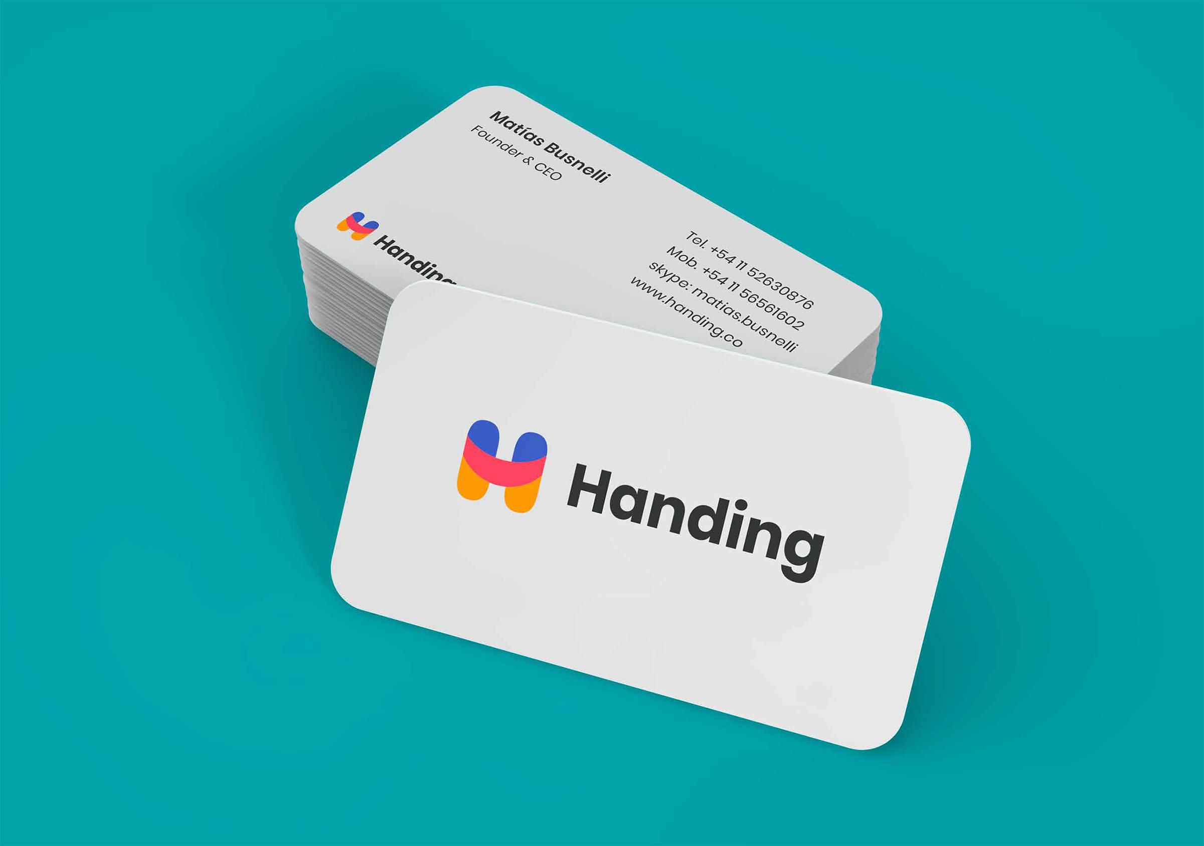
With the main objective of refreshing a purely digital brand, Handing, and differentiating it from its competition, we carried out a complete project that included: creating their new visual identity and a unique illustration set.
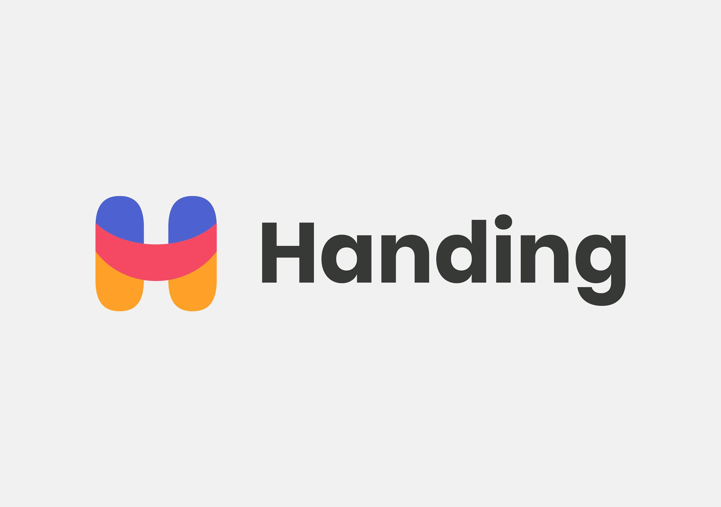
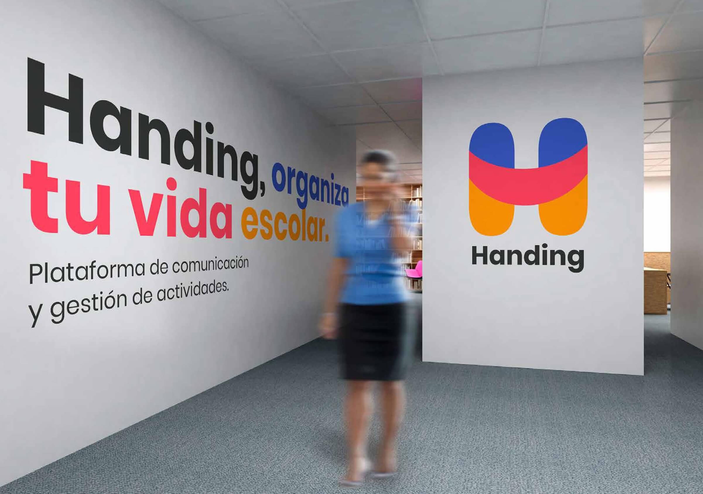
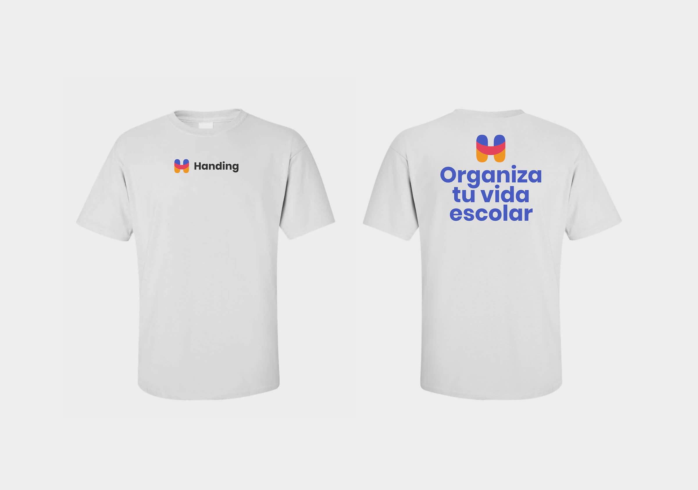
We started with the rebranding process, converting a low vocative and common logo, which could not differentiate itself from the competition (due to its colors and typography), into a colorful, cheerful, empathetic, friendly and fresh brand.
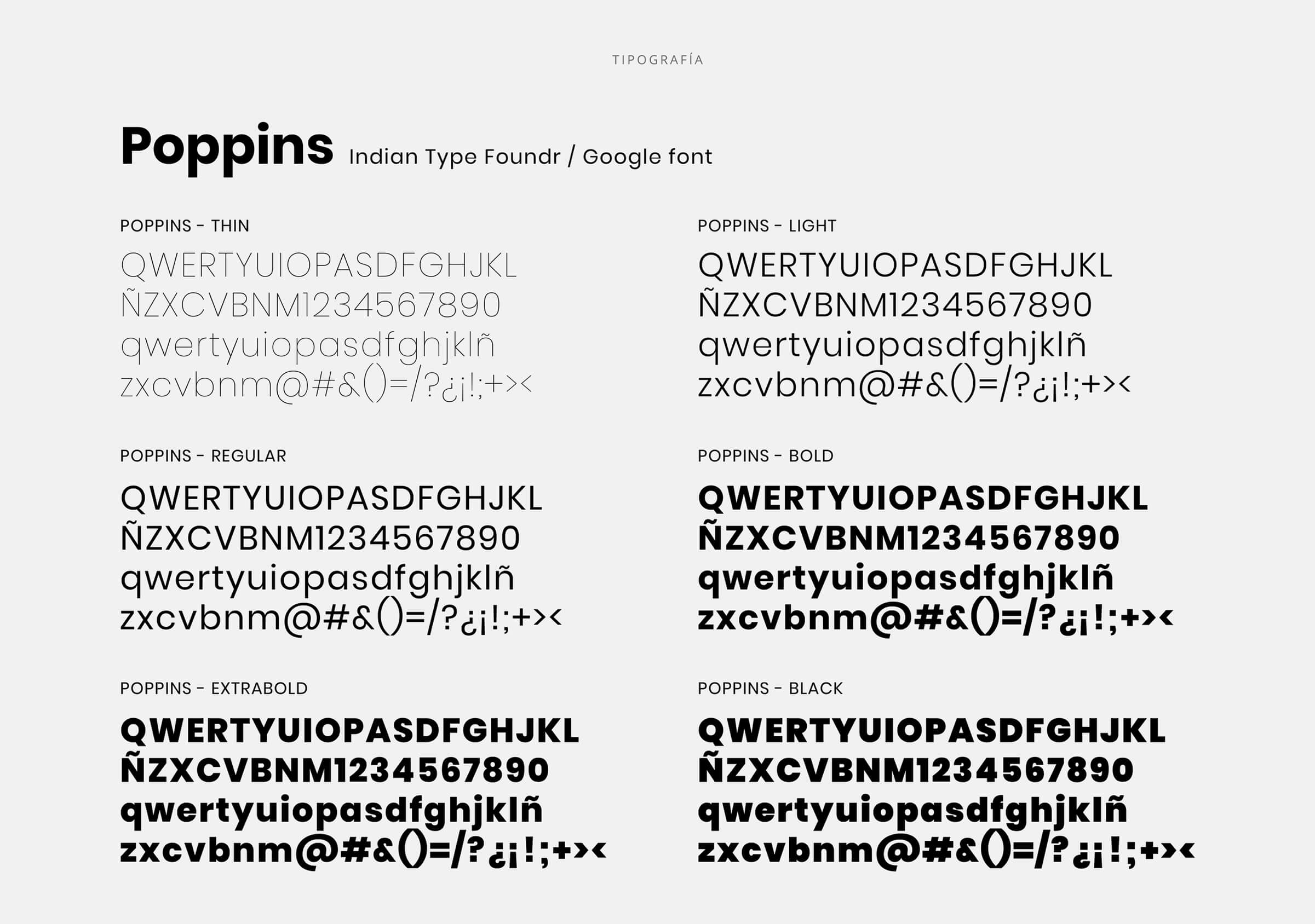
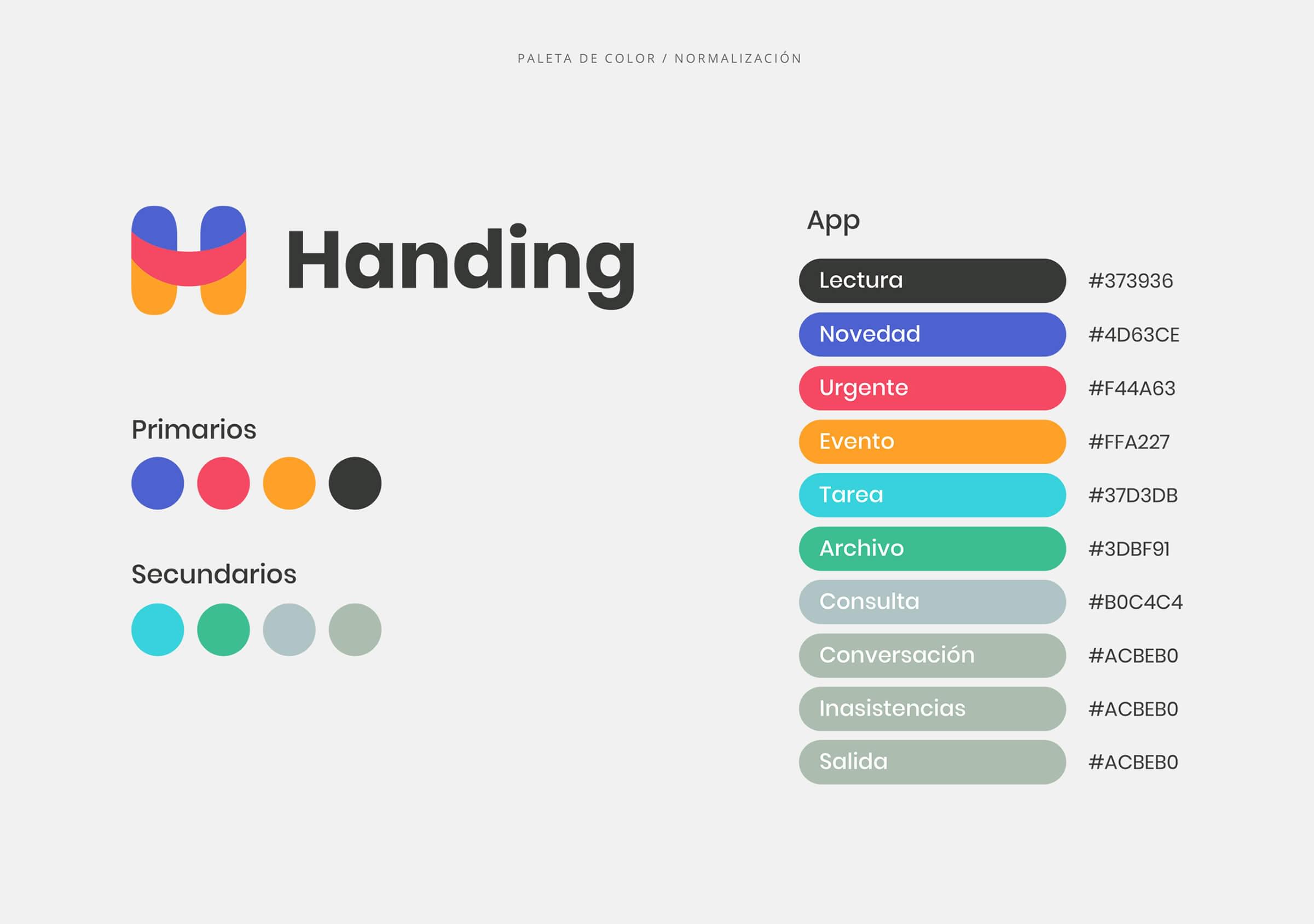
This new corporate visual identity allowed us to create a very pregnant and powerful visual universe around Handing.
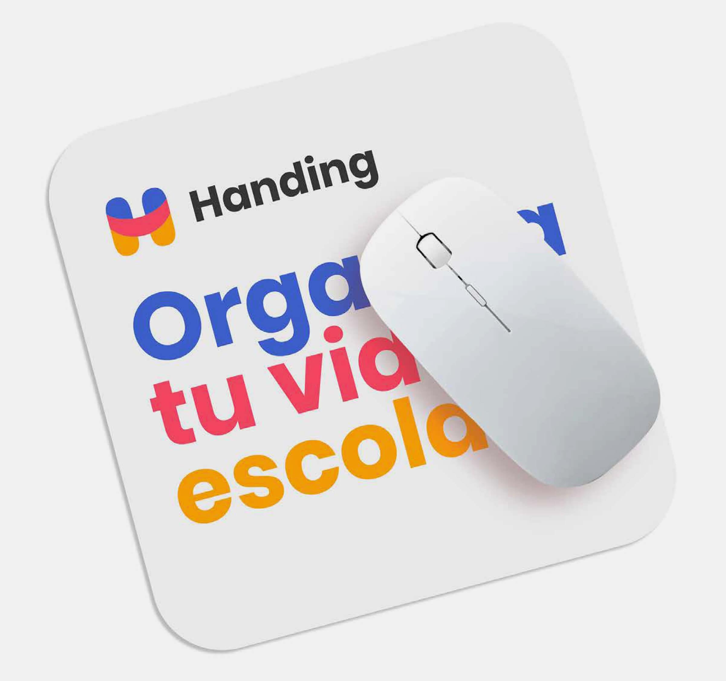
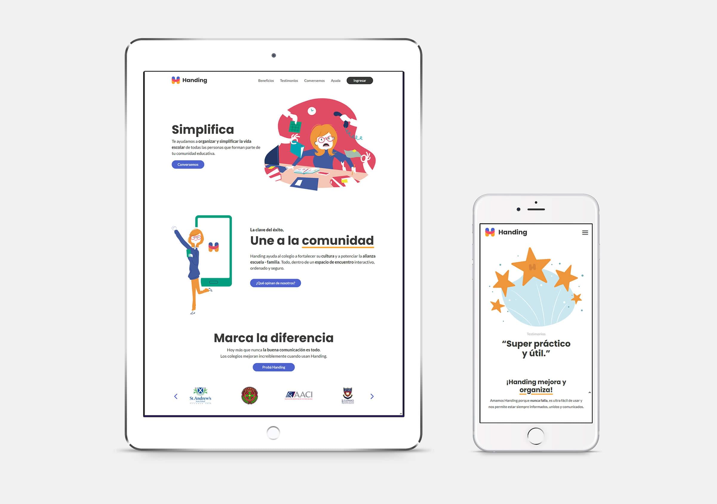
We managed to capture this strong brand identity in a modern and simple website where the white predominates and it is complemented by the multiple colors of the palette.
In addition, Handing entrusted us with the creation of a set of illustrations for the project, which added a unique style to the identity and enhanced the modern, warm and approachable character of the brand. All of this, married with a well-curated content makes for a happy, fun and user-friendly site.


